2. Fonts
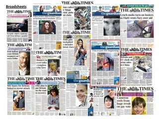
Masthead
Masthead
MastheadMasthead
Masthead
Masthead
Masthead
MastheadMasthead
MastheadMasthead Masthead
Masthead Masthead
Masthead
Body Copy
Body Copy
Body CopyBody Copy
Body Copy
Body Copy
Body Copy
Body CopyBody Copy
Body CopyBody Copy Body Copy
Body Copy Body Copy
Body Copy
Body Copy
Body Copy
Body CopyBody Copy
Body Copy
Body Copy
Body Copy
Body CopyBody Copy
Body CopyBody Copy Body Copy
Body Copy Body Copy
Body Copy
Masthead
Masthead
MastheadMasthead
Masthead
Masthead
Masthead
MastheadMasthead
MastheadMasthead Masthead
Masthead Masthead
Masthead
The fonts that I outlined and the fonts I would like to use
4. layout
Title will be at
the top in a
clear font so
its easy to
read
Price will be
clearly stated
so people
know
Small bit of
information will be
under the title to
explain the exclusive
interview
Small image of
the exclusive
person to show
who it is
Large image in the
centre related to
the text around it
Three small
columns of text
under the image
to break up the
chunk of text
Text around
the image
explaining the
image
Adverts
placed at the
bottom
5. Production
I opened up a new document and made it to the size 375mm x 597mm. I then added in the grids so I had something to follow then I
looked ad the rough sketch I had draws so I know where I wanted each section to go. I then added in coloured boxes so you could see
where I wanted each part. I made sure I used different colours for each area.
6. Production
I then added text into the boxes so you knew what I wanted there. This would make it easier when I came to add text and images
onto my layout.
7. Production
The I started to insert the images I wanted to use. The main image in the centre is related to what the main text is going to be about. I
had used this image because it will catch peoples attention and make them want to read more. Then I have used an image of a hip
hop artist kanye west because under the title I am going to have a strap line under promoting an exclusive interview with him.
8. Production
I then added the title. I used this font because I thought it looked professional and stood out catching people attention. I then added
my strap line promoting the exclusive interview, and I also make the text box blue because it thought it needed some colour adding
because without it it looks very plain and boring and unattractive. To capture peoples attention you need to make sure it looks good. I
then added in bullet points just pointing out the other exciting parts that are going to be included within the broadsheet, this will help
to make people read further on.
9. Production
I then added in my text that I wrote out about the release of the new GTA game. I placed it under the bullets then I followed the page
round going underneath the image. I added in a drop cap so it help to lead the reader to the start of the text. I made the text a
readable size but a size that fit a lot of text in because I didn’t want to only have a few words. I think that looking at previous
broadsheets they all have a lot of writing on their front cover so I wanted to keep my front cover looking quite busy with a lot of
writing.
10. Production
Then finally I added in hip hop related adverts at the bottom of the page. This will help break up the page from having so much text
and it will also help the business to gain a profit. I added two because it fit well across the space at the bottom that I had set for
adverts. I didn’t include the price because I could find anywhere to place it without effecting what I had already done. If I was to do
this again I will try fit everything on.