CALL ON ➥8923113531 🔝Call Girls Aminabad Lucknow best Night Fun service
School magazine design analysis
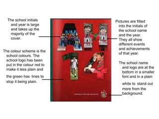
1. The colour scheme is the
school colours. The
school logo has been
put in the colour red to
make it less plain and
the green has lines to
stop it being plain.
The school initials
and year is large
and takes up the
majority of the
cover.
Pictures are fitted
into the initials of
the school name
and the year.
They all show
different events
and achievements
of that year.
The school name
and logo are at the
bottom in a smaller
font and in a plain
white to stand out
more from the
background.
2. The contents page
is split into lots of
different sections
for all the
different areas
the magazine
covers.
The contents page is
very detailed and
contains a lot of
page numbers and
what’s on what page
because of the size
of the magazine.
The editor is
credited at the
bottom of the
contents with
part of the
sentence in bold
to stand out from
the rest of the
text on the page
Each different
section has a
different colour
which stops it
all being all
black text and
makes each
section title
stand out.
3. The background is
white which is
plain and clean.
The logo is in the top
left corner and
uses a red font
which stands out
against the white
background. The
font is a medium
size.
A picture is the main
background for the cover. I
doesn't use many colours.
Apart from the colour red.
4. The logo is
displayed again
in the top right
corner above the
picture of the
editor who is
captioned.
A contents table runs
down the right side.
Underneath is credits of
the team behind the
magazine and a
disclaimer.
The majority of the
page is taken up
by a letter from
the editor which
starts off with an
empowering
quote.
There is a lack of
colours on the page
and the the page
itself is mainly all
text
The lines at the bottom
separate the wall of text
from the contact details
of the school.
5. The main text is white which is
bold, plain and clean against
the background.
The masthead is square and
gives a business feel to it. It is
also a play on words as ‘in press’
sounds like ‘impress’ which is
positive and shows the school off
as ‘impressive’. The font size
here is the largest on the page
making the masthead more
prominent.
The slogan uses a small font and sits above
the masthead. It shows as not as important as
the masthead or cover lines but carries the
message that this magazine is about the
students.
The date and issue number is small and out of
the way of the main focus of the cover. It is
stacked up on one side away from the side with
the main text which doesn't overload the main
side with too much text.
A bar coloured in the schools
colours separates the main part of
the magazine cover from the smaller
sub-headings.
The school logo is small and
placed in the bottom right corner
away from the main focus point of
the magazine. The logo doesn't
need to be more prominent as the
in press logo is the more
important logo.
The subheadings are written in a small font in
the footer of the page and in a colour scheme
that is the same as the point on the colour
gradient of the line above that it is under.
The cover lines are a medium size
and shows a major positive as it says
‘strength to strength’ which shows
improvement upon something that is
already good/great.
The picture uses up the
majority of the space and
brings the main focus to the
middle of the cover.
The colours on the top of
the cover use colours that
are part of the school
colours.
6. The picture at the top
takes up part of the page
and has focal point that is
more to the left than the
centre.
The letter from the
principal text size is
small and against a
white background
which is plain but
clean.
The letter from the principal
substitutes for a contents page.
The principal summarises the
achievements that are talked
about/celebrated in this issue.
The main title for the page is
in capitals. The word principal
is in the largest font on the
page and in a different colour
to draw attention and make it
more important.
Green bars line the
text on the top and
the bottom to make
the page less plain
and not just all text.
There is a small portion of
sexton the side of the page. It is
in caps lock to make sure it isn't
missed and stands out. It talks
about how good the schools
links are.
The overall feel of this page is that
it is uniformed and business-like.