1. The genre of my magazine is R&B and the camera angle
I used is a medium shot this impacts the audience as
they can see not only her facial expressions but her body
language towards the camera as. I think the unique
selling point of this magazine would be the fact that it is
the first combined urban magazine. My front cover has
only one photo on, I did this because in my research I
found that a lot of R&B magazines only used one photo to
attract their audience. My skyline also would attract my
audience as this is the first thing they will see when
searching the magazines.
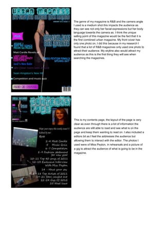
This is my contents page, the layout of the page is very
clear as even through there is a lot of information the
audience are still able to read and see what is on the
page and keep them wanting to read on. I also included a
editors bit as I feel the addresses the audience but
allowing them to interact with the editor. The photos I
used were of Miss Peyton, in rehearsals and a picture of
a gig to attract the audience of what is going to be in the
magazine.
2. This is my double page spread for
mymagazine. The layout of this is
good the audience can clearly see
and read the information. I used a
variety of fonts and colours which
will attract the audience and
makes it seem interesting not
boring, which the audience will
enjoy looking at. The two photos i
used are of Miss Peyton
rehearsing I did this so the
audience have a sense of realism
in being able to look in on what
she is doing. I have set my article
in a question answer format which in my research I found people enjoyed reading these as they seem
more personal to the audience as they can see into their lives. I have also included a little text from
the material near the photo I believe this is too encourage the audience and show them that it is an
interesting article to read.