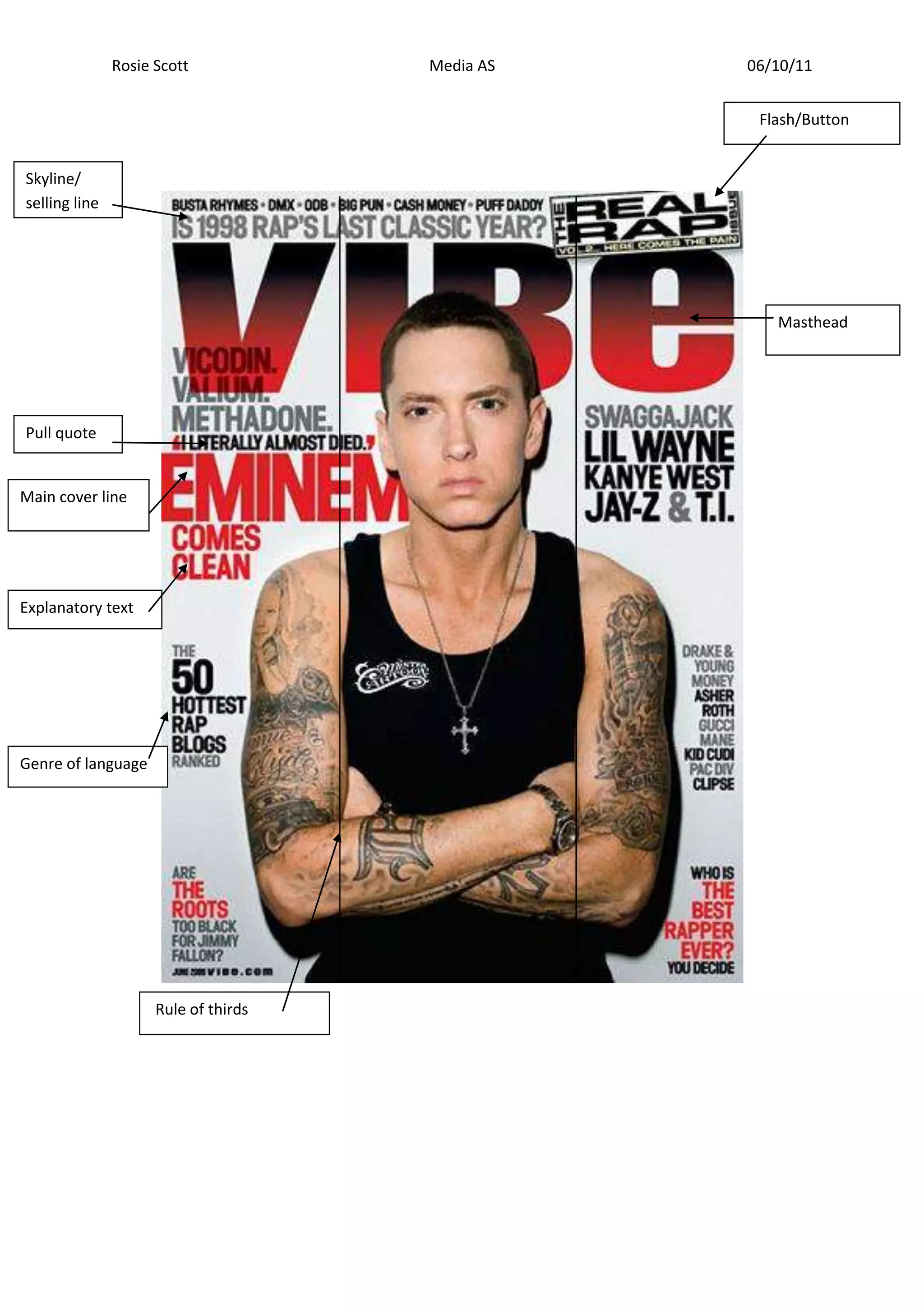
This document discusses techniques for analyzing magazine layouts and covers. It mentions analyzing the rule of thirds composition, images used, text style, intended audience, representation, unique selling points, language and tone. Specific techniques mentioned include examining the masthead placement, use of secondary images, tag lines, mise-en-scene elements like costumes and props, and iconography in the photos. The overall goal is to understand how different design and imagery choices impact the messages and impressions conveyed to the intended audience.


![Tics[1]](https://cdn.slidesharecdn.com/ss_thumbnails/tics1-111021104233-phpapp02-thumbnail.jpg?width=640&height=640&fit=bounds)

![Boletin ok libreta_militar[1]](https://cdn.slidesharecdn.com/ss_thumbnails/boletinoklibretamilitar1-111021095642-phpapp02-thumbnail.jpg?width=640&height=640&fit=bounds)


