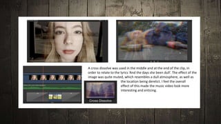
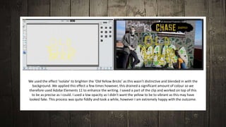
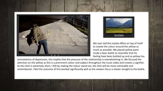
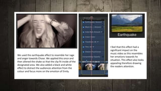
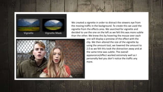
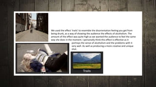
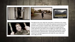
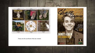
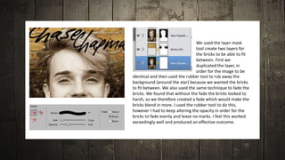
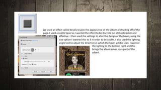
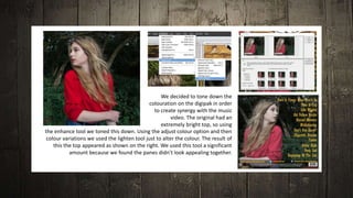
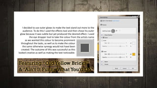
Construction
Final Cut Pro X
A cross dissolve was used in the middle and at the end of the clip, in
order to relate to the lyrics ‘And the days she been dull’. The effect of the
image was quite muted, which resembles a dull atmosphere, as well as
the location being derelict. I feel the overall
effect of this made the music video look more
interesting and enticing.
We used the effect ‘isolate’ to brighten the ‘Old Yellow Bricks’ as this wasn’t distinctive and blended in with the
background. We applied this effect a few times however, this drained a significant amount of colour so we
therefore used Adobe Elements 11 to enhance the writing. I saved a part of the clip and worked on top of this
to be as precise as I could. I used a low opacity as I didn’t want the yellow to be to vibrant as this may have
looked fake. This process was quite fiddly and took a while, however I am extremely happy with the outcome.
We over laid the isolate effect on top of itself
to isolate the colour around the yellow as
much as possible. We placed yellow paint
inside a beer bottle to resemble that his
feeling have been bottled up and as yellow has
connotations of depression, this implies that the pressure of the relationship is overwhelming in. We focused the
attention on the yellow as this is a prominent colour and subject throughout the music video and creates a signifier.
As this shot is extremely short, I felt by making the colour stand out, the shot will be more noticeable and
remembered. I feel the outcome of this worked significantly well as the viewers focus is drawn straight to the bottle.
We used the earthquake effect to resemble her rage
and anger towards Chase. We applied this once and
then altered the shake so that the clip fit inside of the
designated area. We also added a black and white
effect to distract the audiences attention from the
colour and focus more on the emotion of Emily.
I feel that this effect had a
significant impact on the
music video as this resembles
her emotions towards he
situation. This effect also looks
appealing therefore drawing
the readers attention.
We created a vignette in order to distract the viewers eye from
the moving traffic in the background. To create this we used the
vignette from the effects area. We searched for vignette and
decided to use the one on the left as we felt this was more subtle
than the other. We knew this by hovering the mouse over each
one will display a preview of the effect with the
clip. We then altered the size of the vignette by
using the amount tool, we lowered the amount to
2.0 as we felt this took the distraction away and at
the same time was subtle. The overall
appearance/effect worked extremely well as I
personally feel you don’t notice the traffic any
more.
We used the effect ‘trails’ to resemble the disorientation feeling you get from
being drunk, as a way of showing the audience the effects of alcoholism. The
amount of the effect was quite high as we wanted the audience to feel the same
way she does in the moment. I personally think this effect is effective as it
portrays the sense of alcoholism and the problems with it
very well. As well as producing a more creative and unique
shot.
Throughout the music video the colouration is drained as this creates
a sense of . Furthermore this makes the audiences concentrate on the
narrative more as there is limited colour. We intended on doing this
because we wanted the problems of alcoholism and gambling to
create awareness and relate to the struggles of modern day society.
Conventions are adhered to here, because Indie colouration is either
black and white or drained colour. I personally think that this effect
created the intended appearance and made the music video look
more edgy and indie.
Adobe Elements 11
These are the ancillaries that we created
We used the layer mask
tool create two layers for
the bricks to be able to fit
between. First we
duplicated the layer, in
order for the image to be
identical and then used the rubber tool to rub away the
background (around the star) because we wanted the bricks
to fit between. We also used the same technique to fade the
bricks. We found that without the fade the bricks looked to
harsh, so we therefore created a fade which would make the
bricks blend in more. I used the rubber tool to do this,
however I had to keep altering the opacity in order for the
bricks to fade evenly and leave no marks. I feel this worked
exceedingly well and produced an effective outcome.
We used an effect called bevels to give the appearance of the album protruding off of the
page. I used a subtle bevel as I wanted the effect to be discrete but still noticeable and
effective. I then used the settings to alter the design of the bevel, using the
size option I lowered this to 3 in order to be subtle. I also used the lighting
angle tool to adjust the direction at which the bevel will be seen. I wanted
the lighting to the bottom right and this
brings the album cover in as part of the
advert.
We decided to tone down the
colouration on the digipak in order
to create synergy with the music
video. The original had an
extremely bright top, so using
the enhance tool we toned this down. Using the adjust colour option and then
colour variations we used the lighten tool just to alter the colour. The result of
this the top appeared as shown on the right. We used this tool a significant
amount because we found the panes didn’t look appealing together.
I decided to use outer glows to make the text stand out more to the
audience. To do this I used the effects tool and then chose his outer
glow because it was subtle but yet produced the desired effect. I used
the eye dropper tool to take the colour from the artists name
as we wanted this colour to become prominent
throughout the tasks, as well as to make the colour
the same otherwise synergy would not have been
created. The outcome of this was successful as this
looked creative as well as making the text noticeable.
To adhere to conventions we added text to the cd. We decided to warp the text around the cd as
this looked appealing as well as being adding institutional details. The text is small as this is
supposed to be discrete, similar to the digipaks I researched. To warp this we used the warp tool
and then chose the arc style as we only wanted to cover a small amount of space. Using the
bend setting I chose 100% because this then made the arc into a semi circle, which is what we
wanted. I am pleased with the overall effect as this appears as this looks similar to real cds.
I also created additional
promotional material in order to
reflect what a record label would
do to advertise their star/artist.
Camera
We used the cameras that were provided by the media
department for our principle photography to capture high
quality photographs. In addition we used the cameras to take
photographs for the digipak and advert, we had no trouble
using the camera and ended up with very successful images. We
also used the camera and a tripod to film our music video, we
only had one problem which was filming in the wrong setting,
however this was salvageable when we were in the editing
process.
We used the Macs that were in the media department
to create our music videos, using the software Final
Cut Pro X. We also used the Macs to take screen
captures of the music video for the evaluation. We
used Macs throughout the whole of AS, as we did not
have computers so I already knew how to work these.
Apple Macintosh
We used the college media computers throughout the research,
planning, construction and evaluation stages to do our work. I also
used a laptop provided by college to do my work when outside of
college. Using these two pieces of hardware I was able to create my
blog. We used the computes in media, using the software Adobe
Elements 11 to create our digipak and advert
Computers and Laptops
We used the memory cards provided by the media department to capture
the photographs as well as videos. We used a few memory cards as we used
two cameras when filming so each one had different footage. In addition we
used another one when we took photographs of the stars, by doing this we
were more organised with what each memory card contained. We used the
memory card readers in order to access the content on the memory cards.
We used this in conjunction with the Macs and computers, which is where
we did the construction.
Memory Cards and Readers
We used one portable hard drive within our group to store our
music video on. Every time one of the group edited the music video
we would have to plug this into the Mac in order to access and edit
the music video.
Portable Hard Drive

Construction

  • 1.
  • 2.
  • 3.
    A cross dissolvewas used in the middle and at the end of the clip, in order to relate to the lyrics ‘And the days she been dull’. The effect of the image was quite muted, which resembles a dull atmosphere, as well as the location being derelict. I feel the overall effect of this made the music video look more interesting and enticing.
  • 4.
    We used theeffect ‘isolate’ to brighten the ‘Old Yellow Bricks’ as this wasn’t distinctive and blended in with the background. We applied this effect a few times however, this drained a significant amount of colour so we therefore used Adobe Elements 11 to enhance the writing. I saved a part of the clip and worked on top of this to be as precise as I could. I used a low opacity as I didn’t want the yellow to be to vibrant as this may have looked fake. This process was quite fiddly and took a while, however I am extremely happy with the outcome.
  • 5.
    We over laidthe isolate effect on top of itself to isolate the colour around the yellow as much as possible. We placed yellow paint inside a beer bottle to resemble that his feeling have been bottled up and as yellow has connotations of depression, this implies that the pressure of the relationship is overwhelming in. We focused the attention on the yellow as this is a prominent colour and subject throughout the music video and creates a signifier. As this shot is extremely short, I felt by making the colour stand out, the shot will be more noticeable and remembered. I feel the outcome of this worked significantly well as the viewers focus is drawn straight to the bottle.
  • 6.
    We used theearthquake effect to resemble her rage and anger towards Chase. We applied this once and then altered the shake so that the clip fit inside of the designated area. We also added a black and white effect to distract the audiences attention from the colour and focus more on the emotion of Emily. I feel that this effect had a significant impact on the music video as this resembles her emotions towards he situation. This effect also looks appealing therefore drawing the readers attention.
  • 7.
    We created avignette in order to distract the viewers eye from the moving traffic in the background. To create this we used the vignette from the effects area. We searched for vignette and decided to use the one on the left as we felt this was more subtle than the other. We knew this by hovering the mouse over each one will display a preview of the effect with the clip. We then altered the size of the vignette by using the amount tool, we lowered the amount to 2.0 as we felt this took the distraction away and at the same time was subtle. The overall appearance/effect worked extremely well as I personally feel you don’t notice the traffic any more.
  • 8.
    We used theeffect ‘trails’ to resemble the disorientation feeling you get from being drunk, as a way of showing the audience the effects of alcoholism. The amount of the effect was quite high as we wanted the audience to feel the same way she does in the moment. I personally think this effect is effective as it portrays the sense of alcoholism and the problems with it very well. As well as producing a more creative and unique shot.
  • 9.
    Throughout the musicvideo the colouration is drained as this creates a sense of . Furthermore this makes the audiences concentrate on the narrative more as there is limited colour. We intended on doing this because we wanted the problems of alcoholism and gambling to create awareness and relate to the struggles of modern day society. Conventions are adhered to here, because Indie colouration is either black and white or drained colour. I personally think that this effect created the intended appearance and made the music video look more edgy and indie.
  • 10.
  • 11.
    These are theancillaries that we created
  • 12.
    We used thelayer mask tool create two layers for the bricks to be able to fit between. First we duplicated the layer, in order for the image to be identical and then used the rubber tool to rub away the background (around the star) because we wanted the bricks to fit between. We also used the same technique to fade the bricks. We found that without the fade the bricks looked to harsh, so we therefore created a fade which would make the bricks blend in more. I used the rubber tool to do this, however I had to keep altering the opacity in order for the bricks to fade evenly and leave no marks. I feel this worked exceedingly well and produced an effective outcome.
  • 13.
    We used aneffect called bevels to give the appearance of the album protruding off of the page. I used a subtle bevel as I wanted the effect to be discrete but still noticeable and effective. I then used the settings to alter the design of the bevel, using the size option I lowered this to 3 in order to be subtle. I also used the lighting angle tool to adjust the direction at which the bevel will be seen. I wanted the lighting to the bottom right and this brings the album cover in as part of the advert.
  • 14.
    We decided totone down the colouration on the digipak in order to create synergy with the music video. The original had an extremely bright top, so using the enhance tool we toned this down. Using the adjust colour option and then colour variations we used the lighten tool just to alter the colour. The result of this the top appeared as shown on the right. We used this tool a significant amount because we found the panes didn’t look appealing together.
  • 15.
    I decided touse outer glows to make the text stand out more to the audience. To do this I used the effects tool and then chose his outer glow because it was subtle but yet produced the desired effect. I used the eye dropper tool to take the colour from the artists name as we wanted this colour to become prominent throughout the tasks, as well as to make the colour the same otherwise synergy would not have been created. The outcome of this was successful as this looked creative as well as making the text noticeable.
  • 16.
    To adhere toconventions we added text to the cd. We decided to warp the text around the cd as this looked appealing as well as being adding institutional details. The text is small as this is supposed to be discrete, similar to the digipaks I researched. To warp this we used the warp tool and then chose the arc style as we only wanted to cover a small amount of space. Using the bend setting I chose 100% because this then made the arc into a semi circle, which is what we wanted. I am pleased with the overall effect as this appears as this looks similar to real cds.
  • 17.
    I also createdadditional promotional material in order to reflect what a record label would do to advertise their star/artist.
  • 18.
    Camera We used thecameras that were provided by the media department for our principle photography to capture high quality photographs. In addition we used the cameras to take photographs for the digipak and advert, we had no trouble using the camera and ended up with very successful images. We also used the camera and a tripod to film our music video, we only had one problem which was filming in the wrong setting, however this was salvageable when we were in the editing process.
  • 19.
    We used theMacs that were in the media department to create our music videos, using the software Final Cut Pro X. We also used the Macs to take screen captures of the music video for the evaluation. We used Macs throughout the whole of AS, as we did not have computers so I already knew how to work these. Apple Macintosh
  • 20.
    We used thecollege media computers throughout the research, planning, construction and evaluation stages to do our work. I also used a laptop provided by college to do my work when outside of college. Using these two pieces of hardware I was able to create my blog. We used the computes in media, using the software Adobe Elements 11 to create our digipak and advert Computers and Laptops
  • 21.
    We used thememory cards provided by the media department to capture the photographs as well as videos. We used a few memory cards as we used two cameras when filming so each one had different footage. In addition we used another one when we took photographs of the stars, by doing this we were more organised with what each memory card contained. We used the memory card readers in order to access the content on the memory cards. We used this in conjunction with the Macs and computers, which is where we did the construction. Memory Cards and Readers
  • 22.
    We used oneportable hard drive within our group to store our music video on. Every time one of the group edited the music video we would have to plug this into the Mac in order to access and edit the music video. Portable Hard Drive