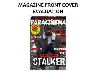
2. The masthead I have used is conventional as it is at the top of the page in a very large
and chunky font, making it in a logical order for the audience to read. The name I’ve
chosen links to thriller films as ‘para’ is short for paranoia which is a common theme in
thriller films.
The typography is a rough, edgy font which links well with the overall mood of the front
cover. The colour white is used because the background is quite dark, so the contrast
makes it clearer to see and stand out.
I have followed conventions by using a skyline and placing it at the top of
the page, this is because it has a statement that will instantly attract readers
attention therefore it should be placed in a position where it can be read
easily and clearly, which is why I’ve placed it above the masthead.
3. I have followed conventions by using coverlines that are consice
and relevant. Conventionally, coverlines are there to attract
readers to continue reading the magazine, through my use of
language I have done this and made the coverlines effective by
using star appeal (mentioning names of big celebrities and using
superlatives such as ‘best’ and ‘biggest’.
Use of news values are conventional on front covers as they
need to attract readers, therefore I’ve used Gultung and
Ruges’s news value of exclusivity – this is effective as it means
readers will want to buy my magazine as they can only see
interviews in this magazine and nowhere else.
4. Puff’s usually contain important information and need to stand out,
I’ve followed this convention by making the puff into a circle shape
and using the bright colour yellow – this assuredly makes it stand
out. Also the black and red text on a yellow background makes it
stand out.
My main coverline is in the form of anchorage
text, it is white text on a dark background and a
large font. This makes it stand out and be read
easily. This follows conventions as since it is the
focus of the magazine, it needs to stand out.
I’ve included the issue month of the magazine, which
allows readers to know which issue this particular
magazine is. I’ve added a website link as this is a
common convention due to the increased use of
internet in the media.
5. The main image is conventional because it is lens
centre and the focus of the page. Also, the image
is of the main character of the film that is most
prominent in the magazine. The NVC of the model
is serious – which links to the dark thriller genre.
Also mise-en-scene has been precisely chosen –
the dress code is that of a regular teenager –
which attracts the target audience. Whilst the
setting is a forest, which is a conventional setting
for the thriller genre as it heavily involves mystery.
Barcode in a conventional position in the
bottom right hand corner. Adds
professionalism and makes the front cover look
more realistic
Sophisticated colour code – limited use of
colours for professionalism. Colours red and
black link well to the thriller genre as red
connotes danger whilst black connotes
mystery. White is a professional colour which
makes certain pieces of text stand out.