
Recommended
More Related Content
Viewers also liked
Viewers also liked (20)
Similar to Radio times article
Similar to Radio times article (20)
Recently uploaded
Recently uploaded (20)
Radio times article
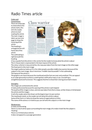
- 1. Radio Times article Codesand Conventions: There are dropcaps to showwhere the article starts,this tellsthe reader where tostart readingthe article The main image is takenup overone page to showthe meaningof the article The headingis enlarged atthe left handside of the article The subheadingis rightbeneaththe heading It has a quote fromthe article inthe centre forthe readerto know what the article isabout The in-house style isrepresentedinthe basiclayoutof the article The colour scheme isnavyandwhite;the navywas takenfromthe mainimage on the otherpage The focal pointisthe mainimage The target audience looksasif itisfor elderpeople,possiblymiddleclasswomenbecauseof the subjectinthe mainimage.Alsoitmentions“middle-classhousewife”inthe subheading The layoutof the article is The graphics are classicbecause the mastheadandthe font are neat andunedited.Thiscanappeal to an eldergenerationasthere isnothingthatisdifficulttoread,or see.Everythingis straightforwardandfunctional. Thissuggeststhatthe tvshow that is beingpresentedisclassic Strengths: The imagesare anchoredtothe article It looksprofessional becausethe spacingof the article iswell aligned The qualityof the imagesisclear,and one was takenfromthe tv show,sothat showsa linkbetween the article and the images It tellsthe readerwhenthe showisat the beginninginitsownsection The mastheadisbold,so the readercan tell whatthe article isabout Some of the fontisin italicstoshowthe name of organisationsortitles The name of the actress isin boldsoyou can tell whothe subjectisinthe mainimage Weaknesses: It looksuninteresting There isa lotof white space surroundingthe mainimage,thismake itlooklike the subjectis ‘floating’ There isa limitedcolourscheme It doesnotappeal to a youngergeneration