
Recommended
More Related Content
What's hot
What's hot (16)
Viewers also liked
Similar to Bring Me The Horizon Cover Story
Similar to Bring Me The Horizon Cover Story (20)
More from Oubahh
Bring Me The Horizon Cover Story
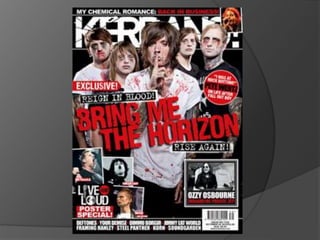
- 2. Front Cover The type of photograph used in the front cover is a medium shot and the picture is a group picture of band called 'Bring Me The Horizon’ with 5 members in it. This group picture is in the middle of the of the cover. You can also see that there as sign of higher status as the main singer is in the front and the rest of the members are in the back. There is also a promotion which includes a poster inside the magazine which could grab some costumers attention. The colors used are mutual colors such as black and red which sort of gives you an idea of what type if music it is. The background is black which makes the pictures stand out as they are wearing white; they are also covered in ‘blood’ which could suggest how ruthless they are. You can tell it is music magazine as the pictures are of well known celebrities such as Green Day and Ozzy Osbourne. The pictures and the headline gives costumer some idea of what they would expect to be inside.
- 3. Denotation - Boys covered in blood, 3 of them have tattoos on their arms, there is a headline in red, there are small pictures of other artists. Connotation – The boys are in the cover of a music magazine which suggest they are a group or an artist. They are covered in blood and tattoos to show how violent they are and how they are so into rock. Representation - Kerrang represent rock music, they are promotion new bands/artist as well as old ones. Audience -This magazine attracts mostly teenagers who are heavily into rock n roll. It attracts audience by quoting some parts from the artist interviews by picking quotes carefully as they want to appeal to their target audience. Language – Is informal which you suggest which type of audience it targets. The language used is not positive either. Font – Is bold and big with eye catching colour red which suggest that their ideal target don't pay much attention to reading which is why there is very little writing in the cover.
- 4. This is a symbolic code as this title has something to do with picture of the band. i.e. Their group name. The price is £2.20 and the website is there to www.kerrang.com Issue: 2/10/10
- 5. Contents page Denotative – There are mainly pictures, letters are in bold, block capitals there are a lot of exclamation points. Connotative – This is because they are emphasising the angriness of rock as the magazines target market is rock. They are a lot of pictures to attract their audience bit it looks messy and overdone. Font – There are only 4 different style of font used and the colour scheme consist of 3 colours which is yellow ,black and white which is eye catching and makes the contents page look more attractive and artistic. Language – It is very informal and they also use some slang words which could target an ideal audience such as the working class who thinks reading is a waste of time and they don’t want to waste their valuable reading time to find where a specific article is. Images - There are a lot of pictures which could suggest that they want the readers to focus more on the pictures as they are dominating the contents page.
- 7. Denotative – colour scheme is purple, black, white and grey. There’s a man sitting in a sofa looking relaxed, there is a lot of writing, a quote on the picture in bold, block capitals, the name of the of the man on the top of the first side (symbolic code). Connotative - The colours used are very dull which suggest that it focuses more on the writing than looking attractive and the picture is dominating the page which suggest that the article is about the man in the picture. Font – 6 different style of font is used to grab the audience attention to continue reading.