1. Media Studies Induction Work
MixMag: genre – Dance/clubbing
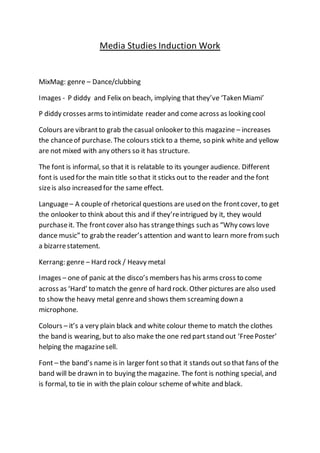
Images - P diddy and Felix on beach, implying that they’ve ‘Taken Miami’
P diddy crosses arms to intimidate reader and come across as looking cool
Colours are vibrantto grab the casual onlooker to this magazine – increases
the chanceof purchase. The colours stick to a theme, so pink white and yellow
are not mixed with any others so it has structure.
The font is informal, so that it is relatable to its younger audience. Different
font is used for the main title so that it sticks out to the reader and the font
sizeis also increased for the same effect.
Language– A couple of rhetorical questions are used on the frontcover, to get
the onlooker to think about this and if they’reintrigued by it, they would
purchaseit. The frontcover also has strangethings such as “Why cows love
dance music” to grab the reader’s attention and wantto learn more fromsuch
a bizarrestatement.
Kerrang: genre – Hard rock / Heavy metal
Images – one of panic at the disco’s members has his arms cross to come
across as ‘Hard’ to match the genre of hard rock. Other pictures are also used
to show the heavy metal genreand shows them screaming down a
microphone.
Colours – it’s a very plain black and white colour theme to match the clothes
the band is wearing, but to also make the one red part stand out ‘FreePoster’
helping the magazinesell.
Font – the band’s name is in larger font so that it stands out so that fans of the
band will be drawn in to buying the magazine. The font is nothing special, and
is formal, to tie in with the plain colour scheme of white and black.
2. Language– this magazinehas not gone for any particular choice of language,
they have justput all the names of the featured bands on the front cover to
again, match the plain theme. Not only does this makeit simple for the reader,
it also draws in readers that may be a fan of a smaller band that made it on the
magazine, but because it was minimalistic, they have seen their band on the
frontpage and want to buy it.