
Recommended
More Related Content
What's hot
What's hot (17)
Viewers also liked
Viewers also liked (15)
Similar to Contents Page Analysis
Similar to Contents Page Analysis (20)
Recently uploaded
Recently uploaded (20)
Contents Page Analysis
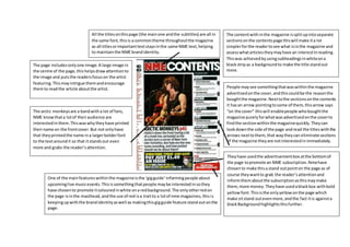
- 1. The contentwith inthe magazine issplitupintoseparate sectionsonthe contentspage thiswill make ita lot simplerforthe readertosee what isinthe magazine and assesswhatarticles theymayhave an interestInreading. Thiswas achievedbyusingsubheadingsinwhiteona blackstripas a backgroundto make the title standout more. People maysee somethingthatwaswithinthe magazine advertisedonthe cover,andthiscouldbe the reasonthe boughtthe magazine.Nexttothe sectionsonthe contents it hasan arrow pointingtosome of them,thisarrow says “on the cover” thiswill enablepeople whoboughtthe magazine purelyforwhatwasadvertisedonthe coverto findthe sectionwithinthe magazinequickly.Theycan lookdownthe side of the page andread the titleswiththe arrows nexttothem,that waytheycan eliminate sections of the magazine theyare notinterestedinimmediately. Theyhave usedthe advertisementbox atthe bottomof the page topromote an NME subscription.Nmehave chosento make thisa stand outpointon the page as of course theywantto grab the reader’sattentionand informthemaboutthe subscriptionasthismaymake them,more money.Theyhave usedablackbox withbold yellowfont.Thisisthe onlyyellowonthe page which make sitstand outevenmore,andthe fact itis againsta blackBackgroundhighlightsthisfurther. One of the mainfeatureswithinthe magazineisthe ‘gigguide’informingpeople about upcominglive musicevents.Thisissomethingthatpeople maybe interestedinsothey have chosento promote itcolouredinwhite ona redbackground.The onlyotherredon the page isinthe masthead,andthe use of red isa traitto a lotof nme magazines,thisis keepingupwiththe brandidentityaswell as makingthisgigguide feature stand outonthe page. All the titlesonthispage (the mainone andthe subtitles) are all in the same font,thisis a commontheme throughoutthe magazine as all titlesorimportanttextstaysinthe same NME text,helping to maintainthe NME brandidentity. The page includesonlyone image.A large image in the centre of the page,thishelpsdrawattentionto the image and putsthe readersfocuson the artist featuring.This mayintrigue themandencourage themto readthe article aboutthe artist. The arctic monkeysare a bandwitha lot of fans, NME knowthata lotof theiraudience are interestedinthem.Thiswaswhytheyhave printed theirname on the frontcover.But not onlyhave that theyprintedthe name ina largerbolderfont to the textaroundit so that itstandsout even more and grabs the reader’sattention.
- 2. Thisis a contentspage froman issue of Q magazine.Itisslightlydifferenttothe contentspagesproducedbyNME so analysingitwill give me abitof variety.The contentspage fitsthe typical conventions of a Q magazine,redisalwaysthe dominantcolourwithinthese magazines and there isno change withthispage.The bannerat the top is colouredred,the titles downthe side andunderlinesinred,and the t-shirtof the artistwhois a memberof the Foo Fightersisalsored.Keepingthe everpresenttheme of redhelpsfitQ’s brand identity. Thisissue of Q was a specificrelease focusingonthe Foo Fighters,the fontcover containedanimage of the leadsingerand there isa large sectionof the magazine dedicatedtothem. Thistheme is maintainedonthe contentspage aswell, the leadsingeristhe mainfocusof the age and a large image of himis arrangedinthe middle of the page withtexttothe side of him. Asa readeropensthe magazine this image will catchtheireye straightaway, therefore remindingthemthe foofighters feature withinthe magazine,thiscould encourage the readertoread the article. An image of the magazinesfrontcoverat the top of the contentspage justto drawfurther emphasisonthe fact thatthis particularmagazine has a focuson the Foo FightersDownthe side of the page isa listof featuring articles,includingthe page numberinwhich they are on anda little descriptionunderneath.Thislist issplitup bythickboldred linesthatrunbetween each topicbetweenthe listedfeatures.Thisdoes twothings,itmakesit a loteasierforthe reader to readthe listasit is all splitupand clearer.It alsohelpsmaintainthe Qbrand identityasitis anotherpointinwhichthe colourred isfeatured on thispage. Picturesof variousotherartists/bandsalso feature onthe page,suggestingthatthere is diversitywithinthe magazineregardingthe bands the bands/artiststheyfocuson. Howeverthisone mainlyfocusedonthe footfighter,bythere is otheroptionsof topicsto readif someone may not be interestedinthe foofighters,thisisall evidentonthispage.