1. Font choices for the magazine front cover
STVI MONTHLY
STVI MONTHLY
STVI MONTHLY
STVI MONTHLY
STVI MONTHLY
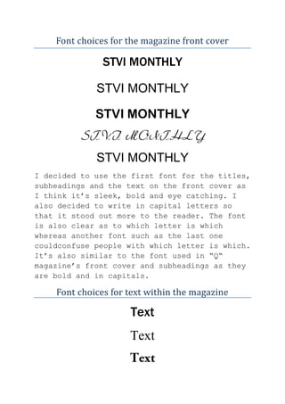
I decided to use the first font for the titles,
subheadings and the text on the front cover as
I think it’s sleek, bold and eye catching. I
also decided to write in capital letters so
that it stood out more to the reader. The font
is also clear as to which letter is which
whereas another font such as the last one
couldconfuse people with which letter is which.
It’s also similar to the font used in “Q“
magazine’s front cover and subheadings as they
are bold and in capitals.
Font choices for text within the magazine
Text
Text
2. I chose to use the first set of text which is
the font that I chose for the titles and other
things in my magazine for my article. I will
simply use the first font on the first section
yet in lower case as opposed to using upper
case as I will do for the front cover, sub
headings and titles.
Font choices for double page spread for
“RAYNE”
RAYNE
Rayne
Rayne
I decided that I would use a different font for Raynes name to
make it look like she has hand written her name to give it
more of a personal feel to it. Also I decided to do my font
for the rest of the title in the rest of the fonts that are
being used for the rest of the magazine.