1. These are the colours I am thinking of using on my magazine. I got my
ideas from the rocksound magazine cover. They produce basic, white
covers with simple, sans serif text, which makes the cover look more
modern which would attract many readers. I am thinking of making a
Initial
Ideas
cover with a white background with either red or blue text.
Colour scheme
Body text
Sample
Sample
Sample
Sample
Sample
These are the fonts I am thinking of using
for my magazine body text. I like these
texts because they are simple and will
look good in an article. The fonts showed
on the left are Calibri, Helvetica Neue
thin, Lantinghei, PT Sans and Trebuchet.
These particular fonts will also make the
text easier for the reader to read, as they
are clear and not too thin.
Camera shots
Headline/Masthead text
Sample
Sample
SAMPLE
SAMPLE
Sampl
These are the fonts I am thinking of using
for my magazine masthead and
headlines. I will be using many different
fonts on the cover of my magazine for
the cover line and other headlines.
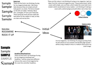
For my magazine, I am thinking of using group long shots
for the photos on my contents and double page spread. I
will be using a medium shot or a medium close up for my
cover image.
Name ideas
ROCKMINE
ROCK IT UP