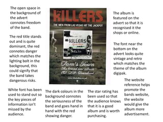
1. The album is
featured on the
advert so that it is
recognised it the
shops or online.
The font near the
bottom on the
advert looks quite
vintage and retro
which matches the
theme of the album
digipak.
The open space in
the background of
the advert
connotes freedom
of the band.
The red title stands
out and is quite
dominant, the red
connotes danger
which matches the
lighting bolt in the
background, this
could signify that
the band takes
dangerous risks.
The star rating has
been used so that
the audience knows
that it is a good
album and is worth
purchasing.
The dark colours in the
background connotes
the seriousness of the
band and goes hand in
hand with the red
showing danger.
White font has been
used to stand out so
the key pieces of
information isn’t
missed by the
audience.
The website
reference helps
promote the
bands website,
the website
would give the
album more
advertisement.