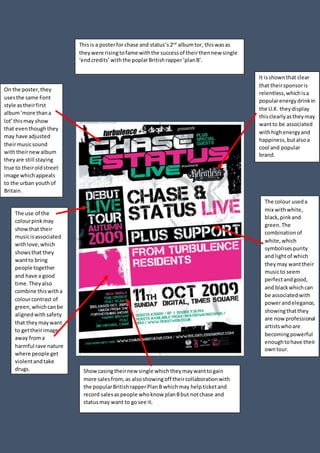
1. Thisis a posterfor chase and status’s2nd
albumtor, thiswasas
theywere risingtofame withthe successof theirthennew single
‘endcredits’withthe poplarBritishrapper‘planB’.
On the poster,they
usesthe same Font
style astheirfirst
album‘more thana
lot’thismay show
that eventhoughthey
may have adjusted
theirmusicsound
withtheirnewalbum
theyare still staying
true to theiroldstreet
image whichappeals
to the urban youthof
Britain.
The colour useda
mix withwhite,
black,pinkand
green.The
combinationof
white,which
symbolisespurity
and lightof which
theymay wanttheir
musicto seem
perfectandgood,
and blackwhichcan
be associatedwith
powerandelegance,
showingthatthey
are nowprofessional
artistswhoare
becomingpowerful
enoughtohave their
owntour.
The use of the
colourpinkmay
showthat their
musicisassociated
withlove,which
showsthat they
wantto bring
people together
and have a good
time.Theyalso
combine thiswitha
colourcontrast of
green,whichcanbe
alignedwith safety
that theymaywant
to gettheirimage
away froma
harmful rave nature
where people get
violentandtake
drugs. Showcasingtheirnew single whichtheymaywanttogain
more salesfrom,as alsoshowingoff theircollaborationwith
the popularBritishrapperPlanB whichmay helpticketand
record salesaspeople whoknow planBbut notchase and
statusmay want to gosee it.
It isshownthat clear
that theirsponsoris
relentless,whichisa
popularenergydrinkin
the U.K. theydisplay
thisclearlyastheymay
wantto be associated
withhighenergyand
happiness,butalsoa
cool and popular
brand.