
Recommended
More Related Content
What's hot
What's hot (20)
Similar to Institution Names
Similar to Institution Names (20)
More from MaiaHeffernan
More from MaiaHeffernan (20)
Recently uploaded
Recently uploaded (20)
Institution Names
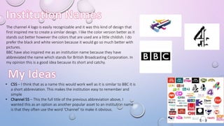
- 1. The channel 4 logo is easily recognizable and it was this kind of design that first inspired me to create a similar design. I like the color version better as it stands out better however the colors that are used are a little childish. I do prefer the black and white version because it would go so much better with pictures. BBC have also inspired me as an institution name because they have abbreviated the name which stands for British Broadcasting Corporation. In my opinion this is a good idea because its short and catchy. • C5S – I think that as a name this would work well as it is similar to BBC it is a short abbreviation. This makes the institution easy to remember and simple • Channel 5S – This the full title of the previous abbreviation above, I wanted this as an option as another popular asset to an institution name is that they often use the word ‘Channel’ to make it obvious.
- 2. This is my first design that I have made by using Photoshop. I have followed the codes and conventions that were used in the ‘Educating Essex’ and made it similar to the logo I have made. I think this design is very effective because they are simple and the color combination works as the colored background makes the writing more bold and it makes it evident on what the show is called. The companies logo Channel 5S was inspired by Channel 4 logo, while the original is in black and white, I stuck with the previous design of the ‘Educating Coventry’ as I thought it would blend in nicely with the first design and give it the same effect in terms of standing out. I did follow the codes and conventions of the actual logo except I included the ‘S’ which stood for ‘Show’, this I believed made it simple and recognizable.