Download to read offline

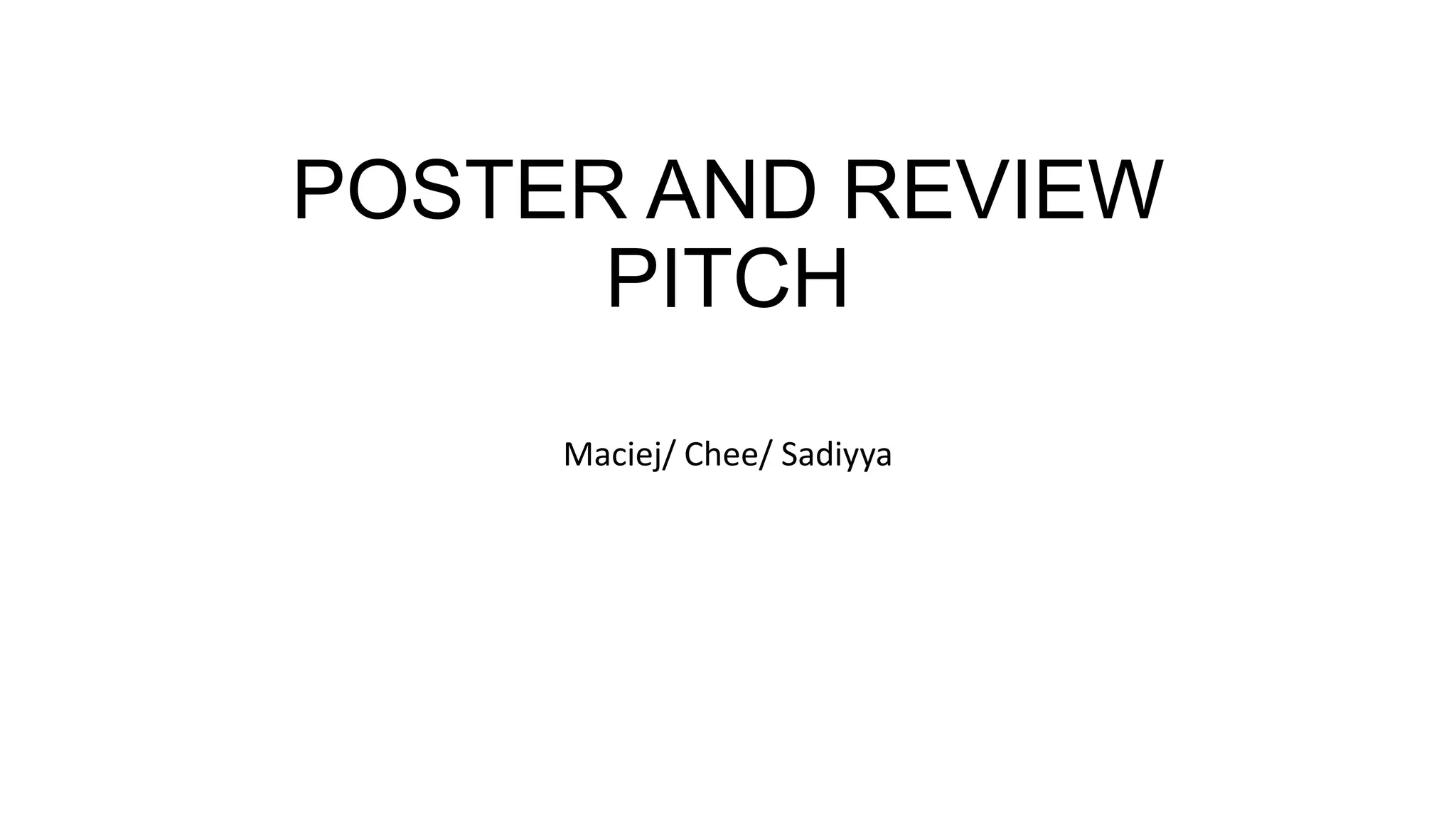
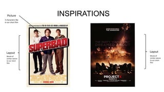
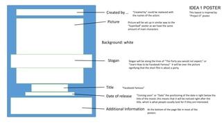
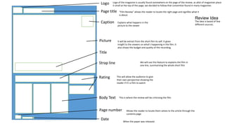

This document discusses ideas for a movie poster and film review for a short film called "Facebook Famous." Two poster design ideas are presented that draw inspiration from movies with similar plots like "Project X" and "Superbad." The first idea includes elements like the film title, slogan, date, and cast photos. The second removes the "Created By" text to make the poster feel more professional. The film review layout idea is also discussed. It would include elements like the magazine logo, a picture from the film, the title/strapline, a rating, and body text criticizing the film. Feedback is requested on which poster and review ideas and elements work best.


