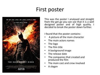
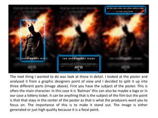
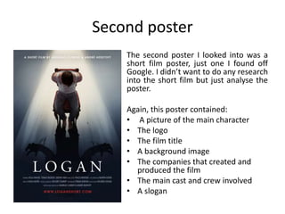
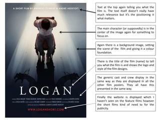
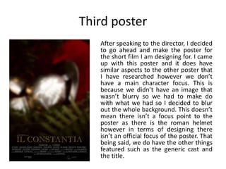
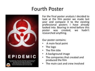
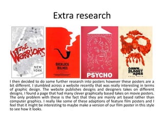
The document discusses the author's research into film posters for both a professional feature film and a student short film project. The author analyzed several posters, including "The Dark Knight Rises", identifying common elements like the main character, film title, and production company credits. Most posters followed guidelines having the character in the center, background image, and text placements. The author then designed a poster for their student short film, applying what they learned. They created a template summarizing typical poster elements and concluded posters should look professional while adhering to these conventions.
Unleash Your Inner Demon with the "Let's Summon Demons" T-Shirt. Calling all fans of dark humor and edgy fashion! The "Let's Summon Demons" t-shirt is a unique way to express yourself and turn heads.
https://dribbble.com/shots/24253051-Let-s-Summon-Demons-Shirt
Book Formatting: Quality Control Checks for DesignersConfidence Ago
This presentation was made to help designers who work in publishing houses or format books for printing ensure quality.
Quality control is vital to every industry. This is why every department in a company need create a method they use in ensuring quality. This, perhaps, will not only improve the quality of products and bring errors to the barest minimum, but take it to a near perfect finish.
It is beyond a moot point that a good book will somewhat be judged by its cover, but the content of the book remains king. No matter how beautiful the cover, if the quality of writing or presentation is off, that will be a reason for readers not to come back to the book or recommend it.
So, this presentation points designers to some important things that may be missed by an editor that they could eventually discover and call the attention of the editor.
You could be a professional graphic designer and still make mistakes. There is always the possibility of human error. On the other hand if you’re not a designer, the chances of making some common graphic design mistakes are even higher. Because you don’t know what you don’t know. That’s where this blog comes in. To make your job easier and help you create better designs, we have put together a list of common graphic design mistakes that you need to avoid.
Can AI do good? at 'offtheCanvas' India HCI preludeAlan Dix
Invited talk at 'offtheCanvas' IndiaHCI prelude, 29th June 2024.
https://www.alandix.com/academic/talks/offtheCanvas-IndiaHCI2024/
The world is being changed fundamentally by AI and we are constantly faced with newspaper headlines about its harmful effects. However, there is also the potential to both ameliorate theses harms and use the new abilities of AI to transform society for the good. Can you make the difference?
White wonder, Work developed by Eva TschoppMansi Shah
White Wonder by Eva Tschopp
A tale about our culture around the use of fertilizers and pesticides visiting small farms around Ahmedabad in Matar and Shilaj.
Transforming Brand Perception and Boosting Profitabilityaaryangarg12
In today's digital era, the dynamics of brand perception, consumer behavior, and profitability have been profoundly reshaped by the synergy of branding, social media, and website design. This research paper investigates the transformative power of these elements in influencing how individuals perceive brands and products and how this transformation can be harnessed to drive sales and profitability for businesses.
Through an exploration of brand psychology and consumer behavior, this study sheds light on the intricate ways in which effective branding strategies, strategic social media engagement, and user-centric website design contribute to altering consumers' perceptions. We delve into the principles that underlie successful brand transformations, examining how visual identity, messaging, and storytelling can captivate and resonate with target audiences.
Methodologically, this research employs a comprehensive approach, combining qualitative and quantitative analyses. Real-world case studies illustrate the impact of branding, social media campaigns, and website redesigns on consumer perception, sales figures, and profitability. We assess the various metrics, including brand awareness, customer engagement, conversion rates, and revenue growth, to measure the effectiveness of these strategies.
The results underscore the pivotal role of cohesive branding, social media influence, and website usability in shaping positive brand perceptions, influencing consumer decisions, and ultimately bolstering sales and profitability. This paper provides actionable insights and strategic recommendations for businesses seeking to leverage branding, social media, and website design as potent tools to enhance their market position and financial success.
Dive into the innovative world of smart garages with our insightful presentation, "Exploring the Future of Smart Garages." This comprehensive guide covers the latest advancements in garage technology, including automated systems, smart security features, energy efficiency solutions, and seamless integration with smart home ecosystems. Learn how these technologies are transforming traditional garages into high-tech, efficient spaces that enhance convenience, safety, and sustainability.
Ideal for homeowners, tech enthusiasts, and industry professionals, this presentation provides valuable insights into the trends, benefits, and future developments in smart garage technology. Stay ahead of the curve with our expert analysis and practical tips on implementing smart garage solutions.
2. Initial thoughts.
Researching film posters was an exiting topic for me
due to the fact at this very moment I am in the
process of designing a poster for a professional film
so not only did I have to research posters and see
generic conventions for our media project but also I
had to do it for the professional feature film I am
designing for. Firstly I looked into a professional
feature film poster to see what that looks like. I had
a choice of a few different high quality successful
films but I chose a specific poster that I loved the
design of which was "The Dark Knight Rises". This
was the first poster that I analyzed.
3. First poster
This was the poster I analysed and straight
from the get go you can see that it is a well
designed poster and of high quality. I
decided to break the poster down further.
I found that the poster contains:
• A picture of the main character
• The main actors names
• The logo
• The film title
• A background image
• The release date
• The companies that created and
produced the film
• The main cast and crew involved
• A slogan
4. The next thing I wanted to do was look at these in detail. I looked at the poster and
analysed it from a graphic designers point of view and I decided to split it up into
three different parts (image above). First you have the subject of the poster. This is
often the main character. In this case it is 'Batman' this can also be maybe a logo or in
our case a lottery ticket. It can be anything that is the subject of the film but the point
is that that stays in the center of the poster as that is what the producers want you to
focus on. The importance of this is to make it stand out. The image is either
generated or just high quality because it is a focal point.
5. First poster thoughts.
I found that this professional poster followed a certain set
of guidelines and that everything is set out in a specific
order with the:
• Background
• Main character/subject
• Logo/film name
• Slogan/actors
I decided that I wanted to see if any other film posters
followed these similar guidelines. I wanted to look into
the different types of films including short films and low
budget films.
6. Second poster
The second poster I looked into was a
short film poster, just one I found off
Google. I didn’t want to do any research
into the short film but just analyse the
poster.
Again, this poster contained:
• A picture of the main character
• The logo
• The film title
• A background image
• The companies that created and
produced the film
• The main cast and crew involved
• A slogan
7. Text at the top again telling you what the
film is. The text itself doesn’t really have
much relevance but it’s the positioning it
what matters.
The main character (or supposedly) is in the
center of the image again for something to
focus on.
Again there is a background image, setting
the scene of the film and giving it a colour
foundation.
There is the title of the film (name) to tell
you what the film is and shows the logo and
style of the film designs.
The generic cast and crew display in the
same way as they are displayed In all the
other film posters. They all have this
presented in the same way.
Finally the website is displayed which I
haven’t seen on the feature films however
the short films kind of need to for the
publicity.
8. Third poster
After speaking to the director, I decided
to go ahead and make the poster for
the short film I am designing for. I came
up with this poster and it does have
similar aspects to the other poster that
I have researched however we don’t
have a main character focus. This is
because we didn’t have an image that
wasn’t blurry so we had to make do
with what we had so I decided to blur
out the whole background. This doesn’t
mean there isn’t a focus point to the
poster as there is the roman helmet
however in terms of designing there
isn’t an official focus of the poster. That
being said, we do have the other things
featured such as the generic cast and
the title.
9. Fourth Poster
For the final poster analysis I decided to
look at the film poster we made last
year and compare it to the existing
professional posters I have already
looked into. Bearing in mind before this
poster was created, we hadn’t
researched anything.
Our poster contains:
• A main focal point
• The logo
• The film title
• A background image
• The companies that created and
produced the film
• The main cast and crew involved
10. Post-research thoughts
After a lot of research I have come to
the conclusion that most film posters
have similar rules and guidelines to
follow. I have developed a diagram
which I feel that is a template for all
film posters to follow. This diagram is
based on my research into film posters.
Each poster should have some quote on
the top or slogan of some kind and then
has a main focus point in the center of
the poster, the title of the film and the
cast and crew involved in the film. All
this should be set out in the similar way
and must look professional. Personally I
think that in our film poster we should
abide by these rules and follow the
rules of posters and the diagram I have
created.
11. Extra research
I then decided to do some further research into posters however these posters are a
bit different. I stumbled across a website recently that was really interesting in terms
of graphic design. The website publishes designs and designers takes on different
designs. I found a page that had many clever graphically based takes on movie posters.
The only problem with these is the fact that they are mainly art based rather than
computer graphics. I really like some of these adaptions of feature film posters and I
feel that it might be interesting to maybe make a version of our film poster in this style
to see how it looks.