- The document discusses how ancillary texts like a digipak and magazine advert are used to promote an artist's music and attract fans and a wider audience.
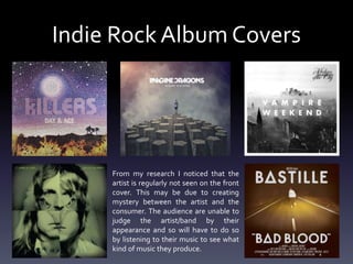
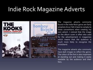
- Research showed that indie rock album covers often do not feature the artist, creating mystery. Magazine ads in the genre are typically simplistic with dark images reflecting the music.
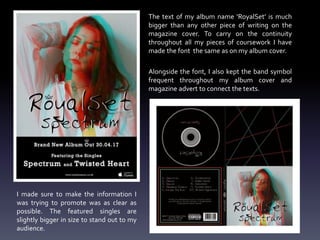
- The author aimed to clearly promote information like single songs while maintaining continuity with the album art through consistent fonts and symbols.
- While the ancillary texts followed conventions, their themes did not fully link to the expressed emotions in the main music video product.