
Recommended
More Related Content
What's hot
Viewers also liked
Similar to My Digipak Plan
Similar to My Digipak Plan (20)
Recently uploaded
Recently uploaded (20)
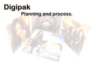
My Digipak Plan
- 2. Template This template shows my two disc, six page digipak. The reason I have decided to use this template is because there are clear established outlines that are easy to follow, professional looking and allows me enough room to fit two discs on. I got this template from; http://www.discwizards.com/cd-dvdartwork-templates.htm.
- 3. Examples: What I like and dislike in these digipaks? Like Dislike I like how the bottom image of the hands not only continues across the bottom of the digipak but also goes onto the CD, this creates great continuity and pulls all the pieces together. I’m not a fan of the left and right sections (pink curtains) as I do think this is quite boring however I do understand that this is to re-enforce the idea that the whole digipak is meant to be one stage.
- 4. Examples: What I like and dislike in these digipaks? Like Again the continuity throughout all of the inside pictures draw the whole album together and create a clearer image. I also like how the artist is featured on the covers but not on the CD. Dislike I don’t think the album cover is particularly exciting as it is just a close up of the artists face and nothing else. However the colours used do continue into all of the images showing continuity.
- 5. Examples: What I like and dislike in these digipaks? Like I really like how Katy Perry has linked her digipak directly to her music video this introduces continuity in a completely new way. I really like how interesting the disk designs are. Dislike I think the image attached (above case) stands out as it is completely different, therefore I will not include this feature in my music video.
- 6. Back Cover
- 7. Images That I like… Why? What ideas will I take from this?
- 8. Some Digipak back cover ideas for images…
- 9. Practice Designs (created on PowerPoint)
- 10. The 1975 The 1975 The City M.O.N.E.Y Chocolate Talk! An Encounter Heart Out Settle Down Robbers Girls 12 She Way Out
- 11. The 1975 1. The 1975 2. The City 3. M.O.N.E.Y 4. Chocolate 5. Talk! 6. An Encounter 7. Heart Out 8. Settle Down 9. Robbers 10.Girls 11.12 12.She Way Out
- 12. The 1975 1. The 1975 2. The City 3. M.O.N.E.Y 4. Chocolate 5. Talk! 6. An Encounter 7. Heart Out 8. Settle Down 9. Robbers 10.Girls 11.12 12.She Way Out
- 13. The 1975 1. The 1975 2. The City 3. M.O.N.E.Y 4. Chocolate 5. Talk! 6. An Encounter 7. Heart Out 8. Settle Down 9. Robbers 10.Girls 11.12 12.She Way Out
- 14. The 1975 1. The 1975 2. The City 3. M.O.N.E.Y 4. Chocolate 5. Talk! 6. An Encounter 7. Heart Out 8. Settle Down 9. Robbers 10.Girls 11.12 12.She Way Out
- 15. The 1975 1. The 1975 2. The City 3. M.O.N.E.Y 4. Chocolate 5. Talk! 6. An Encounter 7. Heart Out 8. Settle Down 9. Robbers 10.Girls 11.12 12.She Way Out
- 16. To create my digipak, I had to use all original images, but after realising that this image… …would be too hard to re-create I have decided to change my plan. (see next image…)
- 17. This is my idea… This is my trial for the image I will create with Ellie. The soft lighting and the cute lollypop is exactly the look I will use. The extreme close up will contrast with the middle ‘split image’ of a long shot. 2014 Finlay Records Burbank, CA 92370 Unauthorized duplication and use prohibited. D000683 960 624 Visit: finlayrecords.com
- 18. This is the new plan…
- 19. Inside Left
- 21. The Split Image Design… As you can see I have used a continued image for two of my sections so that when it is folded out you see just Betty Grable's face and when it is joined you see the whole body. This is not a technique I have created, in fact it is quite common for common digipaks. The example below is of Rhianna's digipak and how the image continues from one section to another.