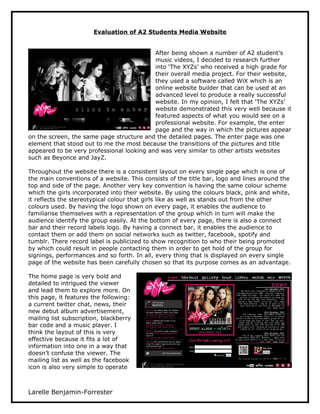
1. Evaluation of A2 Students Media Website
After being shown a number of A2 student’s
music videos, I decided to research further
into ‘The XYZs’ who received a high grade for
their overall media project. For their website,
they used a software called WiX which is an
online website builder that can be used at an
advanced level to produce a really successful
website. In my opinion, I felt that ‘The XYZs’
website demonstrated this very well because it
featured aspects of what you would see on a
professional website. For example, the enter
page and the way in which the pictures appear
on the screen, the same page structure and the detailed pages. The enter page was one
element that stood out to me the most because the transitions of the pictures and title
appeared to be very professional looking and was very similar to other artists websites
such as Beyonce and JayZ.
Throughout the website there is a consistent layout on every single page which is one of
the main conventions of a website. This consists of the title bar, logo and lines around the
top and side of the page. Another very key convention is having the same colour scheme
which the girls incorporated into their website. By using the colours black, pink and white,
it reflects the stereotypical colour that girls like as well as stands out from the other
colours used. By having the logo shown on every page, it enables the audience to
familiarise themselves with a representation of the group which in turn will make the
audience identify the group easily. At the bottom of every page, there is also a connect
bar and their record labels logo. By having a connect bar, it enables the audience to
contact them or add them on social networks such as twitter, facebook, spotify and
tumblr. There record label is publicized to show recognition to who their being promoted
by which could result in people contacting them in order to get hold of the group for
signings, performances and so forth. In all, every thing that is displayed on every single
page of the website has been carefully chosen so that its purpose comes as an advantage.
The home page is very bold and
detailed to intrigued the viewer
and lead them to explore more. On
this page, it features the following:
a current twitter chat, news, their
new debut album advertisement,
mailing list subscription, blackberry
bar code and a music player. I
think the layout of this is very
effective because it fits a lot of
information into one in a way that
doesn’t confuse the viewer. The
mailing list as well as the facebook
icon is also very simple to operate
Larelle Benjamin-Forrester
2. which results in more publicity. One aspect to this page that I like the most is the news
section that has a scroll bar. This is very effective because it reduces the size of the page
as a whole and allows the focus to be in one place. It also makes the navigation of the
website much simpler to use.
The ‘Band Page’ gives the audience
information a small and concise bio
of each of the artists which is
significant as it satisfies the viewer
– in relation to the use and
gratification theory. This page also
features, each of the girls twitters
so that the viewer can connect with
them individually rather than as a
group. I think this is really good
because it appeals to people who
may have a favourite person in the
group.
The Gallery page consists of a number of
pictures of the group that pops out at you
when you click on it so that you can get a
better view. The wallpaper downloads link
is very significant because this
advertisement links in with the page very
well and is likely to attract viewers who
really like these pictures and wish to
download it.
Another concise page used on this website is
the ‘Tour page’ because it appears in a simple
and clear way that reduces confusion of the
viewer and benefits those who want to find out
information quickly.
The ‘Listen Page’ enables the audience to carry out
more than one acting at once which consists of
singing along to the song whilst watching the
video. On the viewers behalf, I think this is very
effectual and something that majority of viewers
will like.
Larelle Benjamin-Forrester
3. I think the ‘watch page’ is also very
simple and straight forward.
However, I think this comes as a
downfall to the website because it’s
very basic and doesn’t follow the
consistent detailed pages whereby
effort and careful consideration has
been showcased.
The ‘Win page’ is one highlight to
the website because it is a form of
interaction with the viewer and the
artist in the sense that the artist is
giving them the opportunity to
have a free product of theirs. Much
like majority of the pages used on
this website, there is clear and
detailed information shown
throughout the page to make it
easier for the viewer.
I really like the ‘Merchandise
page’ because it shows that there
has been a lot of time and effort
put into creating the logos and
pictures on the clothing. It also
reflects their creativity. Lastly,
this page is significant because it
gives viewers an opportunity to
wear clothing and accessories by
their favourite band.
To conclude, I think that this
website is really good because it’s
a clear reflection of an existing
artist’s website. I also like the creativity that has been put into the website, in particular
the logo and the layout of every page. I think this website will influence me to put forward
ideas from this website to my group as well as take on the role of creating a website
because of the many things you can put into it.
Larelle Benjamin-Forrester
4. I think the ‘watch page’ is also very
simple and straight forward.
However, I think this comes as a
downfall to the website because it’s
very basic and doesn’t follow the
consistent detailed pages whereby
effort and careful consideration has
been showcased.
The ‘Win page’ is one highlight to
the website because it is a form of
interaction with the viewer and the
artist in the sense that the artist is
giving them the opportunity to
have a free product of theirs. Much
like majority of the pages used on
this website, there is clear and
detailed information shown
throughout the page to make it
easier for the viewer.
I really like the ‘Merchandise
page’ because it shows that there
has been a lot of time and effort
put into creating the logos and
pictures on the clothing. It also
reflects their creativity. Lastly,
this page is significant because it
gives viewers an opportunity to
wear clothing and accessories by
their favourite band.
To conclude, I think that this
website is really good because it’s
a clear reflection of an existing
artist’s website. I also like the creativity that has been put into the website, in particular
the logo and the layout of every page. I think this website will influence me to put forward
ideas from this website to my group as well as take on the role of creating a website
because of the many things you can put into it.
Larelle Benjamin-Forrester
5. I think the ‘watch page’ is also very
simple and straight forward.
However, I think this comes as a
downfall to the website because it’s
very basic and doesn’t follow the
consistent detailed pages whereby
effort and careful consideration has
been showcased.
The ‘Win page’ is one highlight to
the website because it is a form of
interaction with the viewer and the
artist in the sense that the artist is
giving them the opportunity to
have a free product of theirs. Much
like majority of the pages used on
this website, there is clear and
detailed information shown
throughout the page to make it
easier for the viewer.
I really like the ‘Merchandise
page’ because it shows that there
has been a lot of time and effort
put into creating the logos and
pictures on the clothing. It also
reflects their creativity. Lastly,
this page is significant because it
gives viewers an opportunity to
wear clothing and accessories by
their favourite band.
To conclude, I think that this
website is really good because it’s
a clear reflection of an existing
artist’s website. I also like the creativity that has been put into the website, in particular
the logo and the layout of every page. I think this website will influence me to put forward
ideas from this website to my group as well as take on the role of creating a website
because of the many things you can put into it.
Larelle Benjamin-Forrester
6. I think the ‘watch page’ is also very
simple and straight forward.
However, I think this comes as a
downfall to the website because it’s
very basic and doesn’t follow the
consistent detailed pages whereby
effort and careful consideration has
been showcased.
The ‘Win page’ is one highlight to
the website because it is a form of
interaction with the viewer and the
artist in the sense that the artist is
giving them the opportunity to
have a free product of theirs. Much
like majority of the pages used on
this website, there is clear and
detailed information shown
throughout the page to make it
easier for the viewer.
I really like the ‘Merchandise
page’ because it shows that there
has been a lot of time and effort
put into creating the logos and
pictures on the clothing. It also
reflects their creativity. Lastly,
this page is significant because it
gives viewers an opportunity to
wear clothing and accessories by
their favourite band.
To conclude, I think that this
website is really good because it’s
a clear reflection of an existing
artist’s website. I also like the creativity that has been put into the website, in particular
the logo and the layout of every page. I think this website will influence me to put forward
ideas from this website to my group as well as take on the role of creating a website
because of the many things you can put into it.
Larelle Benjamin-Forrester