.net technique makeover


            m
            makeover
        www.igapyear.com
         The team behind this gap year information site were scratching their heads over how
         to present it better. We asked Focca, from top Brazilian agency Grïngo, for advice

                                                                    each category. Travellers are always interested in      visitors to make their own customised homepage
          The brief
                                                                    maps, and I imagined they would love a visual           with the information that would be most valuable
             Site www.igapyear.com                                  representation of the kind of things you could get      to them. Even cooler would be to use Facebook
             Site owner Mick Briggs                                 up to in far away, exotic places.                       Connect, which would quickly search and
             Brief Mick is happy with the technology                   The structure of the site, as I found it, was        understand the content on their profiles and then
            behind it but unhappy with the look, feel and           somewhat confusing. The top-level navigation            suggest itineraries. But that seemed potentially
            structure of the site.                                  mixed types of trip (such as paid work or               a little bit too advanced and intense for the site’s
                                                                    volunteering) with secondary information                next iteration.
                                                                    (including ideas and resources). The area below             The site is built in HTML, and I think this is the
                                                                    the fold is also a little too messy. There’s a myriad   correct choice, as it will display reasonably well
                                                                    of content structures that confuse the user.            on mobile devices. Not that too many people
                                                                    Advertising, in the form of small visuals and larger    will be planning their year abroad from a mobile
                                                                    blocks of text, is mixed in with a Q&A and incentive    phone, but I’m all for compatibility. However, I
                                                                    texts. I felt I should focus the main content on        would choose to use Flash in specific areas, such
                                                                    what people would really be looking for.                as the homepage map, because it gives me more
                                                                                                                            freedom in how to navigate through interesting
                                                                    Search functionality                                    information and call it up more quickly. You could
                                                                    The search function wasn’t working particularly         use beautiful transitions and sound effects to help
                                                                    well either. There were too many options through        build people’s excitement about what’s to come. I’d
                                                                    which to filter the information, and if you indulged    therefore make the world map a cool centrepiece
                                                                    in searching, chances are you’d end up at a page        on the homepage.
                              The designer                          with no results.                                            To finalise the redesign, I took the liberty of
                              Name Focca                                The way to resolve that, I reasoned, was to add     changing the logo. I think we can do away with
                              Company Grïngo                        more content, group information in larger chunks,       the ‘.com’, right? In the spirit of maintaining the
                              URL www.gringo.nu
                              Areas of expertise
                              Interactive advertising,
                              art direction
                                                                     “Content has to be clearly organised
                                                                     and categorised, making it easy for
                    I was very excited by the idea of working
                    on iGapYear’s site, because I’ve been            users to browse through quickly”                                                       Focca
                    thinking of taking a sabbatical year
         myself sometime soon. So I dug right in, and               or, when arriving at a page with no results,            heritage, I’ve kept some of its distinctive elements,
         after some initial fiddling, it quickly became clear       offer the most feasible option right away, so           such as the stroked typography.
         what wasn’t working.                                       that the user has something to hold on to.                 I really liked the content there was on this site,
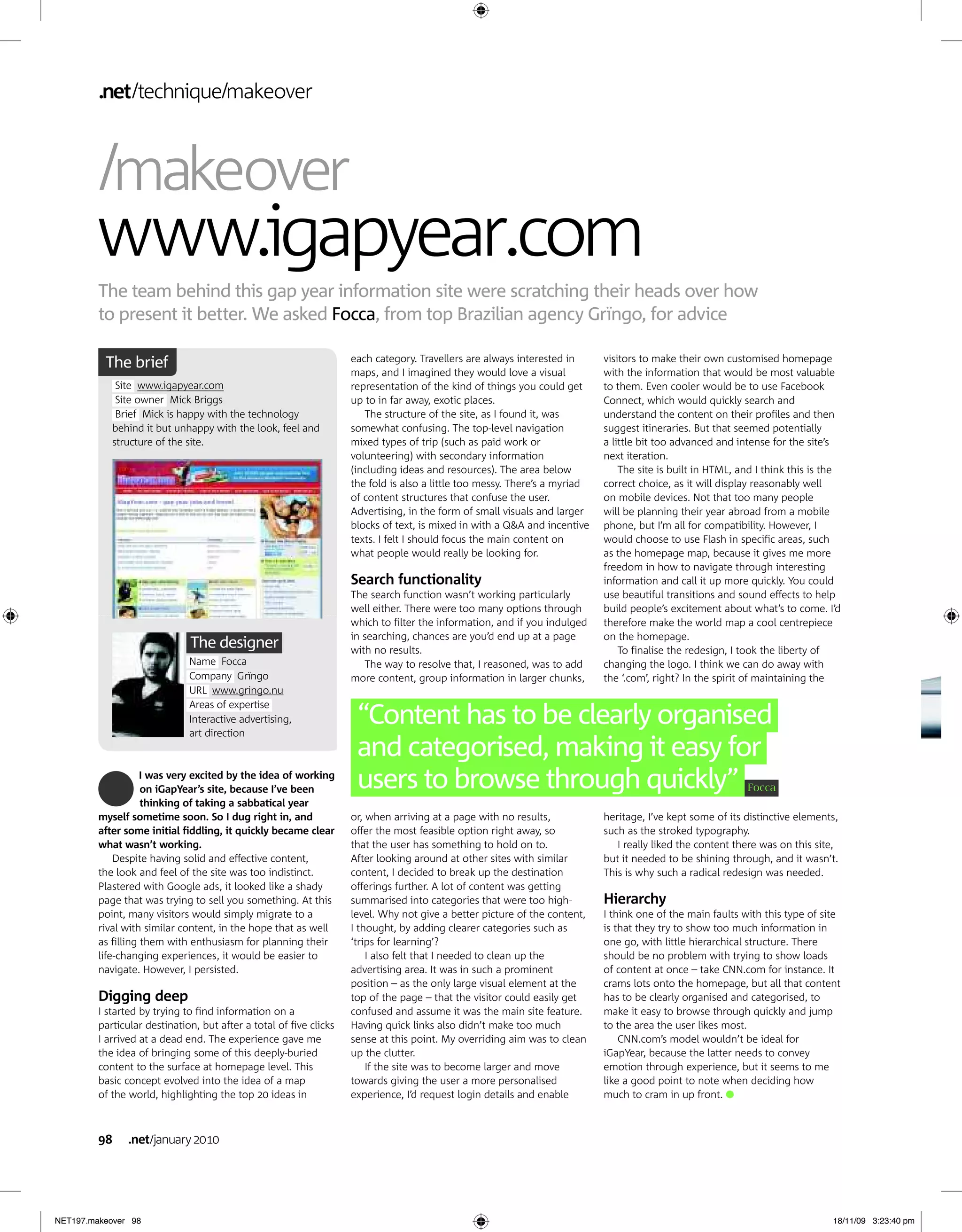
             Despite having solid and effective content,            After looking around at other sites with similar        but it needed to be shining through, and it wasn’t.
         the look and feel of the site was too indistinct.          content, I decided to break up the destination          This is why such a radical redesign was needed.
         Plastered with Google ads, it looked like a shady          offerings further. A lot of content was getting
         page that was trying to sell you something. At this        summarised into categories that were too high-          Hierarchy
         point, many visitors would simply migrate to a             level. Why not give a better picture of the content,    I think one of the main faults with this type of site
         rival with similar content, in the hope that as well       I thought, by adding clearer categories such as         is that they try to show too much information in
         as filling them with enthusiasm for planning their         ‘trips for learning’?                                   one go, with little hierarchical structure. There
         life-changing experiences, it would be easier to               I also felt that I needed to clean up the           should be no problem with trying to show loads
         navigate. However, I persisted.                            advertising area. It was in such a prominent            of content at once – take CNN.com for instance. It
                                                                    position – as the only large visual element at the      crams lots onto the homepage, but all that content
         Digging deep                                               top of the page – that the visitor could easily get     has to be clearly organised and categorised, to
         I started by trying to find information on a               confused and assume it was the main site feature.       make it easy to browse through quickly and jump
         particular destination, but after a total of five clicks   Having quick links also didn’t make too much            to the area the user likes most.
         I arrived at a dead end. The experience gave me            sense at this point. My overriding aim was to clean         CNN.com’s model wouldn’t be ideal for
         the idea of bringing some of this deeply-buried            up the clutter.                                         iGapYear, because the latter needs to convey
         content to the surface at homepage level. This                 If the site was to become larger and move           emotion through experience, but it seems to me
         basic concept evolved into the idea of a map               towards giving the user a more personalised             like a good point to note when deciding how
         of the world, highlighting the top 20 ideas in             experience, I’d request login details and enable        much to cram in up front.


         98     .net january 2010


NET197.makeover 98                                                                                                                                                              18/11/09 3:23:40 pm
.net technique makeover


                                                                                                                                                                                   5
                                                        1
                                                                                                           2

                                                                                                                                                                       3


                     4


                                                                                                                                                                                  Pimp my site!
                                                                                                                                                                                  Does your site lack lustre?
                                                                                                                                                                                  Could it benefit from a few
                                                                                                                                                                                  tweaks? To get an expert
                                                                                                                                                                                  opinion, email your URL to
                                                                                                                                                                                  netmag@futurenet.com


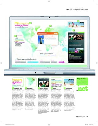
              1   Look and feel              2   Map area                   3   Who’s abroad                    4   Menu                       5   Advertising
             All is new. The site now       To me there’s no better        I would be more likely to           There’s no specific reason     There are many
             radiates bright colours, new   way to showcase exciting       give the site a go if I could       why the menu is on the         opportunities for
             typography, some delicate      trips to a traveller than      touch upon testimonials             left-hand side, but I think    advertising on the site. I’d
             illustration and images of     by pointing them out on        from travellers who are             it works better for the        prefer to place relevant
             real people spending their     a map. I wanted to bring       currently abroad. Reading           composition. Checking out      ads alongside content on
             real year abroad. To me it’s   some of the content about      about their experiences             the content, I’ve expanded     the homepage and other
             got the feeling of starting    popular destinations to        as they lived them would            it into an extra grouping:     pages. However, I imagine
             anew. I think this may be a    the surface, so I’ve created   give me an extra push               learn. So now we have          that a prominent ad display
             Brazilian thing – we dress     a few simple Top 20 lists.     to investigate further              four categories to choose      above the fold would be of
             fully in white to celebrate    Clicking on a highlight        and get excited. You can            from: volunteering, travel     use, given that advertising
             the coming of the new year.    would bring detailed           scroll through the various          (paid for out of your own      is so dominant on the
             For the logo, I retained       content from the area,         testimonials and read               pocket), learning trips and    current site. If that’s how
             the few heritage elements      together with a small          more. It’s important to keep        paid work. Notice that the     iGapYear gets some cash,
             that I trusted would keep it   descriptive image. I’ve        the testimonials real. We           whole site uses four colours   let’s help. Our banner sits
             recognisable to the owners,    stayed away from smiley-       need three to five people           to indicate each of these      at the top right of the page,
             such as the capitalisation     people stock photos and        who’ve used the site and            categories, so every time      where it won’t interfere
             and font stroke. However, I    gone with landscape and        are currently experiencing          you see them scattered         with the content or confuse
             dropped the .com bit.          attraction imagery.            their dreams abroad. Why            around, they follow that       the visitor’s eye, but is still
                                                                           not also enable people              colour coding system for       visually prominent.
                                                                           who visit the site to contact       better visualisation.
                                                                           these travellers if they
                                                                           want to?


                                                                                                                                                                                .net january 2010          99


NET197.makeover 99                                                                                                                                                                                     18/11/09 3:23:41 pm

iGapYear

  • 1.
    .net technique makeover m makeover www.igapyear.com The team behind this gap year information site were scratching their heads over how to present it better. We asked Focca, from top Brazilian agency Grïngo, for advice each category. Travellers are always interested in visitors to make their own customised homepage The brief maps, and I imagined they would love a visual with the information that would be most valuable Site www.igapyear.com representation of the kind of things you could get to them. Even cooler would be to use Facebook Site owner Mick Briggs up to in far away, exotic places. Connect, which would quickly search and Brief Mick is happy with the technology The structure of the site, as I found it, was understand the content on their profiles and then behind it but unhappy with the look, feel and somewhat confusing. The top-level navigation suggest itineraries. But that seemed potentially structure of the site. mixed types of trip (such as paid work or a little bit too advanced and intense for the site’s volunteering) with secondary information next iteration. (including ideas and resources). The area below The site is built in HTML, and I think this is the the fold is also a little too messy. There’s a myriad correct choice, as it will display reasonably well of content structures that confuse the user. on mobile devices. Not that too many people Advertising, in the form of small visuals and larger will be planning their year abroad from a mobile blocks of text, is mixed in with a Q&A and incentive phone, but I’m all for compatibility. However, I texts. I felt I should focus the main content on would choose to use Flash in specific areas, such what people would really be looking for. as the homepage map, because it gives me more freedom in how to navigate through interesting Search functionality information and call it up more quickly. You could The search function wasn’t working particularly use beautiful transitions and sound effects to help well either. There were too many options through build people’s excitement about what’s to come. I’d which to filter the information, and if you indulged therefore make the world map a cool centrepiece in searching, chances are you’d end up at a page on the homepage. The designer with no results. To finalise the redesign, I took the liberty of Name Focca The way to resolve that, I reasoned, was to add changing the logo. I think we can do away with Company Grïngo more content, group information in larger chunks, the ‘.com’, right? In the spirit of maintaining the URL www.gringo.nu Areas of expertise Interactive advertising, art direction “Content has to be clearly organised and categorised, making it easy for I was very excited by the idea of working on iGapYear’s site, because I’ve been users to browse through quickly” Focca thinking of taking a sabbatical year myself sometime soon. So I dug right in, and or, when arriving at a page with no results, heritage, I’ve kept some of its distinctive elements, after some initial fiddling, it quickly became clear offer the most feasible option right away, so such as the stroked typography. what wasn’t working. that the user has something to hold on to. I really liked the content there was on this site, Despite having solid and effective content, After looking around at other sites with similar but it needed to be shining through, and it wasn’t. the look and feel of the site was too indistinct. content, I decided to break up the destination This is why such a radical redesign was needed. Plastered with Google ads, it looked like a shady offerings further. A lot of content was getting page that was trying to sell you something. At this summarised into categories that were too high- Hierarchy point, many visitors would simply migrate to a level. Why not give a better picture of the content, I think one of the main faults with this type of site rival with similar content, in the hope that as well I thought, by adding clearer categories such as is that they try to show too much information in as filling them with enthusiasm for planning their ‘trips for learning’? one go, with little hierarchical structure. There life-changing experiences, it would be easier to I also felt that I needed to clean up the should be no problem with trying to show loads navigate. However, I persisted. advertising area. It was in such a prominent of content at once – take CNN.com for instance. It position – as the only large visual element at the crams lots onto the homepage, but all that content Digging deep top of the page – that the visitor could easily get has to be clearly organised and categorised, to I started by trying to find information on a confused and assume it was the main site feature. make it easy to browse through quickly and jump particular destination, but after a total of five clicks Having quick links also didn’t make too much to the area the user likes most. I arrived at a dead end. The experience gave me sense at this point. My overriding aim was to clean CNN.com’s model wouldn’t be ideal for the idea of bringing some of this deeply-buried up the clutter. iGapYear, because the latter needs to convey content to the surface at homepage level. This If the site was to become larger and move emotion through experience, but it seems to me basic concept evolved into the idea of a map towards giving the user a more personalised like a good point to note when deciding how of the world, highlighting the top 20 ideas in experience, I’d request login details and enable much to cram in up front. 98 .net january 2010 NET197.makeover 98 18/11/09 3:23:40 pm
  • 2.
    .net technique makeover 5 1 2 3 4 Pimp my site! Does your site lack lustre? Could it benefit from a few tweaks? To get an expert opinion, email your URL to netmag@futurenet.com 1 Look and feel 2 Map area 3 Who’s abroad 4 Menu 5 Advertising All is new. The site now To me there’s no better I would be more likely to There’s no specific reason There are many radiates bright colours, new way to showcase exciting give the site a go if I could why the menu is on the opportunities for typography, some delicate trips to a traveller than touch upon testimonials left-hand side, but I think advertising on the site. I’d illustration and images of by pointing them out on from travellers who are it works better for the prefer to place relevant real people spending their a map. I wanted to bring currently abroad. Reading composition. Checking out ads alongside content on real year abroad. To me it’s some of the content about about their experiences the content, I’ve expanded the homepage and other got the feeling of starting popular destinations to as they lived them would it into an extra grouping: pages. However, I imagine anew. I think this may be a the surface, so I’ve created give me an extra push learn. So now we have that a prominent ad display Brazilian thing – we dress a few simple Top 20 lists. to investigate further four categories to choose above the fold would be of fully in white to celebrate Clicking on a highlight and get excited. You can from: volunteering, travel use, given that advertising the coming of the new year. would bring detailed scroll through the various (paid for out of your own is so dominant on the For the logo, I retained content from the area, testimonials and read pocket), learning trips and current site. If that’s how the few heritage elements together with a small more. It’s important to keep paid work. Notice that the iGapYear gets some cash, that I trusted would keep it descriptive image. I’ve the testimonials real. We whole site uses four colours let’s help. Our banner sits recognisable to the owners, stayed away from smiley- need three to five people to indicate each of these at the top right of the page, such as the capitalisation people stock photos and who’ve used the site and categories, so every time where it won’t interfere and font stroke. However, I gone with landscape and are currently experiencing you see them scattered with the content or confuse dropped the .com bit. attraction imagery. their dreams abroad. Why around, they follow that the visitor’s eye, but is still not also enable people colour coding system for visually prominent. who visit the site to contact better visualisation. these travellers if they want to? .net january 2010 99 NET197.makeover 99 18/11/09 3:23:41 pm