Framing an Appropriate Research Question 6b9b26d93da94caf993c038d9efcdedb.pdf
Double page spread
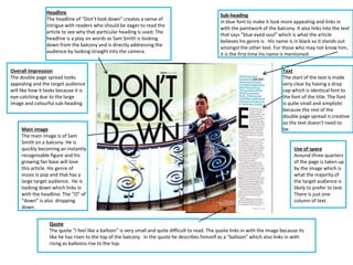
1. Headline
The headline of “Don’t look down” creates a sense of
intrigue with readers who should be eager to read the
article to see why that particular heading is used. The
headline is a play on words as Sam Smith is looking
down from the balcony and is directly addressing the
audience by looking straight into the camera.
Overall impression
The double page spread looks
appealing and the target audience
will like how it looks because it is
eye-catching due to the large
image and colourful sub-heading.
Main image
The main image is of Sam
Smith on a balcony. He is
quickly becoming an instantly
recognisable figure and his
growing fan base will love
this article. His genre of
music is pop and that has a
large target audience. He is
looking down which links in
with the headline. The “O” of
“down” is also dropping
down .
Sub-heading
In blue font to make it look more appealing and links in
with the paintwork of the balcony. It also links into the text
that says “blue eyed soul” which is what the article
believes his genre is. His name is in black so it stands out
amongst the other text. For those who may not know him,
it is the first time his name is mentioned.
Text
The start of the text is made
very clear by having a drop
cap which is identical font to
the font of the title. The font
is quite small and simplistic
because the rest of the
double page spread is creative
so the text doesn't need to
be.
Use of space
Around three quarters
of the page is taken up
by the image which is
what the majority of
the target audience is
likely to prefer to text.
There is just one
column of text.
Quote
The quote “I feel like a balloon” is very small and quite difficult to read. The quote links in with the image because its
like he has risen to the top of the balcony. In the quote he describes himself as a “balloon” which also links in with
rising as balloons rise to the top.