
Recommended
More Related Content
What's hot
What's hot (20)
Similar to Poster Steps
Similar to Poster Steps (20)
Recently uploaded
Recently uploaded (20)
Poster Steps
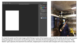
- 1. To create the poster we first took images whilst filming in some of the locations seen in the film, while we did try each location taking photographs of characters during filming sessions ultimately the best photograph was in the basement when “Abby Walters” gets captured, the basement has old tools, chipped paint on old brick walls and gives off a very creepy horror vibe.
- 2. First using the eraser tool I created a rough and jagged edge to the image, allowing the dull background colour to be seen in the far corners of the image, I then wanted to dull the image down as currently the image alone isn’t scary enough and was too bright, so in an new layer, using the brush tool I drew around the masked villain character creating an outline and filled the layer in leaving only the silhouette of the character open.
- 3. I then filed in the silhouette with a lower opacity black and then toned down the entire layers opacity down so that it could overlay on top of the image dulling some of the colours and making the poster darker and more sinister looking. The reason I made the sillute paler in opacity than the rest of the black of the background was to allow more of the bright photograph to seep in so that the masked villain stood out more amongst the dull background.
- 4. Next using some brushes I downloaded whilst following a text effect tutorial on YouTube for my title of the poster, I used the effect not only on text but also on the overall image adding a distorted and static effect to the image. Once the effect was created I used a low opacity eraser brush and rubbed out a vague silhouette of the masked villain so once again the character doesn’t get lsot within the deep colours and distorted effects.
- 5. Here is the image after I had turned down the opacity of the textured effect and overplayed it on top of the image to create a subtle but effective gritty texture to really go for the horror poster feel which can be seen in some of the posters I used as inspiration below. As you can clearly see, all of these posters feature noise or a textured effect on the images which give off a gritty and chilling effect which is something I wanted to try and capture in my poster.
- 6. Here is the tutorial that I watched which created a really interesting effect to simple text and looked very professional and horror poster-esque, some of the ideas I had been trying were more horror font however rthis cracked distorted texture is something that I think stands out and also looks very realistic in the sense that it looks very professionally made.
- 7. Here are some for the stages from the tutorial to show how the text starts off and how eventually the creator slowly, using multiple layers and custom brushes creates the effect
- 8. Here are the custom brushes I downloaded that the tutorial suggested and here are some of the stages I went through whilst creating the text effect for the poster.