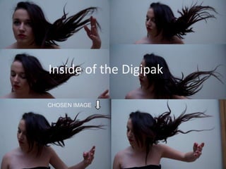
1. Inside of the Digipak
Using the rule of thirds.
CHOSEN IMAGE
2. Editing the image
First of all I started by cropping the Image using the
rule of thirds concept. This image will be on the
inside of my Digipak. I chose to use the rule of
thirds so it could stretch across all three panels of
the Digipak.
Then using the Clone Stamp tool I erased the hand
out of the image as it was too distracting. This makes
it look more professional.
When shooting these images, I used the Tungsten
lighting in the white balance as the photos kept
coming out in a extremely orange colour. I then
figured that if I used and orange filter on it, it will
cancel out the blue making the background look white.
3. Editing the image
• I then increased the brightness and
contrast. This brought the model out of
the image. The brightness also
bleached the background making it
look whiter and more professional.
• I added in into the template of my
Digipak, keeping my original concept of
the rule of thirds. I have decreased the
opacity just so I can see what it looks
like on the template. I think the
extreme close up works well to create a
unique yet sophisticated image.
4. • This is the final edited image of my Digipak inside, although when I
fit it to the template it gives an extreme close up and crops out her
body. I like this as I feel her torso is in an odd position. I have also
played around with the straightening as her hair is more effective
higher up.
5. To edit this image, first of all I cropped it to
the standard Digipak dimensions. I wanted
the chair to be featured on the right hand
third as I feel the rule of thirds creates a
unique image, it also works well as I have
used it a lot in my video and in my photos.
This creates a distinct theme.
I then proceeded to erase the fence out
of the background with the clone stamp
tool. I did this because I felt it was
natural enough to fit in the photo, it
also looked unprofessional and was a
little distracting.
6. • I then practised a skill that I
acquired in my photography
lessons. This enables me to
change the image so it has more
pastel tones. I did this but adding
a white and a pink solid fill layer,
then changing the over lay to soft
light. I then changed the opacity
so it is not as strong with pink
tones as the top screen grab. The
pastel tones give the image a
more girly and sophisticated feel
which matches my artist and my
target audience of females aged
between 17-25.
7. This is the final image, I feel
that the rule of thirds combined
with the pastel tones and the
screen glare, all work together
to create a unique, dreamlike
image.
The image to the right is what it
will look like as the inside page
on my Digipak.
8. Digipak back cover
First of all Image to the required measurements.
I decided to use her stepping across the rule
of thirds as if gives the sense of movement,
as if she is stepping across the image. I also
chose to place her like this as the left hand
third will be the blank space that I will put my
titles that will go on my back cover.
I then proceeded to use the clone stamp tool
to edit out the helpers hand, as I got her to
throw the dress in the air as the model
stepped forward. I opted for a silhouette shot
as it has strong links to the music video and i
feel that it is a more dramatic and mysterious
image.
9. I then increased the contrast of the image as it
made the colours richer, it also deepened the
photo, removing some of the grass that was
visible and making the model stand out of the
image.
I then found another image where I
preferred the skirt movement, but didn't like
how she was stepping, so I decided to use
my skills that I have acquired in Photoshop
to combine the two skirts. This has allowed
the image to look more professional and
10. • This is a screen shot of after I combined the two
skirts together, I like how it has made it look
longer.
I then noticed that there was a part of the skirt
that i had cut out which was too sharp and
unrealistic at the bottom of the image, so using
the polygonal selection tool, I selected the
triangle, removed it and smoothed it off using
the clone stamp tool.
• Finally I smoothed the bump at the top of the
dress to make it flow more and make it look
more genuine.
• Elongating the dress has given a sense of floating
and dreaminess, it also shows her on a journey
to find someone and the idea of the wind makes
it feel as if she is ‘battling the elements’. Placing
her in the rule of thirds also shows how lonely
she is which links to the lyrics of the song.
11. • This is the
finished back
cover before I put
text on it, I feel
that the skirt
with the extra
length to its adds
together to make
a more effective
and eye catching.
12. • First of all using the Gaussian blur I blurred
the background, this gave it more depth of
field and allowed her face to stand out of
the image, showing that she is the most
important part of the front cover.
• Here I looked at using a de-saturated
colour tone although I feel like completely
black and white will not work with the rest
of the digipak.
• I then selected her pupils and with the
Unsharp Mask I played around with the
sharpening of the eyes. I did this to make
them stand out and give more of a 'wow'
factor; enticing the audience in.
13. • Here I played around with the curves
like Rhianna’s album but i feel like the
curves do not work as well as the
original colour tone is too harsh. I think
I will stick to a slightly de-saturated
colour tone.
• With the typefont I overlaid it and with
a bit of time managed to get a
overlapping effect wanted by entwining
the two fonts together and playing
about with the positioning of the layers.
I feel that it looks more professional
with this type of editing work.