
Recommended
More Related Content
What's hot
What's hot (20)
Similar to Finalcut
Similar to Finalcut (20)
Recently uploaded
Recently uploaded (20)
Finalcut
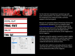
- 1. For the title font I decided that I wanted to go with quite a distressed font. The slashes in “Final Cut” could be compared to the cutting of a knife a common weapon in the horror genre. Because I’m somewhat skilled at Photoshop CS5 but not a professional, I decided to turn to a website called http://www.dafont.com/. This website allowed me to look at free fonts what were very high quality. I decided to go for fonts that were quite damaged and had associations of violence and horror, as the magazine is a horror magazine. As well as using this website I wanted to make it slightly unique. I decided to add effects I used the layer style in the Photoshop tab and added a drop shadow. This made the text look 3D; stand out more. As well as this I added an outer glow almost to make it seem like the text is in fact glowing. This further added to the professional effect of the magazine.
- 2. I decided to add the smoke effect to the poster as it broke up the main image into thirds. This allows for the audience to focus on each character separately, yet simultaneously draw attention Sam in the centre of the magazine. I added the smoke effect using the paintbrush tool, varying in gradient for each stoke this was probably one of the harder tasks for the magazine. But I’m pleased with the outcome as it adds depth to the magazine too. After doing the paint brush tool I added a Photoshop effect called liquify then further distorted the shape to make the flow appear more realistic. The final adjustment I added was the the blur tool as smoke is very soft. The brush lines left a very blunt brush marks so the blur tool helped smooth it out further.
- 3. For the main actors within the magazine I decided to Photoshop their skin. This added to the overall professional quality but also aided in the appearance. This was the hardest task as I needed them to look realistic, yet polished. This meant that I worked in layers rather than on the final image as it was easier to simply undo. I used several tools like the dodge to add highlights on cheekbones and eyes and burn to darken certain areas. I decided to not add the bruising on Sam (the centre) character as I wanted to portray her as strong. This is why I posed her this way and allowed her to take up the major third of the magazine. Adding effects to their face such as makeup (the lipstick was added later on rather than it being in the actual photoshoot) and bruising. For this I experimented with different brush tools and layering them by increasing the flow of certain brushes and colours.
- 4. The use of banners and stickers in magazines is very common so I decided to make my own. This was one of the easier tasks as it just involved distorting the shape of a straight line, then tilting it. This was a feature I took direct inspiration from film magazine. The banner almost invites the audience into the magazine as it hints at key stories within the magazine. In my banner I decided to put a story that was relevant to the time and the audience. As my target audience are around 18-25 they would be far more interested in breakout actors/actresses as they are closer to their age.