
Recommended
More Related Content
What's hot
What's hot (16)
Viewers also liked
Viewers also liked (19)
Similar to Analysis of front covers for music magazines
Similar to Analysis of front covers for music magazines (20)
Recently uploaded
Recently uploaded (20)
Analysis of front covers for music magazines
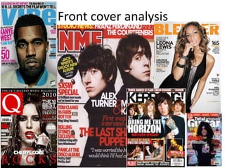
- 2. Front cover analysis; Q Q has quick sharp cover Q is a music magazine based in the UK. It’s been lines that get to published monthly, since it was first published in the point . All October 1986. Bauer Media Group publishes Q. Q the cover lines doesn’t have one specific genre of music. They focus are also in on new releases and upcoming artists. bright colours The masthead is positioned on the top left , meaning the draw attention. hand corner. It’s always positioned in the same place for every issue. The masthead is in a red box and the ‘Q’ is white and this makes it stand out. The central image is used as a lure , as its someone famous. The image is a mid close up shot at eye level . The person on the image is dressed in satin small white dress and this used to draw in male readers. There is another lure when it states there is an exclusive with professor green and exclusive is written in capital letter and in pink and this is used to encourage the audience to buy this The background colour of Q is grey and this balances out the magazine because it already has pink and yellow cover lines. If they had used a brighter colour for the background it would look like it was aimed for a younger teen audience, but they used a neutral colour to match its targeted adult audience
- 3. Front cover analysis ; mixmag. Mixmag is a UK based electronic dance music and clubbing music magazine. Its published by development hell ltd. Mixmag is a monthly published magazine The masthead is in big bold letters and is in white to fit in with the consistent colour scheme and on the ‘I’ the dot is made to look like a record or speakers and this links in with connotations of dancer music This issue has a a lure in a big white box at the center of the magazine stating the greatest dance act of all time will be revealed inside and this draws attention and is used to lure people into purchasing the magazine. The colours used on the front cover are ; gold , white and black and this suggests that the magazine is aimed at people in their late teens and young adults , who would actually be interested in clubbing and dancing . The colours provide a clubbing atmosphere with lights flashing.
- 4. Front cover analysis : total guitar total Guitar is a monthly magazine based in the United Kingdom. The magazine is owned by Future Publishing. The masthead is in big bold black letters positioned at the top of the magazine, this position applies to all of their magazine issues, the masthead is total guitar with the word guitar in serif and more bigger and this does draw attention to the audience. Total guitar has a basic colour scheme that contains black green and white and this is kept consistent through the whole magazine. then they inform the audience of an exclusive ‘21 page slash fest’ using a bright pink puff containing white and yellow font and this technique is used to grab the audiences attention because its visually eye The cover stories inform the audience what this The central image is always in the middle of the magazine to particular issue is about, this is usually reflected grab the audience’s attention. It overlaps the masthead through the central image. It’s also shown suggesting that the it’s the main focus and the artist on the through what language is used on the cover image is dressed in black and this matches the magazines and what big names are involved to target their house style. in the image, the audience cant see the male’s audience. eyes but body language and facial expressions suggests and creates the illusion he’s looking right at us and this is used to draw the audience in .