
Recommended
More Related Content
What's hot
What's hot (17)
Viewers also liked
Viewers also liked (15)
Similar to Analyzing Magazine Contents Pages
Similar to Analyzing Magazine Contents Pages (20)
More from Jade Foreman
More from Jade Foreman (17)
Recently uploaded
Recently uploaded (20)
Analyzing Magazine Contents Pages
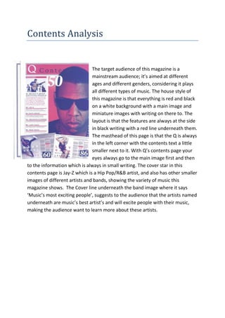
- 1. Contents Analysis The target audience of this magazine is a mainstream audience; it’s aimed at different ages and different genders, considering it plays all different types of music. The house style of this magazine is that everything is red and black on a white background with a main image and miniature images with writing on there to. The layout is that the features are always at the side in black writing with a red line underneath them. The masthead of this page is that the Q is always in the left corner with the contents text a little smaller next to it. With Q’s contents page your eyes always go to the main image first and then to the information which is always in small writing. The cover star in this contents page is Jay-Z which is a Hip Pop/R&B artist, and also has other smaller images of different artists and bands, showing the variety of music this magazine shows. The Cover line underneath the band image where it says ‘Music’s most exciting people’, suggests to the audience that the artists named underneath are music’s best artist’s and will excite people with their music, making the audience want to learn more about these artists.
- 2. The target audience of this magazine is also a mainstream audience it’s aimed at different ages and genders of people. Mainly people that enjoy Rock bands and Punk artists. The house style of this magazine is mainly the colours. The colours are always black and yellow. Black represents danger, darkness, and isolation and the yellow shows warning. Also the Contents itself is always yellow on a black background standing out to the audience what page this is and then the other text on the page is also in yellow writing on black backgrounds standing out to the audience that these parts of the page are important. The audience’s eyes most likely go to the main image which is of Craig Owens who is a past member of the band Chiodos who are a post-hardcore band and so will be known by the people that enjoy that kind of music. But then the eyes will go straight to the highlighted words because they stand out which are small headings down the page for people to know what to expect inside. Showing the audience this magazine is going to be busy and have lots of information and photos of different rock bands and artists which are associated with the music which is fast, busy and wild. The people in these images are all wearing the same kind of clothes, black, yellow, white and dark colours associating with the genre of music, showing the audience that this magazine is definitely going to have a lot of information about rock bands. The cover lines in this contents page are the bands names under their pictures showing the audience who they are and having a small quote with it too, this has been done to give the audience more information about the people in the image showing what band they are and what they’re kind of like. Comparisons and contrasting of Contents Page covers Both these Contents pages have some similarities including using the people inside to gain its audience and using certain colours for certain social groups and people, and also shows a variety of images and text about what’s going to be inside the magazine. In comparison it also mainly has the same background
- 3. as white, having the images and cover lines stand out to people. In contrast Kerrang has a lot more information inside maybe being associated with the fact that it has more people on the page too and so needs more information for the audience. Also in contrast the images on Kerrang’s Contents page are all set out straight and neat, whereas Q’s contents page the images are mainly curved and over lapped, I think this has been done to show the audience how much Q magazine is filled with and that’s its full because of all the different genres of music it does, whereas because Kerrang only does mainly one or similar genres of music there’s only one kind of stuff to add to it and so doesn’t need to be cramped and can be set out neat and straight. Furthermore in contrast both magazine contents pages show how different they are targeting at certain audiences, by the colours and styles of quotes etc.