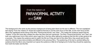
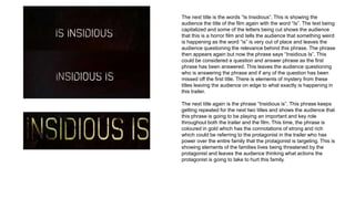
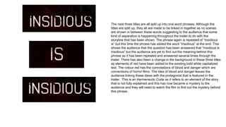
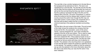
The document provides a detailed analysis and breakdown of the titles presented in a movie trailer. It examines each individual title slide, discussing elements like font, color, text effects, and how they are used to convey information, set tone, pique audience interest, and hint at the film's plot and themes. The overall purpose is to build intrigue and anticipation around the movie's central mystery through cryptic and unanswered phrases that will drive viewers to watch the full film for resolution.
MPAA Age Rating and Production Company Screens in Horror Film Trailer
1. The opening screen commences with a green screen from the MPAA. This splash screen shows the audience that this film has an age rating of
PG 13 meaning nobody under the age of 13 should watch and parents are strongly cautioned to watch with their children. The websites of the
company are shown on the screen. This gives the audience he chance to visit the websites if they want to find out more information about why the
film has received a certain age rating and what is in the film that makes the film of this certain age rating. All professional film companies use these
screens at the beginning of the film to make the audience aware of the age rating and shows the professionalism behind the creation of the film.
The green background and white text is centred and capitalized to show the importance behind this screen as age ratings are used to protect
younger viewers.
2. This screen is used to show the audience what production company has been used to create the film. The title “Film
District” is used to show the audience the production company and is also used to show the audience that films that they
may have watched in the past has the same production company. If the audience recognize the film company from a good
film that they have watched previously, they will be more interested in knowing what the film is going to be about as they
will know that this company produces amazing films and that this film is going to be good. The title is capitalized to signify
the importance of the production company as without the production company the film would not be a reality. The title is
black and so is the ground underneath the title which shows the audience the mysterious side behind the company as this
company is called “Film District” showing the audience that horror is not the only genre this company specialize in. The
dark black and red clouds connote danger and death which are connotations of a horror film.
3. The first title that appears is the name of the film. The title of the film in a trailer is usually one of the last titles to appear but in
this trailer the title of the film is the first title to appear. In my opinion, I think that the director should always leave the title of the
film until the last title as the audience engage more on the content of the film rather than knowing the title first as they may look
up the film before they know what the film content is going to be based on. The black background and the capitalized white text
makes the title stand out to the audience and makes the audience aware of the title of the film. The title is animated and the
words get scrambled up when the title is coming to a close. This has an effect on the audience as it makes them question the
meaning behind this word and makes the audience question what the storyline may contain as the idea of words being
scrambled up could be telling the audience that the storyline may be a little difficult to understand or may be a very disturbing
storyline.
4. The background is the same as the previous background of being plain black but the text is different. The non-capitalized
text saying “From the makers of” shows the audience that this is not the main focus of this title, as the main focus of this
title is the capitalized words being of the films “Paranormal Activity” and “Saw”. This makes the audience aware that the
“makers” of this film have also created the other two films that are mentioned. The films “Paranormal Activity” and “Saw” are
both very well-known horror films which were huge hits in the box office telling the audience that this film is also going to be
a success. This makes the audience want to watch the film as if they are fans of the other films, they would want to see
what the directors have done similarly and different to the previous films. The positioning of the text is centred telling the
audience that this title is very important as it gives the audience a little bit of background of what they should be expecting
from both the trailer and the film.
5. The next title is the words “Is Insidious”. This is showing the
audience the title of the film again with the word “Is”. The text being
capitalized and some of the letters being cut shows the audience
that this is a horror film and tells the audience that something weird
is happening as the word “is” is very out of place and leaves the
audience questioning the relevance behind this phrase. The phrase
then appears again but now the phrase says “Insidious Is”. This
could be considered a question and answer phrase as the first
phrase has been answered. This leaves the audience questioning
who is answering the phrase and if any of the question has been
missed off the first title. There is elements of mystery from these
titles leaving the audience on edge to what exactly is happening in
this trailer.
The next title again is the phrase “Insidious is”. This phrase keeps
getting repeated for the next two titles and shows the audience that
this phrase is going to be playing an important and key role
throughout both the trailer and the film. This time, the phrase is
coloured in gold which has the connotations of strong and rich
which could be referring to the protagonist in the trailer who has
power over the entire family that the protagonist is targeting. This is
showing elements of the families lives being threatened by the
protagonist and leaves the audience thinking what actions the
protagonist is going to take to hurt this family.
6. The next three titles are all split up into one word phrases. Although the
titles are split up, they all are made to be linked in together as no scenes
are shown in between these words suggesting to the audience that some
kind of separation is happening throughout the trailer to do with the
storyline that has been shown. The phrase again is repeated of “Insidious
is” but this time the phrase has added the word “Insidious” at the end. This
shows the audience that the question has been answered that “Insidious is
Insidious” but the audience are yet to find out the meaning behind this
phrase as it has been repeated and answered several times through the
trailer. There has also been a change in the background in these three titles
as elements of red have been added to the existing bold white capitalized
text. The colour red has the connotations of blood and danger which are
conventions of horror films. The idea of blood and danger leaves the
audience linking these ideas with the protagonist that is featured in the
trailer. This is an Hermeneutic Code as it refers to an element of the story
that is not fully explained and this has now became a mystery to the
audience and they will need to watch the film to find out the mystery behind
this phrase.
7. The next title is has a similar background to the last title as
the background has elements of red in. The text is not
capitalized but is the last title. The last title and the first title
are the titles that the audience will remember the most as it
will be the first and last thing that they see which is used so
that the audience remember the title of the film and the
release date of the film. The word “Everywhere” is used to
show the audience that the release date compels to every
country around the world. Even though the film may not
have been shown in every cinema, the companies aim is
that they will be able to watch the film in at least one
cinema screening in the audience members surrounding
area.
The last title is the end screen of the trailer. The end screen
of the trailer shows the audience the company that has
produced the film, the association, some of the actors
names, costume designers etc. and it also includes the
website of the film at the very bottom. This is used to make
the audience aware of some of the actors, directors etc.
that have created the film. If the audience known of any of
these people that have created the film, the films fan base
may grow as famous actors will draw a lot of attention to
the film. The website is the only thing that is not capitalized
on this last title which makes the audience’s attention focus
on the website. The website is added so that the audience
can go onto the website to find more information about the
film and to see where they can view the film when it has
been released.