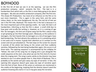
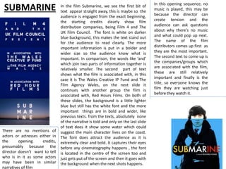
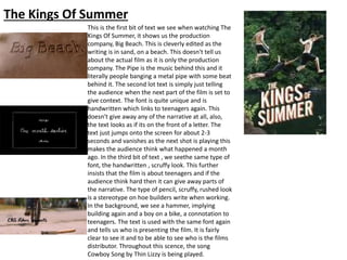
1. Task 7: Title Research
1) Boyhood
2) Submarine
3) Kings Of Summer
2. In the first bit of text we see in at the opening, we see the film
production company which presents the film. The text is in a
handwritten font which tells us the film is most likely going to be about
teenagers. We also see another production company, after the first one.
This shows IFC Productions has more of an influence on the film or its
just more important. This is again in the same font, and the same
colour, black, on the same background, the sky. The last bit of text we
see is the film title, Boyhood. The reason this is the last is because it is
the most important part of the opening credits. As I said, the text is all
handwritten, informing us that the film is about a small child due to
how poor and scruffy the writing is. However, as it is a coming of age
film for teenagers, the font sort of gives away hat the film s about a boy
or girl growing up into their teenage years. Obviously, as the audience is
teenagers, the font heavily links to teenagers as a lot of teenagers have
bad handwriting. The font attracts the audience as it is something which
is not used a lot in movies. It grads their attention as it is written on the
screen and not just whacked on. The text stays on the screen for around
2 seconds of the whole text being on the screen and then suddenly
vanishes, followed by the text being handwritten again, this occurs in all
three texts. The opening sequence is accompanied by the coldplay hit
‘Yellow’, the start of the song has no singing and is put alongside the
credit sequence at the start, only when we see the first shot of a human
does the singing start. The song is quite catchy so the director may have
wanted to use it so when people hear it, they think of Boyhood. This is
probably so the words cant give away any type of narrative. In fact, the
opening title sequence doesn't give away any type of narrative apart
from the font of text. None of the actors or actresses are mentioned in
the credits at the beginning, implying that the director doesn't want the
audience knowing who starts in it as it may give away the narrative.
BOYHOOD
3. SUBMARINE In the film Submarine, we see the first bit of
text appear straight away, this is maybe so the
audience is engaged from the exact beginning,
the starting credits clearly show film
distribution companies, being Film 4 and The
UK Film Council. The font is white on darker
blue background, this makes the text stand out
for the audience to read clearly. The more
important information is put in a bolder and
wider size so the audience know what is
important. In comparison, the words like ’and’
which join two parts of information together is
relatively smaller. The second part of text
shows what the film is associated with, in this
case it is The Wales Creative IP Fund and The
Film Agency Wales, on the next slide it
continues with another group the film is
associated with, Red Hours Films. On both of
these slides, the background is a little lighter
blue but still has the white font and the more
important things are in bold and wider, like
previous texts. from the texts, absolutely none
of the narrative is told and only on the last slide
of text does it show some water which could
suggest the main character lives on the coast.
The font does attract the audience as it is
extremely clear and bold. It captures their eyes
before any cinematography happens , the font
is located in the centre of the screen too and
just gets put of the screen and then it goes with
the background when the next shots happens.
In this opening sequence, no
music is played, this may be
because the director can
create tension and the
audience can ask questions
about why there's no music
and what could pop up next.
The name of the film
distributors comes up first as
they are the most important.
The second text to come up is
the companies/groups which
are associated with the film,
these are still relatively
important and finally is the
title, so everyone knows the
film they are watching just
before they watch it.
There are no mentions of
actors or actresses either in
the opening credits,
presumably because the
director doesn't want to tell
who is in it as some actors
may have been in similar
narratives of film
4. The Kings Of Summer
This is the first bit of text we see when watching The
Kings Of Summer, it shows us the production
company, Big Beach. This is cleverly edited as the
writing is in sand, on a beach. This doesn't tell us
about the actual film as it is only the production
company. The Pipe is the music behind this and it
literally people banging a metal pipe with some beat
behind it. The second lot text is simply just telling
the audience when the next part of the film is set to
give context. The font is quite unique and is
handwritten which links to teenagers again. This
doesn't give away any of the narrative at all, also,
the text looks as if its on the front of a letter. The
text just jumps onto the screen for about 2-3
seconds and vanishes as the next shot is playing this
makes the audience think what happened a month
ago. In the third bit of text , we seethe same type of
font, the handwritten , scruffy look. This further
insists that the film is about teenagers and if the
audience think hard then it can give away parts of
the narrative. The type of pencil, scruffy, rushed look
is a stereotype on hoe builders write when working.
In the background, we see a hammer, implying
building again and a boy on a bike, a connotation to
teenagers. The text is used with the same font again
and tells us who is presenting the film. It is fairly
clear to see it and to be able to see who is the films
distributor. Throughout this scence, the song
Cowboy Song by Thin Lizzy is being played.
5. The Kings Of Summer: Carried on
The next bit of text is again in the same font and by now we know
its about teenagers by the amount of times this font has been
included within the opening minutes. We can see another
production company mentioned here aswell as Big Beach. This
implies that this is a smaller production company as it has been
added later on in the sequence. The text has been positioned in
the centre of the screen in a bold white colour to ensure the
audience sees it. The text enters the screen when the shot is
changed and when the camera is looking at the boy. The text stays
on screen for 2 different shots and goes on the 3rd shot after it has
been put on, giving the audience time to comprehend and read it.
It attracts the audience as it is put on screen very fast and sharply.
The song is still playing by Thin Lizzy at this point and it just adds a
bit of music to the scenes to keep the audience entertained and
engaged. The final shot of text in the opening few minutes is the
title of the film. Again, this is in the same font as previous texts
and is still in white. However this time the font has got larger to
show the title, as this is the most important thing, it is the last
thing shown and in the biggest. The text doesn't give the narrative
away exactly but the audience can guess that it is set in the
summer months and could possibly be either about wildlife or
building things, or both. This text attracts the audience more than
any other text as it is so much more bigger. The text arrives on the
screen a short time after the shot. It stays on screen for a couple
of seconds. The music is still the same and in none of the texts are
the actors and actresses names, only the production companies
and titles. This is as these are the most important things for the
director and he may not want to expose any actors or actresses
early on.