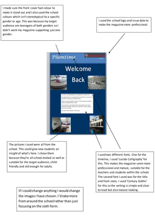
1. I made sure the front cover had colour to
make it stand out and I also used the school
colours which isn’t stereotypical to a specific
gender or age. This was because my target
audience are teenagers of both genders so I
didn’t want my magazine supporting just one
gender.
I used two different fonts. One for the
timeline, I used ‘Lucida Calligraphy’ for
this. This makes the magazine seemmore
professional and mature, suitable for the
teachers and students within the school.
The second font I used was for the title
and front story. I used ‘Century Gothic’
for this so the writing is simple and clear
to read but also mature-looking.
The pictures I used were all from the
school. This could give new students an
insight of what’s here. I chose them
because they’re all school related as well as
suitable for the target audience; child-
friendly and old enough for adults.
I used the school logo and issue date to
make the magazine more professional.
If I could change anything I would change
the images I have chosen. I’d takemore
fromaround the schoolrather than just
focusing on the sixth form.