Kotlin Multiplatform & Compose Multiplatform - Starter kit for pragmatics
Media powerpoint for blog
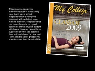
1. This magazine caught my attention because it made it very clear that it was a school magazine which is very good because it will catch their target markets attention. The picture that has been chosen is very good because it shows a typical student with books. However I would have suggested another title because the masthead should be clear and I think that the kicker grabbed my attention more than the actual title.
2. This magazine is appealing, its eye catching with a clear title and clear stand out image, there is a clear colour theme throughout the magazine however there isn't a main kicker which stands out .
3. This is my first draft of my school magazine front cover, my title is SMS weekly, I have made it relate to the school which will interest students. The picture is of a student indulging in a book which relates to school life. I have used 3 colours which are red white and black If I had chosen any other colour it wouldn’t all fit with each other unlike these colours which do all fit in with each other . I have used 2 different fonts to show a variety of fonts on my page but not over doing it .
4. This is my updated front cover for my magazine I made a changes after looking at my peer assessment sheet for one I had to make my page A4 to stat with I then changed the first kicker to blue because I was told the red was too bright and random amongst the other two colours so I took the colour off the blue chair and put it into my font but it was looking dull so I added a shadow of white underneath it which brought it out more, I did this for my main kicker to which is in black with a white shadow underneath it . The page was looking empty so I added in another kicker to fill the extra space giving the front cover a more full look.