SlideShare a Scribd company logo
1 of 20
HOW DID I APPEAL TO MY
AUDIENCE?
Georgina Gilbey
AS Media Studies
MODELS AND COSTUME
• Although the models on my front cover
were all female, I made sure to include
male models on my contents page so as
to keep my audience as open as possible,
and when featuring ads such as for the
new clothing range, I included images of
both women's and men's clothing items to
appeal to both.
MODELS AND COSTUME
• When studying magazine front covers, I took note of
the fact that where there were group photos as the
main image, each person in the band was often
representing a specific character type in order to target
the different tastes in their audience.
• For this reason, I decided to replicate this in my own
main image. I had the model in front represent the
'cute/pretty one' by having her look directly at the
camera and smile, with the model on the left being 'the
mysterious one' looking into the distance with a
serious expression, and the model on the right being
'the boy-ish type', dressed casually with minimal
make-up and her arms folded.
MODELS AND COSTUME
• My models were all in a similar age
bracket to my target audience to make it
clear that this is a magazine aimed at
young adults who are interested in the
rock/metal music genre. I tried to dress
them in costume that was appropriate for
this target audience, keeping it casual with
make-up that wasn't so heavy as to
connote a social group such as emo, but
heavy enough to connote the social group
casual rock.
CODES AND CONVENTIONS
• In terms of codes and conventions, I
followed a few but also tried my best to
challenge them to create a new rock/metal
magazine that my target audience would
be attracted to. I knew from my research
into this genre that there are a lot of
features that have become typical ...
CODES AND CONVENTIONS
• ... For example, the colour scheme of red,
black and white has become very common
for these magazines. For this reason, I
challenged the convention by having a
colour scheme made up of yellow, blue,
black and white. This set my magazine
apart from the rest and gave my magazine
a new, fresh look. The audience would
therefore be able to instantly see a
difference between mine and other generic
magazines.
AUDIENCE
FEEDBACK
COLLAGE
This shows my
front cover
annotated with
quotes from the
survey I
conducted to
get audience
feedback on
my finished
products. I
have also
included it
below this
presentation as
a larger image.
AUDIENCE FEEDBACK COLLAGE
• These comments prove that the codes and
conventions I used to appeal to my audience were
quite successful, as my audience was able to spot
them and state how it attracted them to the magazine.
• For example, I included a graphic advertising a free
CD on my front cover, and someone in the survey
said, "Good strategic marking at age group with top
lists of 2015 music, free CD, see your favourite band
competition".
• This suggests that my aim to attract potential buyers
with these features would be successful, if I were to
publish the magazine, and that I would be able to
establish a readership with a young audience.
AUDIENCE FEEDBACK COLLAGE
• I also got lots of comments referencing the
masthead and main image being that of the rock
music genre, for example "the main picture is
styled in a way that represents the genre well and
its masthead also looks straight out of a rock
magazine".
• This proves that my decision to stylize my
masthead by adding cracks and scratches going
through it to connote the genre of the music was
successful, as many were able to tell from looking
at this that it was a rock/metal magazine.
OTHER FEATURES
Another way I attempted to
target my audience was
through the use of particular
font styles to represent the
rock/metal genre further ...
OTHER FEATURES:
THE MASTHEAD
• For example, for my masthead I used a large, bold font
called 'Bernard MT Condensed', and had the masthead
in capital letters to give it more impact.
• I then used the eraser tool to add the scratches and
cracks to give my magazine a defined brand as well as
to connote the aggressive nature of the music.
OTHER FEATURES:
SECONDARY FONT
• For my story lines and taglines I used the
font 'Rockwell' as I thought it fitted in with
the rest of the page and masthead font
and was bold enough to be conventional
of a rock/metal music magazine.
CHANGES IN PRODUCTION
• In light of my primary audience research, I decided to make
some changes in order to appeal to my target audience more
accurately.
• For example, from my first survey I found that offers such as
exclusives and free items almost always influence a buyer's
decision when purchasing a magazine.
• For this reason, I added advertisements for such free items on
my front cover, such as the free CD.
• This finding was backed up by my second phase of primary
research, as in my audience's feedback on my final
production I got the comment "Free CDs are always a plus"
when I asked if they would consider my magazine as a
purchase choice if they saw it on the shelves.
CHANGES IN PRODUCTION:
THE DOUBLE PAGE SPREAD
• At first, when making the double page spread, I was working
on a program called InDesign. This was a program I was
completely new to working with, and I had difficulties with
working with the tools and overall layout of this platform and I
didn’t like the way my double page spread looked (this first
draft is shown below).
• I spoke to my teacher who helped with this by telling me
which tools to use for what, but I later decided to change to
working on Photoshop.
• This was providing I could make sure to include columns,
drop-caps, and other expected conventions of double page
spreads successfully. Fortunately, as I was very familiar with
working in Photoshop, this was achievable and I found the
double page spread a lot easier to construct efficiently.
CHANGES IN PRODUCTION:
THE DOUBLE PAGE SPREAD
The original double page spread, on InDesign:
CHANGES IN PRODUCTION:
THE DOUBLE PAGE SPREAD
The new (second draft) double page spread, on Photoshop:
CHANGES IN PRODUCTION:
THE DOUBLE PAGE SPREAD
Other changes I made after this
platform-switch were regarding the
main image.
First of all, I used the image shown
below, a photograph of two of my
models doing a silly, informal pose,
as I had observed in my research
that magazines usually choose to
have a serious pose on the front
cover and an informal pose on the
double page spread to show two
sides to the artist or band they are
featuring and give the article a
more personal feel.
However, I soon found difficulties in
working with this image because for
one, it left out the lead singer of the
band, and secondly it was difficult to
position the text around it and I
thought I would soon run out of
room for my article and make the
page look squashed or crowded as
a result.
CHANGES IN PRODUCTION:
THE DOUBLE PAGE SPREAD
For these reasons, I
changed the main image
when I changed from
InDesign to Photoshop and
got much better results as it
solved the issues of
including all band members
and being easier to work
around with text. This new
image was actually a
collage of three separate
ones where I picked the
best images in terms of
poses and image quality
and put them together into
one.
The new image:
CHANGES IN PRODUCTION:
THE FRONT COVER
• As well as in my double page spread, in
light of feedback from classmates this
time, I made changes to the main image
and overall design of my front cover.
• This was the first design for my front
cover. A classmate suggested that the
main image and masthead gave
implications of a fashion magazine rather
than rock, so I decided I would change
this as I didn’t want to give off the vibe of
a fashion magazine rather than the very
different genre of rock/metal music.
• As well as this, I didn’t like the design a
lot myself so this also motivated me to
start over and pushed me to make the
final product I have today.
OVERALL ...
• The primary and secondary
research I did, audience
feedback, and changes in
production as a result of these
factors, helped me to appeal
to my audience as accurately
as possible; whilst also taking
into account the need to break
common conventions to
successfully create a new,
exciting rock/metal music
magazine that readers will be
attracted to.

More Related Content

What's hot

Factual Development and Planning Pro Forma
Factual Development and Planning Pro FormaFactual Development and Planning Pro Forma
Factual Development and Planning Pro FormaShaniceYates
 
EVALUATION // QUESTION 1
EVALUATION // QUESTION 1 EVALUATION // QUESTION 1
EVALUATION // QUESTION 1 msharrattmedia
 
Media evaluation q1
Media evaluation  q1Media evaluation  q1
Media evaluation q1jgamble14
 
Formal proposal
Formal proposalFormal proposal
Formal proposalparkin1
 
Evaluation 1 - Renegade Magazine
Evaluation 1 - Renegade MagazineEvaluation 1 - Renegade Magazine
Evaluation 1 - Renegade MagazineMaxSunnar
 
Evaluation, Question One
Evaluation, Question OneEvaluation, Question One
Evaluation, Question OneKiera King
 
Evaluation 1
Evaluation 1Evaluation 1
Evaluation 1MaxSunnar
 
Evaluation 1
Evaluation 1Evaluation 1
Evaluation 1JayFranks
 
Evaluation 1
Evaluation 1Evaluation 1
Evaluation 1JayFranks
 
Evaluation 1
Evaluation 1Evaluation 1
Evaluation 1JayFranks
 
Rockstar presentation
Rockstar presentationRockstar presentation
Rockstar presentationswagzy
 
Question 1 // PART ONE
Question 1 // PART ONEQuestion 1 // PART ONE
Question 1 // PART ONEKiera King
 
Evaluation j – addressing an audience
Evaluation j – addressing an audienceEvaluation j – addressing an audience
Evaluation j – addressing an audienceRyan Tarran
 

What's hot (20)

Evaluation
EvaluationEvaluation
Evaluation
 
UNIT 30 LO3
UNIT 30 LO3UNIT 30 LO3
UNIT 30 LO3
 
Factual Development and Planning Pro Forma
Factual Development and Planning Pro FormaFactual Development and Planning Pro Forma
Factual Development and Planning Pro Forma
 
EVALUATION // QUESTION 1
EVALUATION // QUESTION 1 EVALUATION // QUESTION 1
EVALUATION // QUESTION 1
 
Media evaluation q1
Media evaluation  q1Media evaluation  q1
Media evaluation q1
 
Formal proposal
Formal proposalFormal proposal
Formal proposal
 
Evaluation 1 - Renegade Magazine
Evaluation 1 - Renegade MagazineEvaluation 1 - Renegade Magazine
Evaluation 1 - Renegade Magazine
 
Evaluation, Question One
Evaluation, Question OneEvaluation, Question One
Evaluation, Question One
 
Evaluation 1
Evaluation 1Evaluation 1
Evaluation 1
 
Evaluation 1
Evaluation 1Evaluation 1
Evaluation 1
 
Evaluation 1
Evaluation 1Evaluation 1
Evaluation 1
 
Evaluation 1
Evaluation 1Evaluation 1
Evaluation 1
 
7. evaluation
7. evaluation7. evaluation
7. evaluation
 
Question 1
Question 1Question 1
Question 1
 
Rockstar presentation
Rockstar presentationRockstar presentation
Rockstar presentation
 
Question 1 // PART ONE
Question 1 // PART ONEQuestion 1 // PART ONE
Question 1 // PART ONE
 
QUESTIONNAIRE RESULTS
QUESTIONNAIRE RESULTS QUESTIONNAIRE RESULTS
QUESTIONNAIRE RESULTS
 
Q1 evaluation
Q1 evaluationQ1 evaluation
Q1 evaluation
 
Evaluation j – addressing an audience
Evaluation j – addressing an audienceEvaluation j – addressing an audience
Evaluation j – addressing an audience
 
Evaluation
EvaluationEvaluation
Evaluation
 

Similar to How Did I Appeal To My Audience

Evaluation
EvaluationEvaluation
Evaluationwownoway
 
Alex dougherty evaluation.ppt final
Alex dougherty evaluation.ppt finalAlex dougherty evaluation.ppt final
Alex dougherty evaluation.ppt finalAlex Dougherty
 
As media coursework evaluation
As media coursework evaluationAs media coursework evaluation
As media coursework evaluationKaydraze
 
Evaluation
EvaluationEvaluation
Evaluationleotheo1
 
Magazine pop p2 corrected
Magazine pop p2 corrected Magazine pop p2 corrected
Magazine pop p2 corrected mollyallen19
 
Media evaluation power point
Media evaluation power pointMedia evaluation power point
Media evaluation power pointDannyallison65
 
Evaluation
EvaluationEvaluation
Evaluationwownoway
 
Evaluation question 1
Evaluation question 1Evaluation question 1
Evaluation question 1Rachell_94
 
Evaluation by Olaf Blazewicz
Evaluation by Olaf BlazewiczEvaluation by Olaf Blazewicz
Evaluation by Olaf Blazewiczsandy17541
 
Evaluation
Evaluation Evaluation
Evaluation shad18
 
Evaluation question 1
Evaluation question 1Evaluation question 1
Evaluation question 1shahriyar94
 

Similar to How Did I Appeal To My Audience (20)

AS Media evaluation Questions 1-7
AS Media evaluation Questions 1-7AS Media evaluation Questions 1-7
AS Media evaluation Questions 1-7
 
Evaluation
EvaluationEvaluation
Evaluation
 
Overall evaluation
Overall evaluationOverall evaluation
Overall evaluation
 
Evaluation
EvaluationEvaluation
Evaluation
 
Alex dougherty evaluation.ppt final
Alex dougherty evaluation.ppt finalAlex dougherty evaluation.ppt final
Alex dougherty evaluation.ppt final
 
Evaluation question 1
Evaluation question 1Evaluation question 1
Evaluation question 1
 
As media coursework evaluation
As media coursework evaluationAs media coursework evaluation
As media coursework evaluation
 
Q1
Q1 Q1
Q1
 
Evaluation
EvaluationEvaluation
Evaluation
 
Q1
Q1Q1
Q1
 
Magazine pop p2 corrected
Magazine pop p2 corrected Magazine pop p2 corrected
Magazine pop p2 corrected
 
Evaluation final 3
Evaluation final 3Evaluation final 3
Evaluation final 3
 
Evaluation
EvaluationEvaluation
Evaluation
 
Media evaluation power point
Media evaluation power pointMedia evaluation power point
Media evaluation power point
 
Evaluation
EvaluationEvaluation
Evaluation
 
Evaluation 1
Evaluation 1Evaluation 1
Evaluation 1
 
Evaluation question 1
Evaluation question 1Evaluation question 1
Evaluation question 1
 
Evaluation by Olaf Blazewicz
Evaluation by Olaf BlazewiczEvaluation by Olaf Blazewicz
Evaluation by Olaf Blazewicz
 
Evaluation
Evaluation Evaluation
Evaluation
 
Evaluation question 1
Evaluation question 1Evaluation question 1
Evaluation question 1
 

Recently uploaded

Unit-IV- Pharma. Marketing Channels.pptx
Unit-IV- Pharma. Marketing Channels.pptxUnit-IV- Pharma. Marketing Channels.pptx
Unit-IV- Pharma. Marketing Channels.pptxVishalSingh1417
 
General AI for Medical Educators April 2024
General AI for Medical Educators April 2024General AI for Medical Educators April 2024
General AI for Medical Educators April 2024Janet Corral
 
SOCIAL AND HISTORICAL CONTEXT - LFTVD.pptx
SOCIAL AND HISTORICAL CONTEXT - LFTVD.pptxSOCIAL AND HISTORICAL CONTEXT - LFTVD.pptx
SOCIAL AND HISTORICAL CONTEXT - LFTVD.pptxiammrhaywood
 
Presentation by Andreas Schleicher Tackling the School Absenteeism Crisis 30 ...
Presentation by Andreas Schleicher Tackling the School Absenteeism Crisis 30 ...Presentation by Andreas Schleicher Tackling the School Absenteeism Crisis 30 ...
Presentation by Andreas Schleicher Tackling the School Absenteeism Crisis 30 ...EduSkills OECD
 
Kisan Call Centre - To harness potential of ICT in Agriculture by answer farm...
Kisan Call Centre - To harness potential of ICT in Agriculture by answer farm...Kisan Call Centre - To harness potential of ICT in Agriculture by answer farm...
Kisan Call Centre - To harness potential of ICT in Agriculture by answer farm...Krashi Coaching
 
Beyond the EU: DORA and NIS 2 Directive's Global Impact
Beyond the EU: DORA and NIS 2 Directive's Global ImpactBeyond the EU: DORA and NIS 2 Directive's Global Impact
Beyond the EU: DORA and NIS 2 Directive's Global ImpactPECB
 
IGNOU MSCCFT and PGDCFT Exam Question Pattern: MCFT003 Counselling and Family...
IGNOU MSCCFT and PGDCFT Exam Question Pattern: MCFT003 Counselling and Family...IGNOU MSCCFT and PGDCFT Exam Question Pattern: MCFT003 Counselling and Family...
IGNOU MSCCFT and PGDCFT Exam Question Pattern: MCFT003 Counselling and Family...PsychoTech Services
 
social pharmacy d-pharm 1st year by Pragati K. Mahajan
social pharmacy d-pharm 1st year by Pragati K. Mahajansocial pharmacy d-pharm 1st year by Pragati K. Mahajan
social pharmacy d-pharm 1st year by Pragati K. Mahajanpragatimahajan3
 
A Critique of the Proposed National Education Policy Reform
A Critique of the Proposed National Education Policy ReformA Critique of the Proposed National Education Policy Reform
A Critique of the Proposed National Education Policy ReformChameera Dedduwage
 
Disha NEET Physics Guide for classes 11 and 12.pdf
Disha NEET Physics Guide for classes 11 and 12.pdfDisha NEET Physics Guide for classes 11 and 12.pdf
Disha NEET Physics Guide for classes 11 and 12.pdfchloefrazer622
 
Grant Readiness 101 TechSoup and Remy Consulting
Grant Readiness 101 TechSoup and Remy ConsultingGrant Readiness 101 TechSoup and Remy Consulting
Grant Readiness 101 TechSoup and Remy ConsultingTechSoup
 
Advanced Views - Calendar View in Odoo 17
Advanced Views - Calendar View in Odoo 17Advanced Views - Calendar View in Odoo 17
Advanced Views - Calendar View in Odoo 17Celine George
 
Accessible design: Minimum effort, maximum impact
Accessible design: Minimum effort, maximum impactAccessible design: Minimum effort, maximum impact
Accessible design: Minimum effort, maximum impactdawncurless
 
Student login on Anyboli platform.helpin
Student login on Anyboli platform.helpinStudent login on Anyboli platform.helpin
Student login on Anyboli platform.helpinRaunakKeshri1
 
1029 - Danh muc Sach Giao Khoa 10 . pdf
1029 -  Danh muc Sach Giao Khoa 10 . pdf1029 -  Danh muc Sach Giao Khoa 10 . pdf
1029 - Danh muc Sach Giao Khoa 10 . pdfQucHHunhnh
 
Q4-W6-Restating Informational Text Grade 3
Q4-W6-Restating Informational Text Grade 3Q4-W6-Restating Informational Text Grade 3
Q4-W6-Restating Informational Text Grade 3JemimahLaneBuaron
 
Russian Escort Service in Delhi 11k Hotel Foreigner Russian Call Girls in Delhi
Russian Escort Service in Delhi 11k Hotel Foreigner Russian Call Girls in DelhiRussian Escort Service in Delhi 11k Hotel Foreigner Russian Call Girls in Delhi
Russian Escort Service in Delhi 11k Hotel Foreigner Russian Call Girls in Delhikauryashika82
 
APM Welcome, APM North West Network Conference, Synergies Across Sectors
APM Welcome, APM North West Network Conference, Synergies Across SectorsAPM Welcome, APM North West Network Conference, Synergies Across Sectors
APM Welcome, APM North West Network Conference, Synergies Across SectorsAssociation for Project Management
 

Recently uploaded (20)

Unit-IV- Pharma. Marketing Channels.pptx
Unit-IV- Pharma. Marketing Channels.pptxUnit-IV- Pharma. Marketing Channels.pptx
Unit-IV- Pharma. Marketing Channels.pptx
 
General AI for Medical Educators April 2024
General AI for Medical Educators April 2024General AI for Medical Educators April 2024
General AI for Medical Educators April 2024
 
SOCIAL AND HISTORICAL CONTEXT - LFTVD.pptx
SOCIAL AND HISTORICAL CONTEXT - LFTVD.pptxSOCIAL AND HISTORICAL CONTEXT - LFTVD.pptx
SOCIAL AND HISTORICAL CONTEXT - LFTVD.pptx
 
Presentation by Andreas Schleicher Tackling the School Absenteeism Crisis 30 ...
Presentation by Andreas Schleicher Tackling the School Absenteeism Crisis 30 ...Presentation by Andreas Schleicher Tackling the School Absenteeism Crisis 30 ...
Presentation by Andreas Schleicher Tackling the School Absenteeism Crisis 30 ...
 
Kisan Call Centre - To harness potential of ICT in Agriculture by answer farm...
Kisan Call Centre - To harness potential of ICT in Agriculture by answer farm...Kisan Call Centre - To harness potential of ICT in Agriculture by answer farm...
Kisan Call Centre - To harness potential of ICT in Agriculture by answer farm...
 
Beyond the EU: DORA and NIS 2 Directive's Global Impact
Beyond the EU: DORA and NIS 2 Directive's Global ImpactBeyond the EU: DORA and NIS 2 Directive's Global Impact
Beyond the EU: DORA and NIS 2 Directive's Global Impact
 
IGNOU MSCCFT and PGDCFT Exam Question Pattern: MCFT003 Counselling and Family...
IGNOU MSCCFT and PGDCFT Exam Question Pattern: MCFT003 Counselling and Family...IGNOU MSCCFT and PGDCFT Exam Question Pattern: MCFT003 Counselling and Family...
IGNOU MSCCFT and PGDCFT Exam Question Pattern: MCFT003 Counselling and Family...
 
social pharmacy d-pharm 1st year by Pragati K. Mahajan
social pharmacy d-pharm 1st year by Pragati K. Mahajansocial pharmacy d-pharm 1st year by Pragati K. Mahajan
social pharmacy d-pharm 1st year by Pragati K. Mahajan
 
A Critique of the Proposed National Education Policy Reform
A Critique of the Proposed National Education Policy ReformA Critique of the Proposed National Education Policy Reform
A Critique of the Proposed National Education Policy Reform
 
Disha NEET Physics Guide for classes 11 and 12.pdf
Disha NEET Physics Guide for classes 11 and 12.pdfDisha NEET Physics Guide for classes 11 and 12.pdf
Disha NEET Physics Guide for classes 11 and 12.pdf
 
Código Creativo y Arte de Software | Unidad 1
Código Creativo y Arte de Software | Unidad 1Código Creativo y Arte de Software | Unidad 1
Código Creativo y Arte de Software | Unidad 1
 
Grant Readiness 101 TechSoup and Remy Consulting
Grant Readiness 101 TechSoup and Remy ConsultingGrant Readiness 101 TechSoup and Remy Consulting
Grant Readiness 101 TechSoup and Remy Consulting
 
Advanced Views - Calendar View in Odoo 17
Advanced Views - Calendar View in Odoo 17Advanced Views - Calendar View in Odoo 17
Advanced Views - Calendar View in Odoo 17
 
Accessible design: Minimum effort, maximum impact
Accessible design: Minimum effort, maximum impactAccessible design: Minimum effort, maximum impact
Accessible design: Minimum effort, maximum impact
 
Student login on Anyboli platform.helpin
Student login on Anyboli platform.helpinStudent login on Anyboli platform.helpin
Student login on Anyboli platform.helpin
 
1029 - Danh muc Sach Giao Khoa 10 . pdf
1029 -  Danh muc Sach Giao Khoa 10 . pdf1029 -  Danh muc Sach Giao Khoa 10 . pdf
1029 - Danh muc Sach Giao Khoa 10 . pdf
 
Q4-W6-Restating Informational Text Grade 3
Q4-W6-Restating Informational Text Grade 3Q4-W6-Restating Informational Text Grade 3
Q4-W6-Restating Informational Text Grade 3
 
Russian Escort Service in Delhi 11k Hotel Foreigner Russian Call Girls in Delhi
Russian Escort Service in Delhi 11k Hotel Foreigner Russian Call Girls in DelhiRussian Escort Service in Delhi 11k Hotel Foreigner Russian Call Girls in Delhi
Russian Escort Service in Delhi 11k Hotel Foreigner Russian Call Girls in Delhi
 
APM Welcome, APM North West Network Conference, Synergies Across Sectors
APM Welcome, APM North West Network Conference, Synergies Across SectorsAPM Welcome, APM North West Network Conference, Synergies Across Sectors
APM Welcome, APM North West Network Conference, Synergies Across Sectors
 
INDIA QUIZ 2024 RLAC DELHI UNIVERSITY.pptx
INDIA QUIZ 2024 RLAC DELHI UNIVERSITY.pptxINDIA QUIZ 2024 RLAC DELHI UNIVERSITY.pptx
INDIA QUIZ 2024 RLAC DELHI UNIVERSITY.pptx
 

How Did I Appeal To My Audience

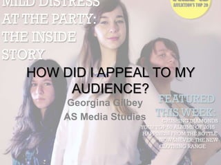
  • 1. HOW DID I APPEAL TO MY AUDIENCE? Georgina Gilbey AS Media Studies
  • 2. MODELS AND COSTUME • Although the models on my front cover were all female, I made sure to include male models on my contents page so as to keep my audience as open as possible, and when featuring ads such as for the new clothing range, I included images of both women's and men's clothing items to appeal to both.
  • 3. MODELS AND COSTUME • When studying magazine front covers, I took note of the fact that where there were group photos as the main image, each person in the band was often representing a specific character type in order to target the different tastes in their audience. • For this reason, I decided to replicate this in my own main image. I had the model in front represent the 'cute/pretty one' by having her look directly at the camera and smile, with the model on the left being 'the mysterious one' looking into the distance with a serious expression, and the model on the right being 'the boy-ish type', dressed casually with minimal make-up and her arms folded.
  • 4. MODELS AND COSTUME • My models were all in a similar age bracket to my target audience to make it clear that this is a magazine aimed at young adults who are interested in the rock/metal music genre. I tried to dress them in costume that was appropriate for this target audience, keeping it casual with make-up that wasn't so heavy as to connote a social group such as emo, but heavy enough to connote the social group casual rock.
  • 5. CODES AND CONVENTIONS • In terms of codes and conventions, I followed a few but also tried my best to challenge them to create a new rock/metal magazine that my target audience would be attracted to. I knew from my research into this genre that there are a lot of features that have become typical ...
  • 6. CODES AND CONVENTIONS • ... For example, the colour scheme of red, black and white has become very common for these magazines. For this reason, I challenged the convention by having a colour scheme made up of yellow, blue, black and white. This set my magazine apart from the rest and gave my magazine a new, fresh look. The audience would therefore be able to instantly see a difference between mine and other generic magazines.
  • 7. AUDIENCE FEEDBACK COLLAGE This shows my front cover annotated with quotes from the survey I conducted to get audience feedback on my finished products. I have also included it below this presentation as a larger image.
  • 8. AUDIENCE FEEDBACK COLLAGE • These comments prove that the codes and conventions I used to appeal to my audience were quite successful, as my audience was able to spot them and state how it attracted them to the magazine. • For example, I included a graphic advertising a free CD on my front cover, and someone in the survey said, "Good strategic marking at age group with top lists of 2015 music, free CD, see your favourite band competition". • This suggests that my aim to attract potential buyers with these features would be successful, if I were to publish the magazine, and that I would be able to establish a readership with a young audience.
  • 9. AUDIENCE FEEDBACK COLLAGE • I also got lots of comments referencing the masthead and main image being that of the rock music genre, for example "the main picture is styled in a way that represents the genre well and its masthead also looks straight out of a rock magazine". • This proves that my decision to stylize my masthead by adding cracks and scratches going through it to connote the genre of the music was successful, as many were able to tell from looking at this that it was a rock/metal magazine.
  • 10. OTHER FEATURES Another way I attempted to target my audience was through the use of particular font styles to represent the rock/metal genre further ...
  • 11. OTHER FEATURES: THE MASTHEAD • For example, for my masthead I used a large, bold font called 'Bernard MT Condensed', and had the masthead in capital letters to give it more impact. • I then used the eraser tool to add the scratches and cracks to give my magazine a defined brand as well as to connote the aggressive nature of the music.
  • 12. OTHER FEATURES: SECONDARY FONT • For my story lines and taglines I used the font 'Rockwell' as I thought it fitted in with the rest of the page and masthead font and was bold enough to be conventional of a rock/metal music magazine.
  • 13. CHANGES IN PRODUCTION • In light of my primary audience research, I decided to make some changes in order to appeal to my target audience more accurately. • For example, from my first survey I found that offers such as exclusives and free items almost always influence a buyer's decision when purchasing a magazine. • For this reason, I added advertisements for such free items on my front cover, such as the free CD. • This finding was backed up by my second phase of primary research, as in my audience's feedback on my final production I got the comment "Free CDs are always a plus" when I asked if they would consider my magazine as a purchase choice if they saw it on the shelves.
  • 14. CHANGES IN PRODUCTION: THE DOUBLE PAGE SPREAD • At first, when making the double page spread, I was working on a program called InDesign. This was a program I was completely new to working with, and I had difficulties with working with the tools and overall layout of this platform and I didn’t like the way my double page spread looked (this first draft is shown below). • I spoke to my teacher who helped with this by telling me which tools to use for what, but I later decided to change to working on Photoshop. • This was providing I could make sure to include columns, drop-caps, and other expected conventions of double page spreads successfully. Fortunately, as I was very familiar with working in Photoshop, this was achievable and I found the double page spread a lot easier to construct efficiently.
  • 15. CHANGES IN PRODUCTION: THE DOUBLE PAGE SPREAD The original double page spread, on InDesign:
  • 16. CHANGES IN PRODUCTION: THE DOUBLE PAGE SPREAD The new (second draft) double page spread, on Photoshop:
  • 17. CHANGES IN PRODUCTION: THE DOUBLE PAGE SPREAD Other changes I made after this platform-switch were regarding the main image. First of all, I used the image shown below, a photograph of two of my models doing a silly, informal pose, as I had observed in my research that magazines usually choose to have a serious pose on the front cover and an informal pose on the double page spread to show two sides to the artist or band they are featuring and give the article a more personal feel. However, I soon found difficulties in working with this image because for one, it left out the lead singer of the band, and secondly it was difficult to position the text around it and I thought I would soon run out of room for my article and make the page look squashed or crowded as a result.
  • 18. CHANGES IN PRODUCTION: THE DOUBLE PAGE SPREAD For these reasons, I changed the main image when I changed from InDesign to Photoshop and got much better results as it solved the issues of including all band members and being easier to work around with text. This new image was actually a collage of three separate ones where I picked the best images in terms of poses and image quality and put them together into one. The new image:
  • 19. CHANGES IN PRODUCTION: THE FRONT COVER • As well as in my double page spread, in light of feedback from classmates this time, I made changes to the main image and overall design of my front cover. • This was the first design for my front cover. A classmate suggested that the main image and masthead gave implications of a fashion magazine rather than rock, so I decided I would change this as I didn’t want to give off the vibe of a fashion magazine rather than the very different genre of rock/metal music. • As well as this, I didn’t like the design a lot myself so this also motivated me to start over and pushed me to make the final product I have today.
  • 20. OVERALL ... • The primary and secondary research I did, audience feedback, and changes in production as a result of these factors, helped me to appeal to my audience as accurately as possible; whilst also taking into account the need to break common conventions to successfully create a new, exciting rock/metal music magazine that readers will be attracted to.