1. Before beginning the creation of my magazine I researched several magazines to gain inspiration and acknowledge
the typical codes and conventions which relate to different aspects of a magazine in order for it to be successful.
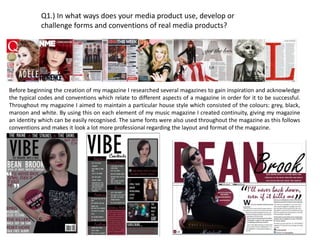
Throughout my magazine I aimed to maintain a particular house style which consisted of the colours: grey, black,
maroon and white. By using this on each element of my music magazine I created continuity, giving my magazine
an identity which can be easily recognised. The same fonts were also used throughout the magazine as this follows
conventions and makes it look a lot more professional regarding the layout and format of the magazine.
Q1.) In what ways does your media product use, develop or
challenge forms and conventions of real media products?
2. I decided to experiment with a variety of fonts which
gave me a wide variety to choose from when deciding
which to use for my final piece.
The font I decided on was ‘Gill Sans MT Condensed’ I felt as
though this fitted well with the genre of my magazine
and the desired look I was going for. After looking at
other magazines such as NME/ MOJO I realised that
the fonts are fairly straight edge and bold which is
where my inspiration came from.
Q1.) In what ways does your media product use, develop or
challenge forms and conventions of real media products?
Initially I came up with 4 potential colour schemes, the one
I decided to go for was black, white and grey. Later on in
the production I decided to introduce a fourth colour
(yellow) to break up the darkness of the magazine and
contrast with the duller colours such as grey and black.
Although my music magazine is based around the indie
rock/pop rock genre which can be grungy, I thought it
would be good to incorporate another colour to make it
seem a lot more light-hearted as opposed to constantly
melancholy.
3. Q1.) In what ways does your media product use, develop or
challenge forms and conventions of real media products?
4. SPECIFIC CONVENTIONS I CONFROMED TO:
The cover line used in combination with the pull quote is
effective in relation to the fact that it highlights the main
feature of the magazine and makes it clear to the audience
what the main article is likely to entail. Due to me
replicating a feature from an existing product it makes the
magazine appear a lot more industry standard.
Similarly to Q’s Lady Gaga issue, the font appears to be situated behind the artist as
opposed to in front. I adapted this technique in my own work in relation to the fact
that it connotes the idea that the artists status it high enough for them to be
recognised without the full name being shown. It also heightens their popularity
further due to people being interested in the person on the front, if they don’t
already know their name they will be more interested in finding it out due to the
layout it is shown in.
I also included a puff on my work as it will help lure in those with a particular interest
in the product or artist I choose to promote within it. I also adopted the ‘5*’ element
of the existing product and used it as a rating scheme of ‘this century's’ album. This
was adapted slightly to ensure it fitted in well with the house style of my product due
to it being maroon, black and grey predominantly.
5. SPECIFIC CONVENTIONS I CONFROMED TO:
I also decided to place the masthead of my magazine in
the conventional area of the left hand side as shown
on the Q magazine. This allows my product to look a
lot more industry standard and appealing to customers
willing to purchase the product.
I chose to include my barcode in the same place of the existing product due to the fact
that it is a conventional area for barcodes to be placed. I also included the issue number
and price on it so customers can find the details easily here if they do not see it in the
top right hand side of the cover. The existing product appears to have removed the
barcode strips however they have also included the date and price on the barcode,
reinforcing the fact that I have conformed to conventions of an industry standard
product.
Similarly to the Q version, I decided to included a skyline to
my magazine however I decided not to place my slogan on it.
This shows that I have partly conformed to this convention
due to me making it black despite the fact that I added artist
names instead of slogans.
6. Q1.) In what ways does your media product use, develop or
challenge forms and conventions of real media products?
After researching several music magazine contents page’s, my main inspiration came
from NME’s music magazine in relation to the fact that it is blocked into different
categories through the use of several subtitles, this makes it easier for the reader to
find a particular article they are interested in. This relates to the fact it creates a
poster-like effect therefore relating to my predominant target audience of young
people such as students. I decided to include an editors note as, although it is not
included in NME, I thought it was a convention which would be good to include. It
makes the magazine appear a lot more personal to the editor and creates a
relationship between both the editor and audience.
I also included the masthead once again on the left hand side of the page to create
continuity throughout the magazine, this makes the magazine easily recognisable to
the readers and maintains the house style. This is a convention taken from various
magazines including the NME magazine below.
A ‘subscribe’ option is also included in my contents page which is another convention
of music magazines as seen on the NME contents. This helps lure in potential
customers to purchase the monthly magazines at a discount. This is helpful as my
magazine revolves around students, which will not have mass amounts of disposable
income.
I also conformed to the conventions of a music magazine in relation to the fact that
my magazine includes a variety of pictures relating to the articles on particular pages,
the captions located next to the image also give the reader an insight into the article
within it. This technique is also shown on the NME magazine of which most of my
inspiration came from. Although, it was adapted to suite my particular genre and
ideas behind the magazine better.
7. Once again the main inspiration for my music magazine double page
spread came from the source of NME – their article of Florence and The
Machine.
In this article I particularly liked the background of the image made up
of the text ‘USA’, so I decided to recreate it into my own using the name
of my artist; ‘BEAN BROOK’. The reason for using 3 images of my artist
from different perspectives connotes the idea that she is fully exposed
within this interview – we see her from every angle.
I also followed conventions in relation to my double page spread
through the use of a standfirst to give a vague introduction to the artist,
and the article on the page.
I then used a drop cap to once again reinforce conventions of the
double page spread regarding the article. The article was then
separated into segments of bold and not bold to make it clear which
part is the question, and which is the answer. A credit line was also put
in regarding the model, and who the images and article belong to.
Page numbers were also included at the bottom of the page, sticking to
the colour scheme, to maintain continuity throughout my magazine.
The page numbers also related to the articles shown on the contents
page which reinforces the continuity throughout the magazine.
Q1.) In what ways does your media product use, develop
or challenge forms and conventions of real media
products?
8. SPECIFIC CONVENTIONS I CONFORMED TO:
As shown in the images I have adopted
a similar stance in my piece, inspired by
the existing product as I thought this
would make the model appear elegant
however I still managed to maintain the
grungy effect through the dark colour
scheme used and the incorporation of
the ‘Marshall’ speaker; reinforcing the
fact that this article revolves around
music.
The artists name is also replicated in a similar way down to the
point where I also chose to used differing fonts that were similar
to those used within the existing product. The standfirst used in
both products are 3 lines long, brief enough to give the audience
an insight into what the article entails.
A drop cap is another convention of industry standard products, I decided to
incorporate this into my work as it gives the article more of a professional ethos.
Despite the fact that NME’s version of a drop cap is slightly deeper, I did not feel
this mattered in the production of my material.
9. Masthead on the left hand side conforms to
conventions due to them usually being placed
in this area as seen on NME and Q.Despite
wanting to conform to conventions, I also
chose to place the masthead in this area as it
looks better regarding the positioning of the
image. It makes it easier to read and more
noticeable for readers.
Magazine and date line are located to the right
of the artists head in a maroonfont to create
and maintain the house style throughout the
magazine. The font ‘Gill Sans MT Condensed’.
is used on both the date and issue line to show
continuity between the two pieces of text. This
font also features within the magazine but I
ensured a variety of other fonts were also
encorporated.
I followed magazine conventions by using a pull
quote on the front cover which links to the main
image, relating to the main article within. This is
done to attract potential customers and give them
an insight as to what the main feature for this
months issue is. Which could then possibly lure
them in to purchase the product.
Similar to official music magazines, the name of my
magazine and price of the issue is located on the
barcode. This follows typical conventions of a music
magazine.
Once again following conventions of a music
magazine, I included a header at the top of the
cover to give the reader an insight as to what the
magazine features before they choose to purchase
it.
Conventions were also
followed on my music
magazine regarding the sell
lines. They are placed on the
left third which is the most
common place for these to be
situated. The house style is
also introduced due to
different colours being used
both on the artist and within
the text, creating a maroon,
grey and black colour scheme.
The black and white contrast
with one another to create a
grungy effect. However, I
decided to incorporate maroon
as I thought it was still slightly
gender neutral and
accentuated the less grungy,
light-hearted atmosphere of
the text.
Q1.) In what ways does your media product use, develop
or challenge forms and conventions of real media
products?
The main image is of the artist
which this months issue of my
music magazine revolves around –
‘BEAN BROOK’. She is shown
stood up facing the audience
which I feel links with the pull
quote on the front cover. The fact
that she is stood up with her hand
on her hip connotes the idea that
she is not beaten, she will rise
above those trying to beat her
down.
10. Q1.) In what ways does your media product use, develop
or challenge forms and conventions of real media
products?
Conventionally, the image relating to
the main article is a lot larger in
comparison to the others featured on
the contents page. The image is
different, with the artist in a different
stance and outfit to show variation. The
main article is also featured on a page
relatively close to the front due to it
being higher of importance.
Smaller photos are also shown on the
contents page, showing the different
features within the magazine. They are
placed further back in the magazine as
they are less important in comparison
to the main story on the front page.
A ‘subscribe’ option is also included in my
contents page which is another convention of
music magazines as seen on others, such as
NME. This helps lure in potential customers to
purchase the monthly magazines at a discount.
This is helpful as my magazine revolves around
students, which will not have mass amounts of
disposable income.
I included an editors note in my magazine. I don’t feel as
though this is 100% conventional due to the fact that
not many music magazine of my genre include one. I
still decided to include it as I feel as though it helps
develop a good relationship between the editor and the
audience – it makes it more personal.
Sub headings are a convention of
magazines which help readers find
what they are looking for,
efficiently. My magazine also
includes 51 pages, which is an
average amount for a music
magazine. Further reinforcing the
use of conventions. The headings
also allow potential customers to
quickly understand what the
magazine entails as they flick
through when it is on the shelf.
I also included the masthead of my
magazine on the contents page to
make it more recognisable to
readers and maintains the initial
continuity of the music magazine.
To further reinforce continuity, I
ensured the use of the same 4
colours, black, white, grey and
maroon, throughout. The
maintenance of this house style
makes the magazine more
recognisable, giving it more of an
iconic look.
11. Page numbers used
on the left page
conform to the house
style of the magazine,
they also link to the
numbers stated in the
contents page
correctly and look
more industry
standard as a result.
I included a stand first
as an introduction to
my article, it gives the
reader an insight into
who the artist
featured on the page
is, and what the article
is about.
This pull quote is used
to intrigue the
audience into reading
the article. It connotes
the idea that the artist
has struggled in some
shape or form. ‘VIBE’
are given the
opportunity to
investigate what
exactly it is that ‘BEAN
BROOK’ is struggling
against. The pull quote
above the text also
creates continuity due
to it being the same as
the one featured on
the front cover.
The use of the word ‘BEAN’ in the
background makes it clear to the
audience who the article is based
upon. The fact that the images are
placed over the top of the text imply
that the person is more important than
the words on the page.
The main image consists of
‘BEAN BROOK’ sat on a
speaker which insinuates
that she is very music
orientated which is the main
reason for her not backing
down from those that do not
support her. The image
shows ‘BEAN BROOK’
looking at the audience, this
engages them with the artist
and lures them into it.
The same fonts are also used throughout
the article. Once again, reinforcing
continuity. The body of the article shows
bold font which makes it clear to the
audience which part of the text is the
question and which is the answer;
through bold and not bold fonts. A drop
cap is also used at the very beginning of
the article. Reinforcing the conventions
of a music magazine.