
Recommended
More Related Content
What's hot
What's hot (20)
Viewers also liked
Viewers also liked (18)
Similar to Film poster analysis 1
Similar to Film poster analysis 1 (20)
Recently uploaded
Recently uploaded (20)
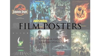
Film poster analysis 1
- 2. THE DARK KNIGHT (2008) The names of the main stars of the film are shown at the top of the poster, with their last names being larger in font style. The font chosen is quite simple and formal, while the stars names’ being in all capitals makes it stand out. The names themselves are quite recognisable, with the lead actors being Christian Bale (who has starred in films such as American Psycho), Michael Caine and Heath Ledger.
- 3. THE DARK KNIGHT (2008) The main image is the largest element of the poster and shows the film’s antagonist, The Joker. The character is staring directly ahead, which acts as a form of direct address and connotes that he is assertive and perhaps aggressive. His identity is hidden by dark make-up which gives the poster a sense of an enigma code; a mystery to intrigue the audience. He also holds a Joker card, further demonstrating the nature of his character, which has an image of Batman on the front. This connotes that the villain has the protagonist of the film in his clutches and is a threat, while the red graphic on the card connotes danger and, possibly, blood being spilled.
- 4. THE DARK KNIGHT (2008) At the bottom of the poster, the film’s title (The Dark Knight) and logo (the Batman symbol) are shown. I find it quite interesting that the title is so small, as it means that the poster’s creator has consciously decided to have the image of the antagonist be the largest item on the page, which could connote that he dominates the film and is threatening and powerful. The logo is a symbol of a bat, which, to any fans of the series, is instantly a signifier of Batman himself, and has a light blue glow around it along with scratches and small holes as if it is damaged, where the ‘light’ behind the logo is at its brightest. This could be hinting at the state of Batman and how his reputation is becoming tarnished by events in the film’s plot.
- 5. THE DARK KNIGHT (2008) Additionally, the poster’s film colour scheme is one of white and varying shades of blue, with the exception of the muted red on the Joker card. This gives the poster a cold, melancholy feel, while the fact that the antagonist is appearing from a black background suggests that he is lurking in the shadows, and may be aiming to bring darkness and depression upon the city of Gotham (the mythical city in which the film is set). Interestingly, the poster subverts conventions somewhat by its lack of a tagline, perhaps suggesting that its creators thought that the mystery of the antagonist and its plot was enough to interest their target audience, who would likely be fans of the franchise due to the previous instalment in the series, Batman Begins (2005).
- 6. CAPTAIN AMERICA: CIVIL WAR (2016) At the top of this poster for Captain America: Civil War is text that reads, “From the studios that brought you [The Avengers Logo]”. This essentially works as the replacement for a tagline, as rather than make the film intriguing with a short, memorable line, it uses an association with the successful Avengers franchise to communicate that this film will occur in the same ‘universe’, therefore making its storyline fairly obvious. This association with the already massively popular franchise acts as the film’s major selling point as a mainstream film, along with the guarantee of the same stars such as Robert Downey Jr and Scarlet Johansson.
- 7. CAPTAIN AMERICA: CIVIL WAR (2016) The main image of the poster shows the main protagonist, Captain America, standing amongst rubble and debris in a city, immediately signifying a mass conflict. The image’s colour scheme is quite cold and rustic in tone, as it is made up of dull reds, white and blues (which matches his identity as the superhero Captain America, as these are the colours on the national flag) and connotes a dark theme. He is surrounded by smoke in the wreckage and we can also see multiple planes above him, including one that is the largest and in the forefront, which may suggest that the other ‘Avengers’ are involved in the conflict.
- 8. CAPTAIN AMERICA: CIVIL WAR (2016) The title of the film and logo are combined into one element and conform to the colour scheme of the rest of the poster. Slightly above the title is the logo for Marvel, the studio backing the film. Again, this association with the studio helps to generate the interest of an audience who enjoys other franchises such as X-Men and The Avengers, and hints at their ‘universes’ converging, meaning popular characters from all franchises can interact. The title is the largest piece of text on the poster so it is the first to catch the audience’s attention.
- 9. CAPTAIN AMERICA: CIVIL WAR (2016) At the bottom of the poster there is an extra line of text that advertises the option of seeing the film in 3D or in IMAX, implying that the audience can get a better experience by seeing it in a different format: IMAX cinemas offer curved screens which better fill your field of vision, making films more immersive. Essentially, this portion of the poster tells the audience that they can get something ‘extra’ from seeing this film as opposed to another which may only offer a 2D or standard 3D experience.
- 10. CAPTAIN AMERICA: CIVIL WAR (2016) This section of compact text contains the names of the main stars of the film along with the director and a second, smaller Marvel Studios logo. The audience is less likely to take notice of this because the font is so small compared to the title and other pieces of text, but if they were interested in who is in the film, they could read this. Additionally, there a promotion for the film’s Facebook page and hashtag ‘#CaptainAmerica’, which could be aiming to appeal to the younger and tech-savvy part of its target audience, prompting them to engage and keep up with the film’s production via social media.
- 11. FROZEN (2013) At the centre of the poster is the studio’s logo, the title of the film, and the text ‘IN CINEMAS SOON’. The studio is Disney, who are famed for their expertise in creating children’s films (which are mostly animation, although they have made live- action films such as Tron: Legacy [2010], which was aimed at an older target audience). The title of the film is in bold, white font and stylized to give the appearance and connotation of ice or snow, as well as to help establish a brand image and possibly make any merchandise they produce more recognisable.
- 12. FROZEN (2013) As well as showing the studio logo, the poster names two of its recent successes, Tangled (2010) and Wreck-it Ralph (2012). I think this has been added to the poster because it may persuade children to see this film due to its association with these previous productions. These films may have also been selected because Tangled’s target audience would, perhaps stereotypically, be made up of mostly females, while Wreck-it Ralph’s would be made up of mostly males, which makes the poster more inclusive because it implies that Frozen can be enjoyable for all members of their chosen demographic.
- 13. FROZEN (2013) The main image shows the main characters of the film (from top to bottom and left to right): Elsa, Olaf the snowman, Anna, Kristoff and Sven the reindeer. The background shows an icy castle and mountains, along with a town below. Elsa is in a sweeping blue dress which shrouds the town and gives the illusion of a harsh winter. The characters below her look as if they are running through a blizzard that Elsa has created (implied by how she is raising one hand, holding glitter and snowflakes) and all have expressions of excitement and determination, suggesting to the target audience that the film has thrilling events in its plot. The castle of ice at the top serves to give it an element of enigma, as the poster doesn’t reveal much about the film’s plot and lacks an explicit tag line. The snowman and reindeer give connotations of a Christmas theme, and as the film’s positioning was for a release on December 6th in the UK, it can be assumed that this was the intention.
- 14. FROZEN (2013) This poster, like the one for Captain America: Civil War, offers a 3D experience (but minus the IMAX, possibly because it might not be suitable for such a young target audience). The options for this film are regular 3D and ‘RealD 3D’. The difference between these two options lies with how they are projected, with RealD said to be newer and more digitally advanced. Below this line, the poster also has a link to the Disney website for Frozen (‘www.disney.com/frozen’). Unlike the previous posters, it lacks the names of stars and a director, mostly due to the fact that as this is an animation, the stars are not as relevant, and even voice actors wouldn’t have much significance to young children. Actors likely wouldn’t influence their choice (or the parents’ decision to take them to see this film) because they would be more interested in characters’ appearance than voices and who acted them and the plot.