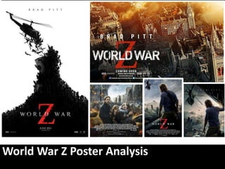
2. Brad Pitt’s name is mentioned
because he is an A-List actor
persuading people to watch
the film.
Silhouette –
gives a
simplified
interpretation
of what to
expect of the
film.
Production details
prior to the date of
release and companies
involved showcasing
the blockbuster film.
Imagery of the
silhouetted still. It
includes people desperate
to climb up to the
helicopter signifying need
of escape and chaos. The
simplicity is effective and
gives a hint of what the
film's about.
The Z stands out as the
colour is in red connoting
danger and conflict. Z also
represents the end.
World War Z
title contrasting
from the black
background –
this is effective
as it draws
attention to the
viewers
3. Brad Pitt mentioned again to
publicise to the audience the
film he is featured in.
World War Z The title
positioned at the top middle.
Production Details
Credits of the people involved
in the making of the film. For
example the actors, director,
production team and other
film associates.
Showing Date & etc.
Date of the film to make the
viewers aware when the film
will be released. Other film
details include the 3D
availability as well as the
website and social networking
link.
Main Image
The main protagonist and
his family (in focus)are
located at the bottom
half of the page while the
deteriorating high rise,
set on fire infested with
zombies above them,
foreshadowing the
turmoil that is about to
happen in the anticipated
film. The family appear to
be fleeing and Brad Pitt
himself is shown, looking
directly towards the
audience to capture a
sense of empathy.
4. Both posters shared similarities and differences. For instance the A-List actor’s
name was mentioned in both to heighten expectations of the blockbuster hit. It has he title
of the film which is important to come across to the public so that the film becomes more
known, easily distinguished with the same use of font and the large bold Z that connotes
emphasis on the letter Z (Z for zombies or ‘the end’- last letter of the alphabet) as well as
danger with the use of red.
Although the first poster was more minimalistic compared to the second poster, where the
image is shown as an illustration of a silhouetted army of zombies creating a mountain
hijacking the helicopter, which gives off a suggestion of chaos and havoc. I think that it is
clever as it somehow reveals but at the same time withhold information from the audience,
making them want to know more about the movie and might be curious enough to watch it
in cinema.
The second poster, however, has more information in relation to the film. The characters are
revealed as well as the setting in New York City. The destruction of the surroundings around
them you can get an idea of what the action packed film would be about. This personally is
my favourite poster out of the rest of the other posters as it captures the emotions of the
characters. The mise en scene in this poster is well thought-out as it visually stimulates the
viewers, with the character positioning and everything included in the frame.