
Recommended
More Related Content
What's hot
What's hot (15)
Viewers also liked
Similar to Mature Pop Magazine Color Scheme and Layout Feedback
Similar to Mature Pop Magazine Color Scheme and Layout Feedback (20)
More from GemmaSpencerMedia
More from GemmaSpencerMedia (11)
Recently uploaded
Recently uploaded (20)
Mature Pop Magazine Color Scheme and Layout Feedback
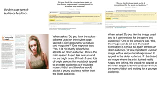
- 1. Double page spread- Audience feedback. When asked ‘Do you think the colour scheme used on the double page spread is conventional for a mature pop magazine?’ One response was ‘Yes, it is not overly colourful so attracts an older audience.’ This is the main reason I used less colours and not as bright ones. If I had of used lots of bright colours this would not appeal to an older audience as it would be more childish and therefore would attract a young audience rather than the older audience. When asked ‘Do you like the image used and is it conventional for the genre and audience?’ One of the answers was ‘Yes, the image stands out and the facial expression is serious so again attracts an older audience.’ It was important I used an image with a serious facial expression to appeal to the older audience. If I had used an image where the artist looked really happy and joking, this would not appeal to the older target audience because it would be more childish and inviting for a younger audience.
- 2. When asked ‘Do you think the layout is conventional?’ One response was ‘Yes, as the article is well organised in columns so easy to read.’ It is conventional to have the article arranged in columns as this is the typical way of laying out the article. It makes the article easy to read and looks more inviting to the audience as it isn’t just a block of writing. This makes it look more appealing as well. When asked ‘What improvements would you make to the double page spread?’ One of the answers was ‘Use a darker blue for the questions to make them stand out more against the white background.’ I agree with this improvement, so I have now applied this improvement to my new double page spread.