Final poster presentation
•Download as PPTX, PDF•
0 likes•129 views

A selection of posters that I made for my design class.

Recommended
More Related Content
What's hot
What's hot (20)
Similar to Final poster presentation
Similar to Final poster presentation (20)
Recently uploaded
Recently uploaded (20)
Final poster presentation
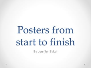
- 1. Posters from start to finish By Jennifer Baker
- 2. Goals and Message • The mortgage process can be stressful and confusing for most customers. My goal for these posters is to make mortgage customers feel more comfortable about the process. • The message that I wanted to send is that a team of mortgage professionals is working for them so they don’t need to worry.
- 3. For my first poster I wanted to highlight a friendly, professional looking team and provide brief descriptions of what each person on the team does. I struggled with aligning the font and making the words look more uniform. The title is too far away from the rest of the poster Overall the message is there but I don’t think that the effort to read the text is rewarded. It’s a functional but boring poster. Photo from Pixabay.com, no attribution required.
- 4. For my second poster I kept the same image and tried to improve on the proximity of the text and make it more interesting. I had similar problems with getting the text to align and match the other text. I experimented with using different alignments but it didn’t work well and is just distracting. The placement of the title is better and the elements connect so this poster is more successful than the previous, but it still needs work
- 5. For this poster I used individual pictures and bolder color choices. I like the colors and think this design could work as part of a multi-page brochure. The photos do support the message but would be more effective if they were bigger. The words are organized better but they still seem bulky to me. Photo from Flikr.com, Steve Wilson, business photos.
- 6. The poster on the left is probably my least favorite attempt. I used it for our color assignment to see if changing the color scheme could improve it. I think that the monochrome poster looks way better.
- 7. For this poster I decided to go a different direction and use less text. I wanted to create a relaxing theme and be less subtle with the message. Photo from Pixabay.com, no attribution required.
- 8. This is my final poster. It has the more direct “Relax” message. The subjects in the photo are centered so I centered the text below it. I made a bold contrast with the fonts but then used size and color to contrast the key words in my message I created an ocean theme, made the photo the visual context, and then used contrasting text to make my message more clear.
- 9. Resources • Pixabay.com, photos free to use with no attribution required. • Flikr.com, photos by Steve Wilson and are shared with Creative Commons license. • Jennifer Baker • 3/7/2016.