
Recommended
More Related Content
Viewers also liked
Viewers also liked (11)
Similar to Fonts and colours comparison
Similar to Fonts and colours comparison (20)
Recently uploaded
Recently uploaded (20)
Fonts and colours comparison
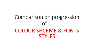
- 1. Comparison on progression of … COLOUR SHCEME & FONTS STYLES
- 3. Colours are very minimal in consistency, e.g. only uses red mostly, which is non- conventional as it doesn’t create a brand identity as there is no house of style, meaning audience can’t recognise publication easily. Fonts are non conventional for the genre (school) the pinks and reds are too feminine would not appeal / attract audience. Font colours are not visible, eye- catching / attracting they non- conventionally fade into main image. This is eye-catching however, as it is yellow and outstands from main image. Conventional use of variations of font styles sans serif & sans for coverlines.
- 4. Improvements on colour scheme, use of mainly pinks and light blues are relative to pop an female leaning – appealing and attracting to my target audience more. Conventional use of bright vibrant colours are better in comparison as they attract target audience of pop more. Logo is further improved with use of technology – internet sources. Font style conventionally varies, and is more unique, which target audience will attract to more. More progression variations of fonts in front, double page and contents. This is more appealing for audience as they are able to navigate easier. Colours and font size chosen for the typography stand out and are improved because they have better readability. Colours scheme e.g. use of pinks and light blue and the same font styles are more consistent – they create a brand identity, as a house of style is being created which my target audience can familiarise with more. Font styles varies more, sans serif and serif in each page which attracts and appeals to target audience more.