call girls in Kamla Market (DELHI) 🔝 >༒9953330565🔝 genuine Escort Service 🔝✔️✔️
New Americana
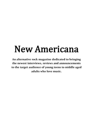
1. New Americana
An alternative rock magazine dedicated to bringing
the newest interviews, reviews and announcements
to the target audience of young teens to middle aged
adults who love music.
2. Design (Detail how your front page will look. Discuss the
choice of masthead and what genre of music your
publication will promote.)
The magazine is titled New Americana, and was one of the
popular choices of my poll, yet not the winner. I decided to go
with my gut instinct as I feel this title has more of a ring to it.
The word new shows that this print will have the newest and
most exclusive content out there, and that’s what I aim to do. A
lot of people who voted were confused as to why I would want a
British printed magazine with the word American in the title; I
chose this simply because a lot of the new music at the moment
is from America. It also opens place for there to be a novelty
issue, or section within every issue titled ‘New Britannia’ which
would be dedicated solely to the British talent.
My magazine will be a primarily alternative rock magazine that
expands into every corner of that scene when needed, be it from
pop-rock through to metal. When I did my survey a lot of people
responded with the bands which were alternative and rock,
though others did still pick the heavier artists, so I shouldn’t just
rule them out, simply include that genre in moderation. To fit
with the genre of music that I will be covering I had to get an
appropriate masthead, I did some experimentation from
different sources and different styles before choosing the front
‘Blacklisted’ from dafont.com. I chose this font because it is a
thick bold font that would be easily recognisable on a shelf of
other since I haven’t seen a magazine with another font like it.
To me, the style of the font makes it look like the middle section
of the letters have been blown back, like when you blow ink with
a hairdryer- or in this case sound waves and I find that fitting for
3. my genre because it’s a popular thing for alternative rock music
to be played so loud you can feel the sound waves and
vibrations, so it is as if they are that strong they are blowing the
middle of the font back, it also fits because in the music scene
that it promotes, there are no boundaries, no defined lines, so I
believe that should be displayed through my branded logo. My
masthead will be effective because it is still original and easily
recognisable, without being over the top and unreadable.
The Cover: My front cover will look very clean and appealing
without being too simple and bare. I will not be having a strict
colour scheme without my magazine, as when I analysed the
results from my survey, most people responded saying that they
liked the colour scheme in their magazines to correspond with
the band that is the main feature of the front cover, so- to ensure
I keep my audience happy in order to gain more sales and profit
I will follow their lead and what they most want. The masthead
will be across the top of the page, but there will be a skyline
above it where I will put in information about posters and other
pullouts, along with one or two pull lines regarding the inside
stories. The background of my magazine will be in the shape of
an image, probably a medium long shot or a portrait, the image
will be chosen regarding who or what the main feature in my
magazine will be. Depending on what kind of image is on my
front cover, the title of that issue will be to the side, or straight
across the width of the cover. I will also have one or two quotes
or tag lines at either the side or the bottom depending on where
the space is on the cover- I don’t want it to look too crowded. I
also plan to have a puff on the front cover detailing a
competition in each issue. Font wise, I will have the font for my
masthead, along with one other font varying in colour or size so
that the quality and readability of the content may remain
4. consistent, sometimes I may use two similar fonts to break up
the cover, yet not make it look messy or unorganised. My
barcode will also be placed primarily in the bottom right hand
corner, but may move if there is a big puff or feature that would
only fit in that specific place.
House style (Discuss the choice house style of your
publication. House style is 'the specific usage and
editing conventions followed by writers and editors to
ensure stylistic consistency in a particular publication or
series of publications'. This includes font, colours, design
of contents and page layout.
My magazine will have a house style but not a very strict one,
since some people get sick of the same layouts in every single
issue. So to combat that, yet still have a form of recognisability, I
intend to use the same fonts (Constantia and Blacklisted) and
general placement layout, yet switch it up from time to time,
personally as a buyer of magazines I don’t like a strict layout in
every issue, I like there to be a variety, so that’s what I plan to do
for my own publication. Colour wise, I will have my black and
white set in stone however I will have two other main colours in
every issues that will differ depending on who is the main artist
on the cover and the colours that are associated with said artist;
for example, twenty one pilots are associated with red, black and
blue, so if they are on the cover those would be the colours I
would use. In my research I have found that a lot of magazines
do have quite a strict house style, however when I conducted my
survey and sent it out to other people who read magazines, they
responded saying that they didn’t like the stricter house styles
5. that magazines go off, a lot of people prefer variety and new
exciting features, things to keep their interest.
Target audience (who would be the target audience for
your product? Give a detailed example of who your target
market would be.)
The target audience for my magazine is people of any age who
are interested in the music scene that my magazine features. The
majority of people who buy magazines are teenagers through to
people in their 20’s, so they would be my main audience. Even
though people much older still purchase magazines, I believe my
magazine might be deemed too relaxed or slack for that
audience. I believe my age bracket is the most beneficial for me
as I’m only 16 myself so I know what my age bracket want and
like, whereas I’m not so confident in knowing what 30 and up
like to see in publications. Magazines such as Kerrang! are
supposedly aimed towards people up to 40, but even I think
some of their features can be quite juvenile. I believe that as I get
more experience and grow within myself that my age range will
develop and get larger, but I would tackle that as it comes. I plan
to make my magazine as diverse as possible, appealing to both
genders and all corners of the rock scene, from the soft rock to
the post-hardcore and beyond. I aim for my magazine to be
worldwide, since I will be including content from artists from all
around the globe, so a wide spread of bands would bring in an
international interest hopefully.
Cover information (how much will your publication cost?
Will it be monthly/weekly/bi monthly. How much revenue
would you expect to make?)
6. I intent for my magazine to have an introductory price of £1.30
so then people would see how cheap it was and give it the
chance that they otherwise wouldn’t give if it was more
expensive. Once I have put a few issues out and started to have
more people interested and buying my magazine, I may up the
price to no more than £2. I intend for my magazine to be a bi-
weekly magazine, so that all the information is still new and
valid, but the issues aren’t so close together that I struggle to get
enough features to put in a single issue. There could also be the
option of subscribing to the magazine on a 6/12 month contract
and get the magazine for cheaper than it is on the market. If for
the first 5 issues I only sold 50 of each, I would still be getting
£325 back. My magazine will also have a digital option, so that
people who aren’t font of carrying a print version, or simply can’t
get to a store, they can download the online version for 90p, a
discounted price since they aren’t having any physical posters,
print so it would be cheaper.
Publishing house (which publishing house would print
your magazine and why? Look back at your previous
institution research.)
To start off I would like Bauer Media Group to publish my
magazine since they are a large media conglomerate and seem to
be one of the few that are still having a steady revenue stream
without too much decrease every year. Bauer Media Group also
have quite a few other magazines so they have experience and
know how to treat and advertise my magazine. On the point of
advertisement, Bauer Media are a multimedia conglomerate
unlike many, so they can do more than just advertise in other
magazines or on billboards, they could advertise my magazine
on any of their TV channels or any of their many radio stations,
7. which would give more coverage and give me a bigger launch
than other companies could do.
However, once I have found my feet and have got a big enough
revenue stream, I intend to go independent, since a lot of
independent publishers have a steady and little decreasing
revenue, since they don’t have to split any of their income with
the larger companies, they can keep most of it for themselves
and help build their company more effectively. It is also easier
for those companies to stay in contact with the buyers and edit
their magazine according to what their audience wants. Whereas
in larger companies, the head office will have the final choice on
what gets published and what doesn’t, so it would be tougher to
adjust when needed.