Kisan Call Centre - To harness potential of ICT in Agriculture by answer farm...
Genre
1. Film
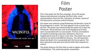
Poster
This is the poster for the film campaign. Every film poster
features key elements including: the film’s title, visual
representations from the film, indication of release, names of
the lead actors/ actresses and the director.
Our poster was made by using Photoshop and denotes a shot of
the protagonist in action. The shot appears to be a scene from
the film. The poster was influenced by the poster for Friday The
Thirteenth. Visual element such as the background of trees
were incorporated with our own poster. This has connotations
of isolation and being away from civilisation, these are
heightened by how he is alone in the shot. The poster has a red
and blue hue which had different themes. The red represents
blood and death, this is associated with the horror genre. The
blue represents how dark and cold the killer feels towards his
victims.
The poster features the film titles as well as tagline and credits
at the bottom. This meets key poster conventions.
2. Genre
We can apply Burton’s theory to the products of the film campaign due
to the key elements of horror present in our products. In the poster
and scenes of the trailer the protagonist is denoted wielding a knife,
this is key iconography for horror films.
Neale’s theory of repetition and variation can be applied to the
campaign mainly due to how we create sympathy for the protagonist
when it is common to portray killers as sadistic/ psychotic.