Graphical Displays of Data
•Download as PPTX, PDF•
0 likes•384 views

This document discusses various methods for graphically displaying data in statistics, including time series graphs, bar charts, histograms, circle graphs, dot plots, stem plots, ogives, and indicators of misleading graphs. It provides examples and descriptions of how to properly interpret and construct each type of graph. Key points include showing change over time with time series graphs, comparing categories with bar charts, displaying continuous or binned data with histograms, showing percentages with circle graphs, listing all values with dot and stem plots, and calculating cumulative frequencies with ogives. Misleading graphs are identified as those that distort scale, lack labels, omit data, or have uneven bins.

Recommended
More Related Content
What's hot
What's hot (20)
Similar to Graphical Displays of Data
Similar to Graphical Displays of Data (20)
More from Cumberland County Schools
More from Cumberland County Schools (10)
Recently uploaded
Recently uploaded (20)
Graphical Displays of Data
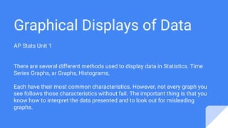
- 1. Graphical Displays of Data AP Stats Unit 1 There are several different methods used to display data in Statistics. Time Series Graphs, ar Graphs, Histograms, Each have their most common characteristics. However, not every graph you see follows those characteristics without fail. The important thing is that you know how to interpret the data presented and to look out for misleading graphs.
- 2. Time Series Graph Use a time series graph to do what it sounds like it will do - show the change in a variable over time. Time on horizontal axis - Variable on vertical axis
- 3. This is a great example of a time series graph. It also is misleading if you compare values by looking at the distance between the lines. In 2100, it looks as if the temperature on the red line is 4 times higher than the black line. In reality, it’s 4 degrees difference since the vertical axis doesn’t start at 0. Pay attention to labels! Title: Surface Air Temperature | Source: Earth Exploration Toolbook | Public Domain
- 4. Bar Charts Segmented Bar Charts Use bar charts when comparing items between different groups. Segmented bar charts may be used to show two or more variables Bars have gaps between and positioned over a label that represents a categorical variable. Height of the bars indicates the frequency of the data and are used to make comparisons. All bins (bars) should have the same width.
- 5. Using this segmented bar chart, you can compare not only total values but also values of referrals for each of four people in the months of March, April, and May.
- 6. Histogram Use histograms when you have continuous data such as height or ranges of values such as 1-5, 6-10, etc. Histograms usually leave no gaps between bins/intervals. Used for LARGE sets of data
- 7. This histogram is labeled properly if we believe that the number of SNPs above 15 for the interval 0.00 and 0.01 is represented correctly by the height of the bin. The only way to know for certain is by looking at the original data.
- 8. Circle Graphs AKA Pie Charts Use circle graphs to show the percentage of categorical variables in a data set. Percentages should total 100%. Although the actual percentages are not labeled on this circle graph, we can make good approximations and comparisons based on the characteristics of circle graphs.
- 9. Dot Plots Use a dot plot to display EVERY value of a variable. Used for small data sets 3/10 or 30% of these families have 1 pet. * * * * * * * * * * 0 1 2 3 4 5 6 7 8
- 10. Stem Plot AKA Stem-and-Leaf Plot Use a stem plot to display all the values of a discrete data set. The stem and leaves are separated by a vertical line. The numbers are listed from the stems out; i.e., 13 | 1 1 4 6 8 represents data values 131, 131, 134, 136, 138 Stems are listed vertically from lowest to highest.
- 11. In this back-to-back stem and leaf plot you can compare battery life of Brand A and Brand B. Brand A had the lowest recorded battery life of 5 hrs compared to Brand Bs low of 7 hrs. You can’t make inferences that can’t be supported such as Brand B is better than Brand A. Image Copyright 2013 by Passy’s World of Mathematics
- 12. Ogive Use an ogive to graph cumulative frequencies for a set of data. Used to calculate frequency of data above or below specific values In this ogive, plotting cumulative frequencies of psychology test scores, by carefully extracting values you can make statements like: Approximately 460/650 or 71% scored below 95. Approximately 110/650 (200-90) or 17% scored between 65 and 75. Your ability to estimate values between labels is important in how closely your estimation represents the actual data. Photo Source: Online Statistics Education: A Multimedia Course of Study (http://onlinestatbook.com/). Project Leader: David M. Lane, Rice University.
- 13. Misleading Graph Indicators Vertical scale is too big or small, skips numbers, doesn’t start at zero Not labeled properly. Data is left out. Bins (bars) are not the same width.