1. Data from a table can be presented
in many ways.
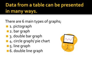
There are 6 main types of graphs;
◼ 1. pictograph
◼2. bar graph
◼ 3. double bar graph
◼ 4. circle graph/ pie chart
◼5. line graph
◼6. double line graph
2. PICTOGRAPH
◼A pictograph is a simple way of representing
data with a picture.
0
1
2
3
dog cat fish rabbit
Y axis
This tells
us the
number
of pets.
X axis. This tells us the type of pets.
3. PICTOGRAPH
◼Can you think what the advantages and
disadvantages of a pictogram may be?
◼ * Easy to read * simple data
◼ * Quick * limited topics
◼ * All languages * suits smaller numbers
4. BAR GRAPH
◼ A bar graph uses columns or blocks to show data values. This
type of chart is useful for showing bigger numbers and for
making quick comparisons.
Y axis –
represents
the values
that change.
X axis – represents the category choices,
the data that does not change.
5. DOUBLE BAR GRAPH
◼ However, if you wanted to know how many boys
and how many girls chose each sport, there is more
data to wade through.......
◼ Now which is the most popular sport?
◼ It is much harder to spot the answers.
Soccer Softball Basketball Other
Boys 3 2 5 2
Girls 6 2 1 1
6. DOUBLE BAR GRAPH
◼A double bar graph is used to compare sets of
data. It groups results for the same category.
7. CIRCLE GRAPH/ PIE CHART
A pie chart is a circle made from segments. Each segment
represents a proportion.
NOT that sort of PIE!!!!
8. CIRCLE GRAPH/ PIE CHART
◼THIS type of PIE!
◼The proportions of a circle graph are usually
shown as a percentage.
Class 1
Blue
Black
Brown
Grey
Hazel
Green
This is called a
legend – it uses a
colour code to
show the
categories.
9. CIRCLE GRAPH/ PIE CHART
◼Circle graphs do not show exact values, but
percentages. They are really useful when
comparing a large sample with a small
sample.
◼ It would be difficult, as a bar chart,
to compare class eye colour with a
top value of 30 children to a whole
school survey, where there will be
over 200 answers.
10. Line Graph
◼A line graph is used when the value being
measured is the same. It is similar to a bar
graph, but samples data at intervals.
Line graphs can track when values are
high or low. One example is a
weather chart, showing the sunshine
or rainfall for the year. Each month
would be an interval measure.
Businesses uses line graphs to track
their sales.
11. Graphs
◼Each graph type has its own advantages and
disadvantages. You need to think about your
purpose and audience before choosing
which style to use.
Can you remember the main types of
graphs?