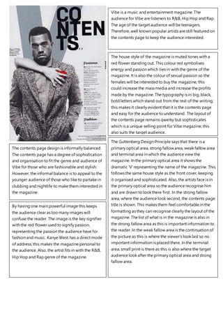
1. Vibe is a music and entertainment magazine. The
audience for Vibe are listeners to R&B, Hip Hop and Rap.
The age of the target audience will be teenagers.
Therefore, well known popular artists are still featured on
the contents page to keep the audience interested.
The house style of the magazine is muted tones with a
red flower standing out. This colour red symbolises
energy and passion which ties in with the genre of the
magazine. It is also the colour of sexual passion so the
females will be interested to buy the magazine, this
could increase the mass media and increase the profits
made by the magazine. The typography is in big, black,
bold letters which stand out from the rest of the writing;
this makes it clearly evident that it is the contents page
and easy for the audience to understand. The layout of
the contents page remains qwerky but sophisticates
which is a unique selling point for Vibe magazine; this
also suits the target audience.
The contents page design is informally balanced.
The contents page has a degree of sophistication
and organisation to fit the genre and audience of
Vibe for those who are fashionable and stylish.
However, the informal balance is to appeal to the
younger audience of those who like to partake in
clubbing and nightlife to make them interested in
the magazine.
By having one main powerful image this keeps
the audience clear as too many images will
confuse the reader. The image is the key signifier
with the red flower used to signify passion,
representing the passion the audience have for
fashion and music. Kanye West has a direct mode
of address; this makes the magazine personal to
the audience. Also, the artist fits in with the R&B,
Hip Hop and Rap genre of the magazine.
The Guttenberg Design Principle says that there is a
primary optical area, strong fallowarea, weak fallow area
and terminal area in which the audience view the
magazine. In the primary optical area it shows the
dramatic ‘V’ representing the name of the magazine. This
follows the same house style as the front cover, keeping
it organised and sophisticated. Also, the artists face is in
the primary optical area so the audience recognise him
and are drawn to look there first. In the strong fallow
area, where the audience look second, the contents page
title is shown. This makes them feel comfortable in the
formatting as they can recognise clearly the layout of the
magazine. The list of what is in the magazine is also in
the strong fallow area as this is important information to
the reader. In the weak fallow area is the continuation of
the picture as this is where the viewer’s look last so no
important information is placed there. In the terminal
area, small print is there as this is also where the target
audience look after the primary optical area and strong
fallow area.
2. The contents page design is informally
balanced. The informal balance and
minimum organisation links in with the
genre of the magazine. This imbalance is
used to emphasise the genre of rock music
and appeal to the target audience of mainly
young males. However, the organisation is
needed so the audience can understand the
contents page clearly.
The target audience for Kerrang are those
who have an interest in bands, punk and
rock music as the magazine features a range
of rock genres. The age of the audience will
be of all ages but attract a wide range of
younger children.
The font represents the artists as bold and confident as this is what the typography insinuates. The font is
written in red which makes the artists look aggressive which links in with their music genre. The house style
of the magazine is brightly coloured with yellow and reds on a black and white background to create
contrast. Yellows represent happiness and red is associated with blood and fire which also creates a contrast.
The use of contrasting colours makes the fonts stand out which helps make clear for the audience to read
and also represents bold and strong characteristics. The ‘KERRANG!’ font also represents loudness as it looks
like smashed glass which signifies the rock genre.
There are two images on the contents page, both of
artists in the rock, punk music industry to link in with the
genre of the music magazine. The way the artists are
dressed and how their hair is styled would appeal to the
target audience of males that like to go to gigs and
concerts. Also, males could aspire to look like them and
those who are in part of a band could be influenced by
the artists.
The Guttenberg Design Principle says that
there is a primary optical area, strong fallow
area, weak fallow area and terminal area in
which the audience view the magazine. In
the primary optical area the magazine name
and contents page are situated as this is
where the audience look first, making them
comfortable with the formatting of the
magazine as it is shown clearly. In the strong
fallow area a list of what will be in the
magazine is shown, this is because it is
important for the audience to know where
to go to navigate through the magazine.