1. The look I tried to put across is almost like a cheeky cat who has a darker side as well. This is
quite different to the normal metal heads you see on double page spreads. I wanted to have a
funky look to add attitude and to say that we are not afraid to be different. It is almost like
working against the conventions of a metal head- something that maybe a elderly person would
like to have for a grandson.
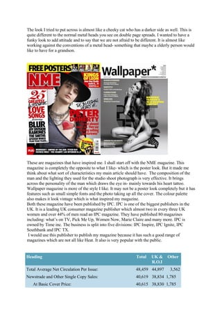
These are magazines that have inspired me. I shall start off with the NME magazine. This
magazine is completely the opposite to what I like- which is the poster look. But it made me
think about what sort of characteristics my main article should have. The composition of the
man and the lighting they used for the studio shoot photograph is very effective. It brings
across the personality of the man which draws the eye in- mainly towards his heart tattoo.
Wallpaper magazine is more of the style I like. It may not be a poster look completely but it has
features such as small simple fonts and the photo taking up all the cover. The colour palette
also makes it look vintage which is what inspired my magazine.
Both these magazine have been published by IPC. IPC is one of the biggest publishers in the
UK. It is a leading UK consumer magazine publisher which almost two in every three UK
women and over 44% of men read an IPC magazine. They have published 80 magazines
including: what’s on TV, Pick Me Up, Women Now, Marie Claire and many more. IPC is
owned by Time inc. The business is split into five divisions: IPC Inspire, IPC Ignite, IPC
Southbank and IPC TX.
I would use this publisher to publish my magazine because it has such a good range of
magazines which are not all like Heat. It also is very popular with the public.
Heading Total UK & Other
R.O.I
Total Average Net Circulation Per Issue: 48,459 44,897 3,562
Newstrade and Other Single Copy Sales: 40,619 38,834 1,785
At Basic Cover Price: 40,615 38,830 1,785
2. Below BCP but not less than 50%: 4 4
Single Copy Subscription Sales: 7,791 6,025 1,766
At Basic Annual Rate: 868 450 418
Below BAR but not less than 50%: 6,379 5,031 1,348
Less than 50% of BAR but not less than 20%: 539 539
Less than 20% of BAR but not less than 10%: 4 4
Less than 10% BAR: 1 1
Multiple Copy Subscription Sales: 49 38 11
At Basic Annual Rate: 7 5 2
Below BAR but not less than 50%: 42 33 9
Actively Purchased: 48,410 44,859 3,551
The abc.org.uk results for the NME magazine which inspired me to go with the publisher IPC.
I have also thought about going on to doing a web magazine.
This is from issue.com and shows many magazines published online. This idea would be
something unconventional than using one of the main publishers. Looking at this site, you can
search for particular documents or whole magazines. They also put it into categories which
help the reader to fine what they are looking for. I would consider doing this as my magazine is
different and the reader could access it quicker than going down to the shops to spend 2.20.
Also it may have better circulation. Bellow I have done a reader profile.
3. My reader profile has photographs of drink
but in a glass to show something different to a metal head. These types of people do exist and I
believe the more I challenge the more ‘fashionable it would be to be an aspiring metal head-
although most artists, of the region, do seem to be seen as aspiration. They like music and may
even play an instrument. They are laid back and ‘cool’ and would like to listen to the metal
music for pleasure. From my survey that I produced after my magazine, people thought that my
double page spread needed added colour because they look too apart from each other.
I have learnt a lot about Photoshop these past few terms. I have learnt to use many of the tools
that I thought to be unimaginable. I know how to use the marquee tool to cut out my photo. I
have to click every so often to seal the line before it. If I mess up then I simply press delete. I
have learnt how to use the gradient tool to create a shadow- like on my double page spread.
This affect is soft with colour so the eye can draw to what is more important. I used the curves
to get the contrast levels right on my photographs. I made sure that the brightness was not too
high and the contrast was quite heavy to create this dark strong look. I mast head was done but
using a off white colour and a bold font. I used the text tool quite a lot. (see screen grabs at the
back)
All in all the skills I have obtained through the preliminary task to the full product are such as
time management and working to deadlines. I have taken control of my work and got
Photoshop at home so I can practise or work on the real thing. Having this advantage, helps me
produce tryouts and experiments.
When looking at my first magazine I made I didn’t have much thought for a clear mast head
and important of the ‘left third’. I placed the main sells in places I thought they had to go but
didn’t know why. I now know that you need to make it easy for the reader to read and clear.
The mast head must be clear, obviously so the reader can see what the magazine is. The mast
4. head also tells you what it is about- for example the magazine about called Wall paper is about
design, not fishing. Though my journey I have looked at what the public likes and dislikes. I
have found that all the information forms into consistent groups. This helps magazine
companies produce a magazine for a certain type of person. We live in a world where there is
order and categories- this works within the media also.