4.18.24 Movement Legacies, Reflection, and Review.pptx
Double article
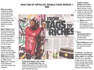
1. ANALYSIS OF ARTICLES- DOUBLE PAGE SPREAD 1 NME Main heading/headline is the key element in attracting the audience to the article. Mise en scene created by graffiti wall background links to the article as the article is talking about how Dizzee Rascal was a graphitti artist before he took to fame. Main Image shows Dizzee painting the graphitti on the wall, this emphasises the fact that the article is about how he used to graphitti but now he has turned his life around. Page number confirms to the audience that they are on the right page (start of the article) NME title shows the reader that it is still an NME article. Date again confirms to the audience when the article was released. Byline (credit for author and photographer) tells the audience who produced the article. Sub heading gives the reader a small insight into what the article entails. 4 columns –the text also raps around the image of the radio , this signifies that this is an important image and as the radio is next to empty beer bottles it gives Dizzee Rascal the look of rebellion that rappers are renound for. Caption saying Dizzee accentuates the fact this article is about Dizzee; it also makes it easier for the reader to see that this is where the article is whilst they are flicking through the magazine. Copy (text) begins with a large letter ‘Y’ using Drops Cap , this emphasises that it is the start of the article and the person reader should start reading from then.
2. Analysis of written article The article itself is basically about how Dizzee has turned his life around. He has gone from the graphitti tagging youth to a famous rap artists. The style of the article is a laid back tone of article which easy for anyone to read. It is written in 4 short columns each of approx75-100 words The main heading/headline is quite dramatic as it is large and in your face. It also emphasises the topic of the article and makes it even more impressive.
3. ANALYSIS OF ARTICLES- DOUBLE PAGE SPREAD 2 NME Page number confirms to the audience that they are on the right page (start of the article) NME title shows the reader that it is still an NME article. Date again confirms to the audience when the article was released. Byline (credit for author and photographer) tells the audience who produced the article. Copy (text) begins with a large letter ‘Y’ using Drops Cap , this emphasises that it is the start of the article and the person reader should start reading from then. Main heading/headline is the key element in attracting the audience to the article – this style of headline also tells the audience that Lilly is your everyday girl as the letters look like magazine cuttings. Sub heading gives the reader a small insight into what the article entails. Main image is just of Lilly in a normal shirt and a necklace, this emphasizes the main heading as a shirt seems very casual and laid back so she is just like your everyday reader. The background is plain so as to not distract from the article and the picture of Lilly. She is the important part of this article.
4. Analysis of written article The article itself is basically about how Lilly tells people the truth and doesn’t beat about the bush when it comes to her opinions. The interviewee also touches on how she is portrayed through the press. The style of the article is again laid back and normal. This seems to be a recurring style with NME, this is to attract more readers and to make the article more enjoyable to read. It is written in 4 short columns each of approx75-100 words The main heading/headline is quite dramatic as it is large and in your face. It also emphasises the topic of the article and makes it even more impressive.