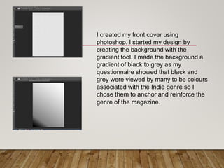
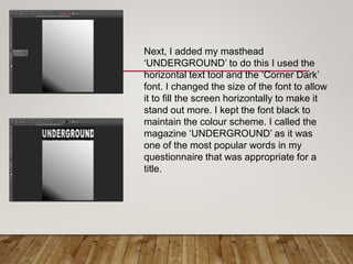
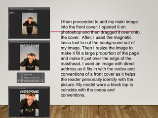
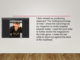
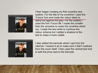
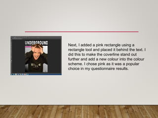
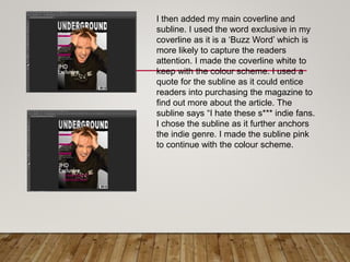
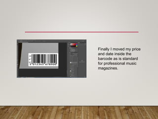
FRONT COVER
PRODUCTION
I created my front cover using
photoshop. I started my design by
creating the background with the
gradient tool. I made the background a
gradient of black to grey as my
questionnaire showed that black and
grey were viewed by many to be colours
associated with the Indie genre so I
chose them to anchor and reinforce the
genre of the magazine.
Next, I added my masthead
‘UNDERGROUND’ to do this I used the
horizontal text tool and the ‘Corner Dark’
font. I changed the size of the font to allow
it to fill the screen horizontally to make it
stand out more. I kept the font black to
maintain the colour scheme. I called the
magazine ‘UNDERGROUND’ as it was
one of the most popular words in my
questionnaire that was appropriate for a
title.
I then proceeded to add my main image
into the front cover. I opened it on
photoshop and then dragged it over onto
the cover. After, I used the magnetic
lasso tool to cut the background out of
my image. Then I resize the image to
make it fill a large proportion of the page
and make it just over the edge of the
masthead. I used an image with direct
address as it fits in with the codes and
conventions of a front cover as it helps
the reader personally identify with the
picture. My model wore a black top to
coincide with the codes and
conventions.
I then created my positioning
statement ‘The Underground kings
of indie’ I chose the word kings as
my magazine is mostly targeted
towards males. I used the word indie
to further anchor the magazine to
the indie genre. I made the text
white to stand out against the black
of the masthead.
I then began creating my first coverline and
subline. For the title of my coverline I used the
‘Futura’ font and made the colour black to
stand out against the grey. For the subline I
used the font ‘Futura Bk’ I made this smaller
than the coverline to make the coverline stand
out. I made the text white to continue the
colour scheme but I added a shadow to the
text to make it more visible.
I also added the barcode which I got from the
internet. I resized it as to make sure it didn’t subtract
from the cover itself. I then used the vertical text tool
to add the price next to the barcode.
Next, I added a pink rectangle using a
rectangle tool and placed it behind the text. I
did this to make the coverline stand out
further and add a new colour into the colour
scheme. I chose pink as it was a popular
choice in my questionnaire results.
I then added my main coverline and
subline. I used the word exclusive in my
coverline as it is a ‘Buzz Word’ which is
more likely to capture the readers
attention. I made the coverline white to
keep with the colour scheme. I used a
quote for the subline as it could entice
readers into purchasing the magazine to
find out more about the article. The
subline says “I hate these s*** indie fans.
I chose the subline as it further anchors
the indie genre. I made the subline pink
to continue with the colour scheme.
Finally I moved my price
and date inside the
barcode as is standard
for professional music
magazines.

Underground (2)

  • 1.
  • 2.
    I created myfront cover using photoshop. I started my design by creating the background with the gradient tool. I made the background a gradient of black to grey as my questionnaire showed that black and grey were viewed by many to be colours associated with the Indie genre so I chose them to anchor and reinforce the genre of the magazine.
  • 3.
    Next, I addedmy masthead ‘UNDERGROUND’ to do this I used the horizontal text tool and the ‘Corner Dark’ font. I changed the size of the font to allow it to fill the screen horizontally to make it stand out more. I kept the font black to maintain the colour scheme. I called the magazine ‘UNDERGROUND’ as it was one of the most popular words in my questionnaire that was appropriate for a title.
  • 4.
    I then proceededto add my main image into the front cover. I opened it on photoshop and then dragged it over onto the cover. After, I used the magnetic lasso tool to cut the background out of my image. Then I resize the image to make it fill a large proportion of the page and make it just over the edge of the masthead. I used an image with direct address as it fits in with the codes and conventions of a front cover as it helps the reader personally identify with the picture. My model wore a black top to coincide with the codes and conventions.
  • 5.
    I then createdmy positioning statement ‘The Underground kings of indie’ I chose the word kings as my magazine is mostly targeted towards males. I used the word indie to further anchor the magazine to the indie genre. I made the text white to stand out against the black of the masthead.
  • 6.
    I then begancreating my first coverline and subline. For the title of my coverline I used the ‘Futura’ font and made the colour black to stand out against the grey. For the subline I used the font ‘Futura Bk’ I made this smaller than the coverline to make the coverline stand out. I made the text white to continue the colour scheme but I added a shadow to the text to make it more visible. I also added the barcode which I got from the internet. I resized it as to make sure it didn’t subtract from the cover itself. I then used the vertical text tool to add the price next to the barcode.
  • 7.
    Next, I addeda pink rectangle using a rectangle tool and placed it behind the text. I did this to make the coverline stand out further and add a new colour into the colour scheme. I chose pink as it was a popular choice in my questionnaire results.
  • 8.
    I then addedmy main coverline and subline. I used the word exclusive in my coverline as it is a ‘Buzz Word’ which is more likely to capture the readers attention. I made the coverline white to keep with the colour scheme. I used a quote for the subline as it could entice readers into purchasing the magazine to find out more about the article. The subline says “I hate these s*** indie fans. I chose the subline as it further anchors the indie genre. I made the subline pink to continue with the colour scheme.
  • 9.
    Finally I movedmy price and date inside the barcode as is standard for professional music magazines.