SQL Database Design For Developers at php[tek] 2024
Two page layout Analysis
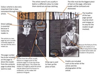
1. The artists name/’s are usually in bold or a different colour to make them stand out and eye catching. The title must be the biggest piece of text on the page, otherwise reader will be confused and distracted. Colour scheme is also very important that is stays consistent through out the article. The headline of the two page spread must be short and snappy so its easy for the readers to get involved. Direct address is essential because it invites the reader in. The article on a two page lay out is usually a friendly register so not very formal, but a mixed use. Because the feature of this article are a band, it is a medium long shot to make sure both band mates are included in the picture. The page number has to be included on the page to direct the reader from the contents page to what they want to read. Quotes from the article usually feature in a bigger print on the contents page or on the top of the double page layout. This shows the readers an insight to what the article may be about and if its funny or a confession, so this makes the audience intrigued. Credits are included such as the writer of the article and the photographer of the article. Drop cap is used to liven up the piece of text.