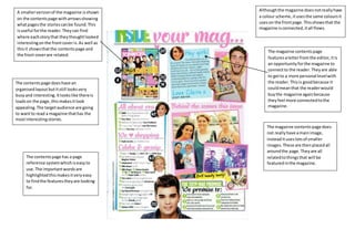
1. A smaller version of the magazine is shown
on the contents page with arrows showing
what pages the stories can be found. This
is useful for the reader. They can find
where each story that they thought looked
interesting on the front cover is. As well as
this it shows that the contents page and
the front cover are related.
Although the magazine does not really have
a colour scheme, it uses the same colours it
uses on the front page. This shows that the
magazine is connected, it all flows.
The magazine contents page
features a letter from the editor, it is
an opportunity for the magazine to
connect to the reader. They are able
to get to a more personal level with
the reader. This is good because it
could mean that the reader would
buy the magazine again because
they feel more connected to the
magazine.
The magazine contents page does
not really have a main image,
instead it uses lots of smaller
images. These are then placed all
around the page. They are all
related to things that will be
featured in the magazine.
The contents page does have an
organised layout but it still looks very
busy and interesting. It looks like there is
loads on the page, this makes it look
appealing. The target audience are going
to want to read a magazine that has the
most interesting stories.
The contents page has a page
reference system which is easy to
use. The important words are
highlighted this makes it very easy
to find the features they are looking
for.