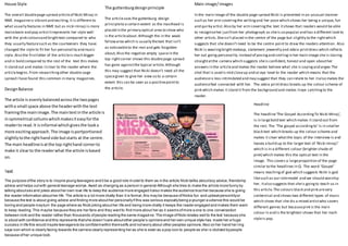
1. The guttenburgdesignprinciple
The articleuses the guttenburg design
principleto a certain extent as the masthead is
placed in the primary optical area to show who
is the articleabout. Although the in the weak
fallowarea which is usually thetext that isn’t
as noticeableto the rest and gets forgotten
about, Also the negative empty spacein the
top rightcorner shows this doublepage spread
has gone againstthe typical article.Although
this may suggest that Nicki doesn’t need all the
spacegiven to give her view so to a certain
extent this can be seen as a positivepointto
the article.DesignBalance
The article is evenlybalancedacrossthe twopages
witha small space above the headerwiththe text
framingthe mainimage.The maintextinthe article is
insymmetrical collumswhichmakesiteasyforthe
readerto read.It isinformal whichgivesthe looka
more excitingapproach.The image isportportioned
slightlytothe righthandside butstarts at the centre.
The main headlineisatthe top righthand cornerto
make it clearto the readerwhat the article isbased
on.
Text
The purpose ofthe story is to inspire young teenagers and ti be a good role m odel to them as in the article Nicki tallks aboutboy advice, friendship
advice and helps outwith general teenage worrys.Awell as changing as a person in general Although she tries to make the article more funny by
talking aboutsex and jokes abouther own love life to keep the audience more engaged italso makes the audience trusther because she is giving
the reader information abouther life. The article is a lot more chatty than it is formal,this may be because ofNickis fun and upbeatpersonlityor
because the text is about giving advice and finding more abouther personallyif this was serious espicallybeing a younger a udience this would be
boring and people mayturn the page where as Nicki joking abouther life and being more chatty it keeps the reader engaged and makes them want
to keep reading.This maybe because they are her fans and they wantto find more about her as it seems ofmore a one to one converastion
between nicki and the reader rather than thousands ofpeople reading the same magazine.The image ofNicki relates well to the text because she
is stood with confidence and this represents thatshe doesn’tcare aboutother people’s opinions and her own unique style has made her a huge
success in life this would inspire teenagers to be confidentwithin themselfs and notworry about other peoples opinions.Also on her hand her ring
says icon which is clearly facing towards the camera clearly representing her as she is seen as a pop icon to people as she i s idolized bypeople
because ofher unique look.
Headline
The headline‘The Gospel AccordingTo Nicki Minaj’,
is in largebold text which makes it stand out from
the rest. The ‘The gospel accordingto’ Is in smaller
black text which breaks up the colour scheme and
makes it clear whatthe topic of the interview is and
leaves a build up to the larger text of ‘Nicki minaji’
which is In a different colour (brighter shade of
pink) which makes this the optical text in the
image. This covers a largeproportion of the page
similar to the headlines in Q. The word ‘Gospel’
means teachingof god which suggests Nicki is god
likesuch as our rolemodel and we should worship
her, italso suggests that sheis goingto teach us in
this article.The colours black and pink arevery
contervisal and shows two different types of music
which shoes that she dis a mixed artistwho covers
different genres but becausepink is the main
colour in and is the brightest shows that her maih
styleis pop.
House Style
The overall doublepage spread articleof Nicki Minaj in
NME magazineis vibrantand exciting.It is different to
what usually features in NME but as nicki minaji is more
mainsteam and pop artistitrepresents her style well
with the pink coloursand brighttext compared to who
they usually featuresuch as the courteeners they have
changed the style to fit her fun personality and music
style. Also the firstletter of the articleis much bigger
and in bold compared to the rest of the text this makes
it stand out and makes itclear to the reader where the
articlebegins.From researchingother double oage
spread I have found this common in many magazines.
Main image/images
In the main image of the double page spread Nicki is presented in an unusual manner
such as her arm coveringthe writingand her pose which shows her being a unique, fun
and quirky artist.Also by her arm coveringthe text itshows that readers would be able
to recogniseher justfrom her photograph as sheis so popular and has a different look to
other artists.Sheisn’t placed in the centre of the page but slightly to the rightwhich
suggests that she doesn’t need to be the centre point to draw the readers attention. Also
Nicki is wearingbrightmakeup, statement jewerelly and zebra printdress which reflects
her out going personality.Instead of posingand smilingin her main image she is staring
straightatthe camera which suggests sheis confident, honest and open abouther
answers in the articleand makes the reader believe what she is sayingand argee.The
shot that is used is mid closeup and at eye level to the reader which means that the
audienceis less intimidated and may suggest that they can relate to her italso makes the
audiencefeel connected with her. The zebra printdress breaks up the colour scheme of
pink which makes it stand it from the background and makes iteye catchingto the
reader.