
Recommended
More Related Content
What's hot
What's hot (18)
Similar to The Script advert analysis
Similar to The Script advert analysis (20)
Recently uploaded
Recently uploaded (20)
The Script advert analysis
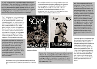
- 1. The use of the same font fortheirlogoand all textcreates a brand identityandhouse style whichfansandaudiences come to recognise andlookoutfor inthe future.Thisis undoubtedlyimportanttoensure thatthe audience recognisestheirwork if the albumsare onthe shelf- designshave tobe eye-catchingandreusingcertainlogos and fontshelpstocatch an audience’seye. Release date- thisisimportantforaudiencessothattheyknow whenthe album’sgoingtobe released.Thismightseem stupid,butif audiencesdon’tknowwhentolookoutforit, theymightnot bother!Assuch,on the posteron the right, there isa linkto The Script website,allowingfanstoengage and go andcheck it out. Both advertsfeature imagesof the membersof the band- thisisfor the band’sStar Image,sothat fans recognise thempossiblybefore they see the bandname on the poster.As much as it’sforexistingfans,itcould alsobe fornewaudiences- since both postersfeature the same three people,foranewaudience,it’slikely that they’ll inferthatthese are the mainpeople of the band.The style of editingisalsoquite unique- possibly unique tothe pop-rockgenre.The blackand white colourscheme for bothpostersiseye catchingand effective,especiallyfromadistance, and givessome indicationtothe audience of whatkindof bandthey are. The other twomenon the posterhave beeneditedinsidethe silhouette of the “main” man- thiscouldbe to highlightthe importance (inorder?) of the people inthe band.Asa new audience membermyself,Iinferthat the personinthe backcouldbe the ‘lead’,simplybecause of hisposition on thisposter.The same thingcan be saidabout the posteronthe other side- the othertwomenare at the back, whereasthe one atthe front is takingup the bottomthirdof the poster. The black and white colourscheme alsocreatesastyle identity for the band.It’seye-catching(evenfromadistance!) andbothof these postersare almostinvertedfromone another- one hasa white backgroundanda lotof back and greyaroundthe artists, whereasthe advertonthe lefthasa blackbackgroundand white text- highlightingthe artistsinthe middle.Inbothcases,the colourschemeshelpthe artiststostandout on the page. The ‘#’ at the back isn’textremelyobvious but it’san effective design.The same ‘#’is on the posteron the right,however,it’s more pronounced.“#3” was the title of the albumwhichthese posterspromote,and Hall of Famewas the ‘star track’ of the album.It’sclearthat both of these posters therefore advertise the product- theyare verysimilarinstyle anddesignandlook effectivefromadistance.The artistsare in stylishposesonbothposters,perhaps emphasisingthe “Hall of Fame”aspectto the album.(Promotingtheirstarimage!) All of these pointsgrabthe attentionof theirtargetaudience because itutilises theirstar image well- the colourscheme and fontchoice (house style)isvery effectiveandstandsout. The use of “FeaturingWill.i.am”possiblyattractsan evenlargeraudience- fansof will.i.amwill be temptedtobuy this,especiallyif they’re intentonpurchasingeverything he’severcreated. PersonallyIthinkthatthese designsare reallyeffective and nicelyconveythe pop-rockgenre of whichitbelongs to. By AmeliaSommer